What you might not know about the AlertDialog
This seemingly simple UI element has a lot of hidden features. If you have ever developed an application, you probably have used it.
An AlertDialog’s main function is to notify users of something that is going to happen that requires their immediate attention and an action to be made on their end. The uses of an AlertDialog are numerous and could range from:
- Ask the user to grant permission for your application to do something (location)
- Alert the user to an action that is about to take place (remove photo)
- Notify the user of what is going on (feature not available)
What this article will not cover is the basic use cases and construction of an AlertDialog, but it will cover some more advanced uses and caveats of this UI element.
For this article, I will be showing examples written in Kotlin.
Length of AlertDialog’s Title
Setting the title on an AlertDialog is easy. Using the following method,
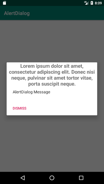
builder.setTitle(title), //where title is a CharSequence. What is not apparent from the code, is that the dialog’s title is limited to only two lines. Meaning, that if you write a long title, it will be truncated and you will see three dots (…) being displayed signifying the sentence is longer than it appears.

But what If we needed more room for our title? We can use the method setCustomTitle which receives a View as a parameter.
Using the above, we can easily create a TextView and style it to our liking to get the desired result.
The Neutral Button
While you may be familiar with the approve or reject buttons associated with the AlertDialog, there is also one other type of button available. That button is the NeutralButton. What is special about this button is that it signals to the user that if he/she makes this choice, nothing will be affected.
If you take another look at the screenshot above, you can see that the button with the Dismiss text is a neutral button.
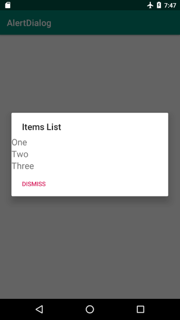
Items Or Message
After setting the title, we can set the message of our alert dialog. Again, what if we wanted the user to select something in our alert dialog (out of a list)? For that, we can use the setItems method:
Or we can use the setSingleChoiceItems method:
Here, we come to a fork in the road, because we will have to choose what is more important to us: a list of items or the alert dialog’s message. We can’t have both. To quote the documentation:
…Because the list appears in the dialog’s content area, the dialog cannot show both a message and a list…
When using an items list, it is a good idea to use an adapter to handle the interaction and management of our list of items. Below is a simple demonstration of just how to achieve that.
If you don’t want to deal with an adapter, you can use the setSingleChoiceItems method like so:
And you’ll get the following:
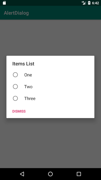
Image Alert
What if we wanted to have a message and an image in our AlertDialog? We can achieve that by using the setView method:
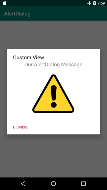
🙌 In fact, you may have noticed that even for the previous problem, we can use a custom view that has a listview and a textview to handle the scenario of a message and a list of items.
Those are just some of the more allusive possibilities you have with the AlertDialog. If you have more examples like this, feel free to share them in the comments.
You can see all the examples shown in this article in an application I created at this GitHub repository.

