Unleashing Creativity with Custom Modifiers in Android Jetpack Compose
Elevate Your UI Design — From Gradient Backgrounds to Interactive Gestures, Harness the Power of Custom Modifiers
In the realm of modern UI development, Android Jetpack Compose has emerged as a revolutionary approach, enabling developers to craft dynamic and engaging user interfaces with ease. One of the key features that empowers this declarative UI framework is the concept of custom modifiers. In this article, we dive deep into the world of custom modifiers, understanding their significance, exploring various use cases, and learning how to create and apply them effectively.
Understanding Custom Modifiers
Modifiers in Jetpack Compose are functions that transform or augment the behavior and appearance of composables. While Jetpack Compose comes with a rich set of built-in modifiers, custom modifiers allow you to extend the framework’s capabilities by creating your own tailored transformations. Custom modifiers are invaluable tools for encapsulating complex behavior, reusability, and composability.
Why Custom Modifiers Matter?
- Abstraction and Reusability — Custom modifiers encapsulate complex behavior or visual modifications into a single function. This abstraction promotes reusability across different parts of your app.
- Code Organization — Custom modifiers enable clean and organized code by isolating specific behavior within a modifier function. This separation enhances the maintainability and readability of your codebase.
- Composability — By encapsulating functionality within custom modifiers, you can create highly composable and modular UI components. This promotes a modular architecture that is easier to develop and maintain.
Creating Custom Modifiers
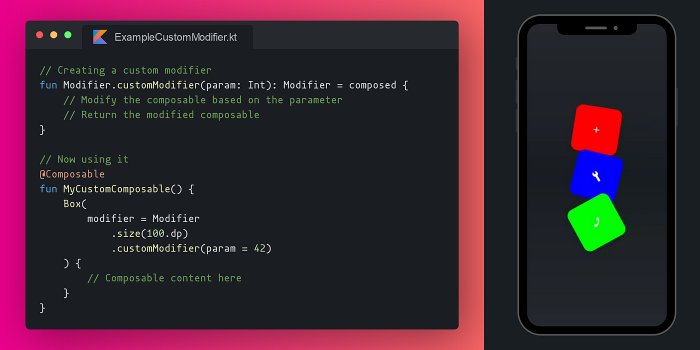
Step 1 — Define the Modifier Function
To create a custom modifier, define a function that takes a composable and returns a modified version of it. This function should accept parameters that allow customization of the behavior or appearance.
fun Modifier.customModifier(param: Int): Modifier = composed {
    // Modify the composable based on the parameter
    // Return the modified composable
}
Step 2 — Apply the Modifier
Apply your custom modifier to a composable by chaining it with the existing modifiers using the modifier parameter.
@Composable
fun MyCustomComposable() {
    Box(
        modifier = Modifier
            .size(100.dp)
            .customModifier(param = 42)
    ) {
        // Composable content here
    }
}
Real World Examples and Use Cases
Example 1 — Gradient Background Modifier
Create a custom modifier that applies a gradient background to a composable. This can be used to provide a consistent visual theme across your app’s components.
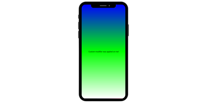
fun Modifier.gradientBackground(colors: List<Color>): Modifier = composed {
    drawWithContent {
        drawRect(
            brush = Brush.verticalGradient(colors),
            size = size
        )
        drawContent()
    }
}
Usage —
Column(
        modifier = Modifier
            .gradientBackground(listOf(Color.Blue, Color.Green, Color.White))
            .fillMaxSize(),
        horizontalAlignment = Alignment.CenterHorizontally,
        verticalArrangement = Arrangement.Center,
) {
   Text("Custom modifier was applied on me!")
}
Example 2 — Aspect Ratio Modifier
Design a custom modifier that enforces a specific aspect ratio for an image. This ensures that images maintain a consistent look across various screens.
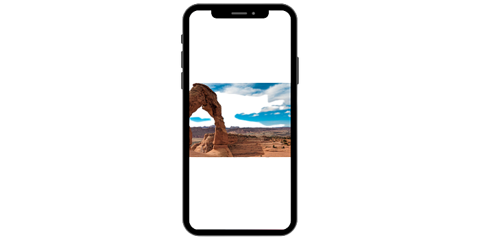
fun Modifier.aspectRatio(ratio: Float): Modifier = composed {
    layout { measurable, constraints ->
        val width = constraints.maxWidth
        val height = (width / ratio).toInt()
        val placeable = measurable.measure(
            constraints.copy(minHeight = height, maxHeight = height)
        )
        layout(width, height) {
            placeable.place(0, 0)
        }
    }
}
Usage —
Image(
    painter = painterResource(id = R.drawable.stock_wallapaper),
    contentDescription = null,
    modifier = Modifier
        .aspectRatio(16/9f)
        .fillMaxWidth(), // modify as needed
    contentScale = ContentScale.Crop
)
Some more example ideas for custom modifiers —
- Elevation Modifier: Apply elevation to a composable, giving it a subtle shadow for a sense of depth.
- Underline Modifier: Add an underline to a text composable, creating emphasis.
- Circular Progress Modifier: Display a circular progress indicator around a composable.
- Image Tint Modifier: Change the tint color of an image to match your app’s color scheme.
- Parallax Scroll Modifier: Apply a parallax effect to a composable when it’s scrolled.
- Slidable Modifier: Create a slidable panel effect for a composable, revealing hidden content.
- Custom Border Modifier: Add a customized border to a composable, with options for width, color, and shape.
- Animated Scale Modifier: Apply a scaling animation to a composable to enhance interaction.
- Loading State Modifier: Modify a composable to display a loading state with a progress indicator.
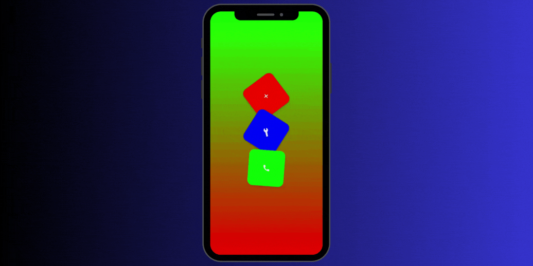
Here’s another custom modifier just for the fun of it!
Achieving Consistency Across Your App
Custom modifiers play a pivotal role in ensuring a consistent look and feel across your app. By creating a library of custom modifiers, your team can apply the same set of visual transformations and behavior adjustments across different UI components. This approach harmonizes the app’s design language, making it easier to maintain a cohesive user experience.
Whether you’re working on buttons, cards, text styles, or spacing, custom modifiers offer a centralized way to enforce consistent design choices. Developers can apply these modifiers to composables throughout the app, ensuring that each component adheres to the established design guidelines.
Remember, the real magic doesn’t just happen in the lines of code; it comes alive in the hands of the users who interact with your creation.
Conclusion
Now armed with the insights from this article, you have the tools to bring your UI elements to life, molding their appearance and behavior in ways that are unique to your app’s personality. By encapsulating behavior and appearance modifications, custom modifiers contribute to cleaner, modular, and more maintainable code.
Code and Closing Remarks
If you liked what you read, please feel free to leave your valuable feedback or appreciation. I am always looking to learn, collaborate and grow with fellow developers.
If you have any questions about any of the examples above or would like some help creating one of your own feel free to drop a comment or message me on LinkedIn!
Here is the link to the gist containing all the previously mentioned code snippets, along with the sample usages and the code for the Floating Button Animator.
Follow me on Medium for more articles — Medium Profile
Connect with me on LinkedIn for collaboration — LinkedIn Profile
Happy Composing!

