Supporting Dark themes in Android

In recent times we have seen a number of apps adopting dark theme. Also as now Android 10+ officially supports dark theme so many devs wanted to implement this feature in their apps, So today we will learn how we can support our apps to use dark Theme using Google material design library.
First, add material library to build.gradle and build your app.
//Material design
implementation 'com.google.android.material:material:1.1.0'
Now change your app default app theme in style.xml and change its parent to MaterialComponent's DayNight theme.
With these basic steps, your app now supports Day and Night theme by default based on the user’s device setting (Android 10).
Now run your app and if you are using a device running (Android 10) then your application will change it’s theme according to your system theme But if using older device versions than you need to manually provide a toggle in-app setting to change the app theme. If you run your app you can see how it behaves according to your Device’s system settings.

As you can see how the TextView and Background view behaves automatically based on these settings and changes its colours without even providing them with any values. This is the magic of new material components library as it supports dark theme out of the box.
Now as we have enabled dark theme in our app. We will now learn how we can change default colours and other components based on Theme settings.
What we need to achieve:
- We want white icons to appear when the dark theme is selected and black icons to appear when the Light theme is selected.
- We need to change the app’s theme settings manually without relying on System settings.
- We need to change text colour based on the selected theme.
- We need to change Image in
ImageViewbased on theme settings.

This will be the UI we will be creating for our app. It will be composed of a Switch, ImageView and a TextView.
Now inside our Activity class, let’s create add ‘CheckedChangedListener’ to our switch for changing theme programmatically at runtime.
With this much configuration, if a user toggle switch on then it will change app theme to Light Theme and if turned off it will change the theme to Dark Theme.
Now we will see how we can Add different resources for both ‘Dark’ and ‘Light’ theme.
First, add a new ‘Resource’ file by Right-clicking on value > new > ‘Value Resource File’.

Now a popup will appear for creating a new resource file. Just name it as colors select Night Model option from the right side and select mode as Night. It would look something like this.
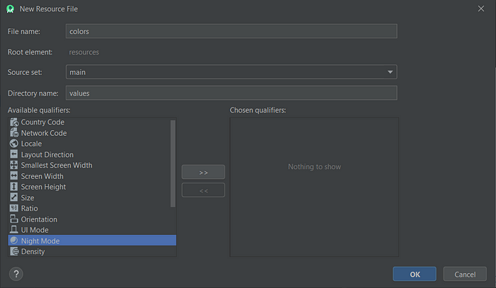

Now select ‘OK’ button.
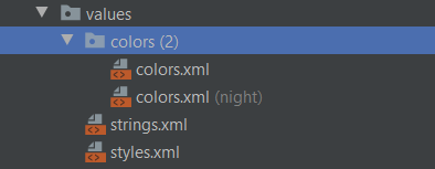
As you can see that a new colors.xml is created. This will be used to provide us with all colour configurations if dark theme is enabled. Otherwise, our app will Automatically pick the other ‘colors.xml’ for Light theme.
This way we can create different for both themes. Like Drawable, Strings, Dimens etc.
Now similarly create a string.xml and drawable directory for Night Mode.
Strings (Light Theme):
Strings (Dark Theme):
Icon (Light Theme):
Icon (Dark Theme):
Colors.xml (Light Theme):
Colors.xml (Dark Theme):
You can get all the resources from This Github repository too.
After placing all the resources in your project. Once you run the app you can see a ‘switch’ for theme toggle. So you can play with it and can see how the app changes its properties at runtime based on the assets provided for different types of themes.

The Github repository for this project : https://github.com/iambaljeet/DarkThemeDemo
Also, you can check my application for Dark/Light Theme implemented in it. This is a fun application.
If this article helped you in understanding the basic concept of Dark/Light theme then please SHARE | SUPPORT | CLAP


