Style Navigation Bar on Android
This is the third post of my style bars on Android series. If you want to know more about other Android UI bars, you can find how to style the action model here and the system toolbar here.
Navigation bar here I refer to the bottom navigation bar, which allows the user to switch between different screens(activities/fragments) easily. It is part of the Material Components for Android library.
There are two ways to style the navigation bar depends on how you create it. One is using the XML style file if you create the navigation bar from XML. The other one is to change it using code. As the Jetpack Compose is ready for production now, I will use Jetpack Compose to create/style it but you can also use the standard way to reference the view and update the style.
In this post, I’ll go through both ways to create/style the bottom navigation bar with the most common use cases. To explore the idea, I created a very simple demo, which you can check here.
Add Material Components Dependence
As I mentioned in the introduction, the navigation bar is included in the martial component, so you need to add the material dependences first.
dependencies {
    // ...
    implementation 'com.google.android.material:material:<version>'
    // for Jetpack Compose
    implementation 'androidx.compose.material:material:<version>'  }
There are two parts you need to be aware of : the app’s compileSdkVersion need to be 30+ and useAppCompatActivity or AppCompatDelegate to ensure all the components work correctly. You also need to inherent your system-level style from one of the material styles, but I will talk about it more in the style with XML section.
Create Navigation bar from XML
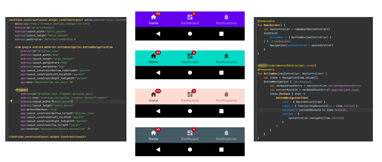
Using a bottom navigation bar on Android is very straightforward, a typical layout would look something like this:
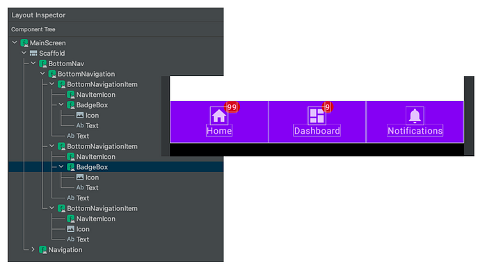
The BottomNavigationView will be set the contains with layout_constraintBottom_toBottom to parent view and the menu items will be configured from the menu XML file. Before we move to how to style the UI, let’s go one level deeper to check how this UI is built. If you use the layout inspector or read the source code of BottomNavigationView, it extends the NavigationBarView , which is customers view, can hold no more than 5 (MAX_ITEM_COUNT) menu items. Here is the hierarchy view of the BottomNavigation and its subviews.

- BottomNavigationView: the root container view of the bottom navigation bar, which extends the
FrameLayout. - NavigationBarItemView: the menu item view, which also extends the
Framelayout. It contains the icon, labels and badge views for each menu item. - Icon: is an ImageView and the AppCampImageView will be automatically used to support compatible features on older versions of the platform.
- Label group: extends the
BaseLineLayout. It contains the large and small text label views and aligns the views inside on a baseline. You can only see one text label at one time. The visibility of the text labels will be switched based on the menu item is active or not. - Text Label: is a
MateriaTextView, large and small labels will share the same text appearance by default. You can usesetTextAppearanceActiveandsetTextAppearanceInactiveto change the text appearance with specified style resources. - Badge: This is a very interesting one, as it doesn’t show in the layout inspector. Once you check the code, it is a
BadgeDrawableclass. For API 18+, the BadgeDrawable will be added as a view overlay to theNavigationBarItemView. More detail regarding the badge view you can find here.
Style with XML file
Now we know how the BottomNavigationViewis created with these subviews. To style the bottom navigation bar is just to style each of the subview components. BottomNavigationView can be customized in terms of colour and typography. As the BottomNavigationView is a material component, you need to inherit from a Material Components theme or a Material Components Bridge theme. Several attributes that will inherit from the default material theme Widget.MaterialComponents.BottomNavigationView.colored. More navigation bar attributes you can find here.
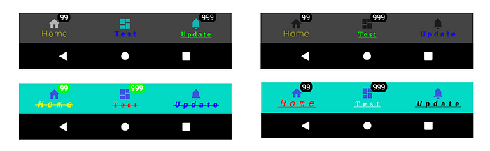
- Container background colour: you can override it with
colorPrimaryorbackgroundColorfrommaterialThemeOverlay. Otherwise, it will use thecolorPrimaryfrom the app-level theme. - Text label style: you can style the text label as a normal material text view. There are two states you can override:
itemTextAppearanceInactiveanditemTextAppearanceActivefor small and large (unselected and selected state) label text views. You can override it withitemTextColorfromBottomNavigaitonViewor thecolorOnPrimaryfrom the default app-level theme and this will apply to both text labels. - Icon: if you don’t set anything, the default behaviour will work here. For inactive state, the overlay will be added 60% of the
colorOnSurface. You can also use the selector state to change the icon state colour. - Badge: you can override the background colour (
backgroundColor), text colour (badgeTextColor) or even gravity of the text (badgeGravity) from the styleWidget.MaterialComponents.Badge. More attributes about the badge component you can find here.
Create with Jetpack Compose
In the Jetpack Compose material library, each material component is an interactive building block. You can use or combine them to create a UI. Here is the code snippet of the same layout as the XML version.
The following components are used to create the bottom navigation bar:
- BottomNavigation: the container composable for the bottom navigation bar, which needs to be configured as the
bottomBarinScafford. - BottomNavigaiton Item: has the same structures as the XML one. There is no restriction for the menu items in the code now, but I wouldn’t suggest adding more than 5 items even we have a bigger screen.
- Icon and Lable: two container composable. In principle, you can put any composable you want but the item composable may not be able to display it.
- BadgeBox: this component is still an experimental composable, which accept the
badgeContent(RowScope) andcontent(BoxScope). In the current Compose Material version (1.0.2), even you don’t set anything in thebadgeContent, it will still display a round circle with the default colour red.
Decoupling is one of the main benefits Jetpack Compose provides as everything will be written in Kotlin. The layout hierarchy is also cleaner than the XML version. There is only one text label in the hierarchy now.
Style with Jetpack Compose
The core element for implementing theming in Jetpack Compose is the MaterialTheme composable. Placing this composable in your compose hierarchy allows you to specify the colour, type and shapes for all components within it. If you are using Jetpack Compose in an existing code, same as the demo project, you can use the adaptor library to bridge the gap between the XML theme and theme in Jetpack Compose. You don’t need to reference these XML files in your Kotlin code and making modifications to them. But there are some known limitations you can find here. The composable default value and export attributes make it easier to style the components. The default values are inherited the same as the ones from the XML style file and you can find some examples below.
- Background colour: in the BottomNavigation composable, two colours are exposed for easy customization:
backgroundColorandcontentBackgroundColor. The first one is the background colour for thisBottomNavigation. The other one is the preferred background colour for the content composable, such as the text or icon. Most of the time you only need to change the first one. - Text: you can style this one as the normal text style, some examples you can check here. The
selectedContentColorandunselectedContentColorare the same as the one active and inactive colour used in the XML file. Once you define the first one, the second one will use the medium level of content alpha as the first colour. - Badge:
backgroundColorwill change the badge background colour andcontentColorwill change the colour of the label text rendered in the badge. I also found there is no method you can changebadgeGravityin theBadgeBoxnow.
Conclusion
In this post, I have given a basic description of how to create/style the bottom navigation bar in two different ways. I hope this post gives you some ideas to style your bottom navigation bar UI. You can find more details from the code in the demo project and play with the code to explore other possibilities. If you have any questions, thoughts or suggestions, feel free to leave comments or let me know if you’d like to hear more.

