Seamless Play of D&D — Implementing Drag and Drop Across Multiple Screens in Your Android App with Jetpack Compose
A Guide to Creating Dynamic and Intuitive Drag and Drop Interactions for Your Android App’s Multi-Screen Experience
Greetings, brave developers! Welcome to a world of magic and wonder, where dragons roam, and epic adventures await — well, not exactly! In this guide, we won’t be rolling dice or slaying monsters in the realm of Dungeons and Dragons. But hey, who says we can’t have a little fun while we master the art of drag and drop?
In this article, we will explore how to implement drag and drop functionality across multiple screens in your Android app using Jetpack Compose. Unlike a simple reorderable list, the example we use will involve dragging items between different pages, allowing users to move items (any data) from any source to any destination screen. Will be explaining each function’s usage, importance, and provide relevant examples to help you easily understand how to enable this powerful drag and drop interaction in your app.
So, buckle up and ready your keyboards as we dive into the enchanting world of drag and drop with Jetpack Compose.
What Are We Building?
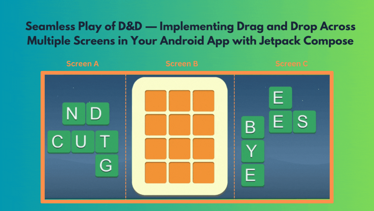
Our goal is to implement a seamless play of D&D, enabling users to intuitively move data between different screens.
The example we’ll be building involves two screens, each featuring draggable widgets representing various data types. Users will have the freedom to drag widgets from one page to another, facilitating effortless data transfer. To enhance the user experience, we will integrate drag targets (widgets) and drop targets (lists) within each page, providing visual cues / feedback and allowing for dynamic data placement.
Let’s dive in and explore how to create this captivating multi-screen experience.
Defining the DragState
The DragTargetInfo class is a class used to store the state information related to drag and drop interactions. It holds various variables that keep track of the current drag state and provide essential data for handling drag and drop operations within the app.
Let’s go through each variable inside the DragTargetInfo class —
internal class DragTargetInfo {
    var isDragging: Boolean? by mutableStateOf(false)
    var dragPosition by mutableStateOf(Offset.Zero)
    var dragOffset by mutableStateOf(Offset.Zero)
    var draggableComposable by mutableStateOf<(@Composable () -> Unit)?>(null)
    var dataToDrop by mutableStateOf<Any?>(null)
    var itemDropped: Boolean by mutableStateOf(false)
    var absolutePositionX: Float by mutableStateOf(0F)
    var absolutePositionY: Float by mutableStateOf(0F)
}isDragging— It represents the current state of dragging. WhenisDraggingis true, it indicates that a drag operation is in progress. When it is false or null, no drag operation is active.dragPosition— This variable of typeOffsetkeeps track of the starting position of the drag operation. It stores the initial position where the drag gesture was initiated.dragOffset— This variable of typeOffsettracks the offset by which the dragged item has been moved from its initial position (dragPosition). It gets updated continuously during the drag operation to reflect the current offset from the starting point.draggableComposable— This variable is of type@Composable () -> Unit, which represents a composable function that can be used to render the draggable item. When the drag operation starts, this function is set to render the draggable item.dataToDrop— This variable of typeAny?is used to store the data that will be dropped during the drag operation. It holds the data associated with the draggable item being moved. You can change this to support a specific type.itemDropped— This variable of typeBooleanis used to track whether the item has been successfully dropped. It helps prevent multiple re-renders of the drop target.absolutePositionXandabsolutePositionY— These variables of typeFloatstore the absolute X and Y positions of the drag target. These values are updated when theDragTargetis positioned in the layout.
These variables collectively provide the necessary state information and data required to manage the drag and drop interactions in the app. They help in tracking the current state of the drag operation, the position of the draggable item, the data to be dropped, and other relevant details. The DragTargetInfo class acts as a central state holder for drag and drop operations, making it easier to manage and control the interactions seamlessly.
Implementing LongPressDraggable
The LongPressDraggable composable function is the foundation of our seamless D&D experience. It allows us to wrap any content (ex. horizontal pager) with dragging behavior, making it draggable upon a long-press gesture.
Code
@Composable
fun LongPressDraggable(
    modifier: Modifier = Modifier,
    content: @Composable BoxScope.() -> Unit
) {

    val state = remember { DragTargetInfo() }

    CompositionLocalProvider(
        LocalDragTargetInfo provides state
    ) {
        Box(modifier = modifier.fillMaxSize())
        {
            content()
            if (state.isDragging == true) {
                var targetSize by remember {
                    mutableStateOf(IntSize.Zero)
                }
                Box(modifier = Modifier
                    .graphicsLayer {
                        val offset = (state.dragPosition + state.dragOffset)
                        // will scale the dragged item being dragged by 50%
                        scaleX = 1.5f
                        scaleY = 1.5f
                        // adds a bit of transparency
                        alpha = if (targetSize == IntSize.Zero) 0f else .9f
                        // horizontal displacement
                        translationX = offset.x.minus(targetSize.width / 2)
                        // vertical displacement
                        translationY = offset.y.minus(targetSize.height / 2)
                    }
                    .onGloballyPositioned {
                        targetSize = it.size
                        it.let { coordinates ->
                            state.absolutePositionX = coordinates.positionInRoot().x
                            state.absolutePositionY = coordinates.positionInRoot().y
                        }
                    }
                ) {
                    state.draggableComposable?.invoke()
                }
            }
        }
    }
}
Usage
We leverage the LongPressDraggable function to make the entire horizontal pager and items draggable, providing users with the flexibility to move items to and from individual screens easily.
@Composable
fun HorizontalPagerContent() {
    val pagerState = rememberPagerState()

    // Wrap the entire horizontal pager with LongPressDraggable
    LongPressDraggable {
        HorizontalPager(state = pagerState, count = 2) { pageIndex ->
            when (pageIndex) {
                0 -> Page1Content()
                1 -> Page2Content()
            }
        }
    }
}
Drag Targets
The DragTarget composable function plays a pivotal role in defining drag sources, representing items that can be dragged.
Code
@OptIn(ExperimentalFoundationApi::class)
@Composable
fun <T> DragTarget(
    context: Context,
    pagerSize: Int,
    verticalPagerState: PagerState? = null, // if you have nested / multi paged app
    horizontalPagerState: PagerState? = null,
    modifier: Modifier,
    dataToDrop: Any? = null, // change type here to your data model class
    content: @Composable (shouldAnimate: Boolean) -> Unit
) {
    val coroutineScope = rememberCoroutineScope()

    var currentPosition by remember { mutableStateOf(Offset.Zero) }
    val currentState = LocalDragTargetInfo.current

    Box(modifier = modifier
        .onGloballyPositioned {
            currentPosition = it.localToWindow(Offset.Zero)
        }
        .pointerInput(Unit) {
            detectDragGesturesAfterLongPress(onDragStart = {

                currentState.dataToDrop = dataToDrop
                currentState.isDragging = true
                currentState.dragPosition = currentPosition + it
                currentState.draggableComposable = { content(false) // render scaled item without animation }

            }, onDrag = { change, dragAmount ->
                change.consume()

                currentState.itemDropped =
                    false // used to prevent drop target from multiple re-renders

                currentState.dragOffset += Offset(dragAmount.x, dragAmount.y)

                val xOffset = abs(currentState.dragOffset.x)
                val yOffset = abs(currentState.dragOffset.y)

                coroutineScope.launch {

                    // this is a flag only for demo purposes, change as per your needs
                    val boundDragEnabled = false

                    if(boundDragEnabled) {
                        // use this for dragging after the user has dragged the item outside a bound around the original item itself
                        if (xOffset > 20 && yOffset > 20) {
                            verticalPagerState?.animateScrollToPage(
                                1,
                                animationSpec = tween(
                                    durationMillis = 300,
                                    easing = androidx.compose.animation.core.EaseOutCirc
                                )
                            )
                        }
                    } else {
                        // for dragging to and fro from different pages in the pager
                        val currentPage = horizontalPagerState?.currentPage
                        val dragPositionX = currentState.dragPosition.x + currentState.dragOffset.x
                        val dragPositionY = currentState.dragPosition.y + currentState.dragOffset.y

                        val displayMetrics = context.resources.displayMetrics

                        // if item is very close to left edge of page, move to previous page
                        if (dragPositionX < 60) {
                            currentPage?.let {
                                if (it > 1) {
                                    horizontalPagerState.animateScrollToPage(currentPage - 1)
                                }
                            }
                        } else if (displayMetrics.widthPixels - dragPositionX < 60) {
                            // if item is very close to right edge of page, move to next page
                            currentPage?.let {
                                if (it < pagerSize) {
                                    horizontalPagerState.animateScrollToPage(currentPage + 1)
                                }
                            }
                        }
                    }
                }

            }, onDragEnd = {
                currentState.isDragging = false
                currentState.dragOffset = Offset.Zero
            }, onDragCancel = {
                currentState.isDragging = false
                currentState.dragOffset = Offset.Zero
            })
        }, contentAlignment = Alignment.Center
    ) {
        content(true) // render positioned content with animation
    }
}
The DragTarget composable function is a fundamental building block for enabling drag and drop interactions.
Let’s break down its key components —
context— TheContextparameter is used to access the application context. It is required to retrieve resources like display metrics, which can be useful in calculating dragging behavior.verticalPagerStateandhorizontalPagerState— These optionalPagerStateparameters represent the state of the vertical and horizontal pagers, respectively. They are used to control the scroll positions and animate scrolling during the drag and drop operation.modifier— Themodifierparameter is used to detect gestures and update the current drag state.dataToDrop— TheAny?parameter represents the data that will be dropped during the drag operation. It allows you to associate specific data with the draggable item being moved.content— The@Composable (shouldAnimate: Boolean) -> Unitparameter represents the content of theDragTarget. It's a composable function that defines the UI elements to be displayed within theDragTargetbased on the state. Additionally, shouldAnimate helps the lambda block decide if the content should be animated or not while rendering. Example, one might not want the scaled composable to have animation.
How It Works —
- Local State and Event Handling: The
DragTargetusesLocalDragTargetInfo.currentto access the current state of the drag and drop interactions. It also uses thepointerInputmodifier to handle drag gestures and respond to user interactions. - Initial Configuration: When the
DragTargetis first created, it calculates and stores the initial position (currentPosition) of theDragTargetin the layout usingonGloballyPositioned. - Drag Gesture Detection: The
detectDragGesturesAfterLongPressfunction is used to detect drag gestures after a long-press is initiated on theDragTarget. When the drag starts (onDragStart), it sets theisDraggingflag to true and captures the initial drag position (dragPosition) relative to the window's coordinates. - Dragging Update: During the drag operation (
onDrag), theonDraglambda is continuously called as the user moves their finger. It updates thedragOffset, representing the current displacement from the initial drag position. The lambda skillfully manages various scenarios, such as detecting when the drag is beyond a specified boundary or reaches the ends of a page, elegantly initiating a smooth move to another page.. Feel free to change that block of code as per your needs. - End and Cancellation: When the drag ends (
onDragEnd) or is canceled (onDragCancel), theisDraggingflag is reset, and thedragOffsetis reset toOffset.Zero.
Usage
@Composable
fun DragTargetWidgetItem(
    data: Widget,
    pagerState: PagerState
) {
    DragTarget(
        context = LocalContext.current,
        pagerSize = 2, // Assuming there are two pages in the horizontal pager
        horizontalPagerState = pagerState,
        modifier = modifier.wrapContentSize(),
        dataToDrop = data,
    ) { shouldAnimate ->
        WidgetItem(data, shouldAnimate)
    }
}

@Composable
fun WidgetItem(
    data: Widget,
    shouldAnimate: Boolean
) {
    // Add your custom implementation for the WidgetItem here.
    // This composable will render the content of the draggable widget.
    // You can use the 'data' parameter to extract necessary information and display it.
    // The 'shouldAnimate' parameter can be used to control animations if needed.

    // Example: Displaying a simple card with the widget's name
    Card(
        modifier = Modifier
            .fillMaxWidth()
            .padding(16.dp)
            .graphicsLayer {
                // Scale the card when shouldAnimate is true
                scaleX = if (shouldAnimate) 1.2f else 1.0f
                scaleY = if (shouldAnimate) 1.2f else 1.0f
            },
        elevation = 4.dp
    ) {
        Column(
            modifier = Modifier
                .padding(16.dp)
                .fillMaxWidth()
        ) {
            Text(
                text = data.widgetName,
                style = TextStyle(fontWeight = FontWeight.Bold, fontSize = 18.sp)
            )
            Spacer(modifier = Modifier.height(8.dp))
            Text(text = data.widgetDescription)
        }
    }
}
Drop Target
The DropTarget composable serves as a drop zone, allowing items to be dropped onto it during a drag and drop operation. It is the counterpart to the DragTarget, representing the area where a dragged item can be accepted.
The DropTarget composable tracks the current drag position and offset and determines whether the dragged item is within the bounds of the drop target. Based on this information, it informs the content composable whether it's currently a valid drop target and provides the associated data (if any) for the dragged item.
@Composable
fun <T> DropTarget(
    modifier: Modifier,
    content: @Composable() (BoxScope.(isInBound: Boolean, data: T?) -> Unit)
) {
    val dragInfo = LocalDragTargetInfo.current
    val dragPosition = dragInfo.dragPosition
    val dragOffset = dragInfo.dragOffset
    var isCurrentDropTarget by remember {
        mutableStateOf(false)
    }

    Box(
        modifier = modifier
            .onGloballyPositioned {
                it.boundsInWindow().let { rect ->
                    isCurrentDropTarget = rect.contains(dragPosition + dragOffset)
                }
            }
    ) {
        val data = if (isCurrentDropTarget && dragInfo.isDragging == false) dragInfo.dataToDrop as T? else null
        content(isCurrentDropTarget, data)
    }
}
How It Works —
- Local State and Event Handling: The
DropTargetusesLocalDragTargetInfo.currentto access the current state of the drag and drop interactions, including the drag position and offset. - Bounds Detection: The
onGloballyPositionedmodifier is used to detect the position and bounds of the drop target in the layout. It calculates whether the drag position + offset is within the bounds of the drop target usingcontains. If so, it sets theisCurrentDropTargetstate totrue. - Content Handling: Inside the
DropTarget, we use theisCurrentDropTargetand the associated data (if available) from theDragTargetInfoto render the content. The content composable receives two parameters:isInBound(whether the dragged item is within the drop target bounds) anddata(associated data of the dragged item).
Usage
@Composable
fun Page1Content(pagerState: PagerState) {
    val widgetList = viewModel.widgetList.collectAsState()

    DropTarget<Widget>(modifier = Modifier.fillMaxSize())
      { isInBound, droppedWidget ->
        if (!LocalDragTargetInfo.current.itemDropped) {
            if (isInBound) {
                droppedWidget?.let { widget ->
                    LocalDragTargetInfo.current.itemDropped = true
                    LocalDragTargetInfo.current.dataToDrop = null

                    val currentlyPlacedItem = getCurrentlyPlacedItemInList()
                    // Use pagerState, LocalDragTargetInfo.current.absolutePositionX,
                    // LocalDragTargetInfo.current.absolutePositionY to determine what's
                    // currently placed in the list and make changes to the list accordingly

                    // Example: If nothing is currently placed at the drop position, add the dropped widget to the list
                    if (currentlyPlacedItem == null) {
                        addWidgetToList(widget)
                    } else {
                        // Example: Swap the currently placed item with the dropped widget
                        moveWidgets(widget, currentlyPlacedItem)
                    }
                }
            }
        }
    }
    WidgetsList(pagerState, widgetList)
}

// Implement the required functions to handle adding and swapping widgets in the list
fun addWidgetToList(widget: Widget) {
    // Add the dropped widget to the list
}

fun moveWidgets(widgetA: Widget, currentlyPlacedItem: Widget) {
    // Move items in the list
}

// Implement the required function to get the currently placed item in the list based on drop position
fun getCurrentlyPlacedItemInList(): Widget? {
    // Use pagerState, LocalDragTargetInfo.current.absolutePositionX,
    // LocalDragTargetInfo.current.absolutePositionY
    // to determine the currently placed item in the list
    // based on the drop position
    return null
}

@Composable
fun WidgetsList(pagerState: PagerState, widgetList: List<Widget>){
    LazyColumn(
        contentPadding = PaddingValues(16.dp),
        verticalArrangement = Arrangement.spacedBy(8.dp)
    ) {
        items(widgetList) { widget ->
            // this composable was defined earlier as
            // each widget item is itself a drag target
            DragTargetWidgetItem(
                data = widget,
                pagerState = pagerState
            )
        }
    }
}

data class Widget(val name: String, val description: String)
You can customize the addWidgetToList, moveWidgets, and getCurrentlyPlacedItemInList functions to handle the actual logic for your app. The Page1Content, WidgetsList, and DragTargetWidgetItem composable functions provide a structured way to set up the draggable widgets and drop targets in your app.
Make sure to replace the Widget class with your actual data model class and customize the handling of the list and drop positions based on your app's requirements.
With the drop target implementation on each of your screens, you can effortlessly enable drag and drop interactions across all screens, allowing smooth data transfer between different parts of your Android App.
Conclusion
In this guide, we delved into the world of seamless D&D using Jetpack Compose. We built a captivating multi-screen experience, allowing users to effortlessly move data between different screens. By implementing LongPressDraggable, DragTarget, DropTarget, and DragTargetWidgetItem, we crafted dynamic and intuitive D&D interactions for our use case.
Shoutout —
I would like to extend my gratitude to Radhika for their insightful article on Drag and Drop in Compose. Their work served as a valuable reference and inspiration for this piece. You can check out their article here.
Complete Code and Closing Remarks
Thank you for exploring this guide, and I hope you enjoyed creating your seamless D&D experience using Jetpack Compose.
To make it easier here are two files DragDrop.kt and DragDropUsage.kt that will help you integrate this functionality quickly into your app.
If you liked the content, please feel free to leave your valuable feedback or appreciation. I am always looking to learn and collaborate with fellow developers.
Follow me on Medium for more articles — Medium Profile
Connect with me on LinkedIn for collaboration — LinkedIn Profile
Happy Composing!


