Responsive layouts using BoxWithConstraints in Jetpack Compose
Exploring some usecases of BoxWithConstraints.
With the ubiquitous nature of Jetpack Compose, which enables us to create UIs on mobiles, tablets, wearables, desktops and web, it stands to reason that apps should be built with responsive layouts that look good on any screen size and orientation.
But how can we create entire screens that naturally adapt to the amount of space available? How can create building blocks that together create screens, each of which adapt to the amount of space available?
Enter BoxWithConstraints. The docs describe it as:
A composable that defines its own content according to the available space, based on the incoming constraints or the current LayoutDirection.
When I first stumbled upon it, the way I understood, that it could be used to build dynamic and responsive layouts that react to the available space. It’s quite practical for creating composables that could be used in different orientations and configurations. Let’s checkout some of it’s many usecases.
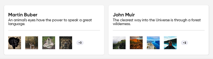
Listing items in a Card with a “+{X}” badge

As the name suggests, BoxWithConstraints is essentially a Box so the children will be layed out on top of each other. In this example, we have a Card child which has Column as a child of it’s own to create this layout. We will focus on the Row at the bottom of the card so let’s break down how BoxWithConstraints helps in showing thumbnails based on the space available and how the value “+3” is calculated.
What’s really happening here? 🤓
- The content of BoxWithConstraints is on scope BoxWithConstraintsScope. Using that we have access to the maxWidth available to the layout.
- On lines 11 to 14, numberOfThumbnailsToShow is calculated based on maxWidth and size of each thumbnail. Notice that we subtract 1 as an easy way to have space for the Badge to show +{remaining}.
- On lines 21 to 31, we iterate through numberOfThumbnailsToShow and call the Image composable with the url and the size of image that we knew already.
- We calculate remaining based on thumbnails.size and numberOfThumbnailsToShow and use that to display as the Badge at the end of the Row.
BoxWithConstraintsScope provides access to maxWidth, minWidth, maxHeight and minHeight, which are values in Dp. In addition to that, there is a constraints property which contains all the above 4 properties in pixels. If you are curious about the implementation of BoxWithConstraints, best place to check would be the source code.
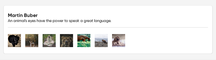
In landscape orientation, all the thumbnails are laid out without adding any specific cases. It just works as maxWidth property on BoxWithConstraintScope updates on changing the orientation.
One could argue that we could have used screenWidth from LocalConfiguration Composition Local and still achieve the same result, but then the composable can only be used in places where it fills the whole screen width, not really ideal. Composables should try to consider the size constraints when deciding how to render. When individual composables naturally adapt to the space available, then a screen can become reasonably responsive even if the author of the screen wasn’t explicitly thinking about responsive layout.
Let’s consider the case where we can place this card in a grid or Row on a wider screen or landscape mode. At the risk of sounding too repetitive, this just works without adding any specific cases as the constraints passed change based on the space available. Pretty neat, right? 😃
Displaying a defined number of items in LazyRow
In the previous example we wanted to list as many photos as possible and their size was known. In this example we want to show pre–determined number of photos and their size is based on the available space and the number of photos we would like to display.

We are showing two items here, let’s jump in the code! 🤓
On lines 9 to 12, we are calculating itemWidth and spaceBetweenItems based on numPhotosVisible param passed to PhotosRow Composable. That’s it really!
Now, let’s say we want to show a bit of the third item so it feels like there are more items available to give a hint to the user that it’s scrollable. All we have to do is pass a different value for numPhotosVisible and it works like a charm!

Lazy Grid uses it under the hood
Have you ever wondered how LazyVerticalGrid is able to show dynamic number of columns based on the space available. Hmmm, Sound familiar? 🤔
Let’s peek into the Compose foundation package check how LazyVerticalGrid implements this functionality.
On lines 22 to 26, we see that it actually uses BoxWithConstraints to calculate the number of cells based on the minSize passed as param of GridCells.Adaptive(minSize). Adaptive actually uses FixedLazyGrid underneath, the same as if we set cells as GridCells.Fixed. The only difference being that it calcuates the nColumns instead of the caller specifying.
Bonus
Based on the width available, we can set different discrete values of fontSizes to the Text child. There’s a code sample and example in this Jetpack Compose Playground project.

