Material3 Color System Basics for Android Developers
Material3 is the newest iteration of Material Design, with dynamic theming, revised components and more… however, it can also be overwhelming with its over 200 different color variations and tens of pages of documentation.
The good thing is that in reality, it’s not all that complex and it can make developers’ lives much easier. And by easier, I mean the following:
- Automatic theming of all Material3 components
- Dark and light color schemes
- Correct colors for the various component states that you never thought of, like “hovered”
- Proper contrasts between colors for accessibility and UX
- A cleaner codebase!
- And more…
In this article, I’ll explain how the Material3 Color System works and why you should implement it in your Android project.
Understanding Material3 color roles
In order to understand how colors are applied in your app, let’s recap a bit on how a color scheme is structured.
The Material3 color scheme consists of three high level “color roles”: Primary, Secondary and Tertiary. These colors are applied on components based on their importance: a FAB or a “login” button would use a Primary color.
The Primary color might be your brand’s main color and thus used for prominent components like primary buttons. The Secondary colors are used for accents, whereas the Tertiary ones are less common.
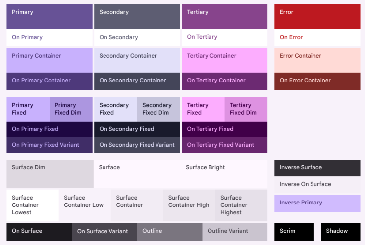
The variations, like “On Primary” have rules on how they should be applied: if your “login” button uses the Primary color, then the text on it would use “On Primary”. Following these rules ensures that your app is readable and accessible.

Why is this important to know? Well, each Component and each state has its own colors, as documented in the Material3 docs. A simple button has 7 states, each with various colors. You shouldn’t have to worry about memorizing each one!
Creating a theme
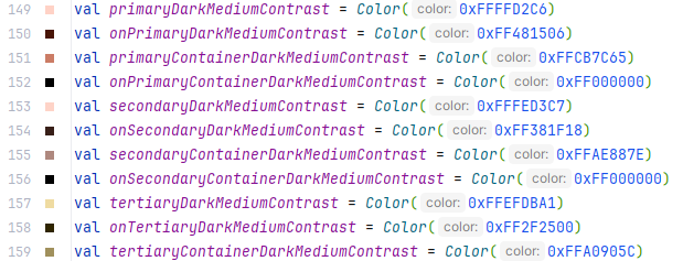
So, how about declaring those +200 colors? Well, the good news here is that it happens pretty much automatically. You definitely don’t want to create a color scheme from scratch.
There are two options: use the Material Theme Builder Figma plugin or use the online Material Theme Builder.
Both of the builders work similarly:
- Choose your source color, all the other colors will be automatically derived from it
- Export the generated
.ktfiles - Place the files in the
ui.themepackage in your Compose project - Rename
AppThemeif you like
And that’s it! Now you have a full custom Material3 Color System applied in your project.
But how does it work?
Behind the scenes
The Theme.kt file you exported contains the following code snippet:
Here, the pre-defined colorScheme is applied to the MaterialTheme composable. When you wrap Composables in your Theme, those composables gain access to the colorScheme. This is for example, how you apply theming to your @Previews.
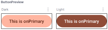
In the above code snippet, the AppTheme provides the defined colorScheme to the Button via CompositionLocal. This results in a fully themed Button, supporting both Light and Dark modes, without explicitly defining colors.
Note that both the backgrounds as well as the text colors are different.
If you look at the Material3 Button’s source, you’ll see that the default value for colors is ButtonDefaults.buttonColors() . The buttonColors() function gets those colors from your MaterialTheme:
@Composable fun buttonColors() = MaterialTheme.colorScheme.defaultButtonColorsWhere do the colors apply?
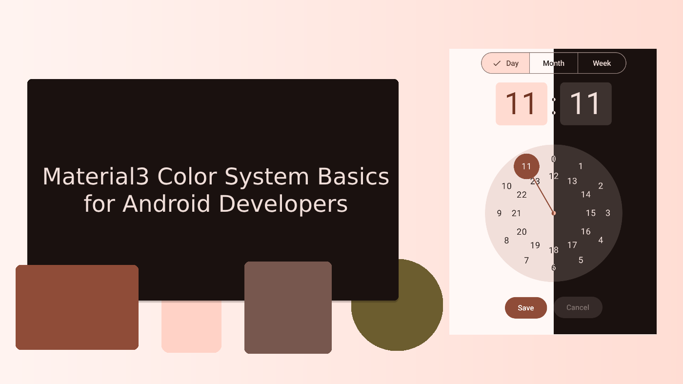
As you might guess, the colors are applied to all Material3 Components, and their states, from the simple Button to complex ones like the TimePicker.
Theming
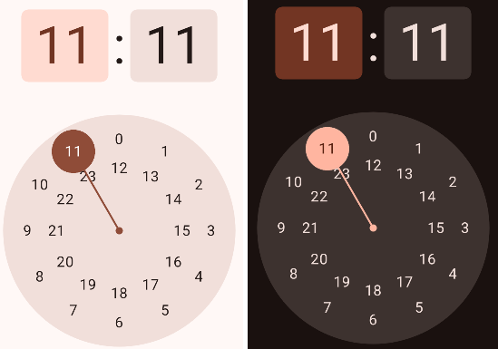
As seen above, you’ll get colors for both dark and light themes, out of the box.
The following piece of code thus results in a fully themed TimePicker component, for both Dark and Light themes.
Resulting in the following Previews
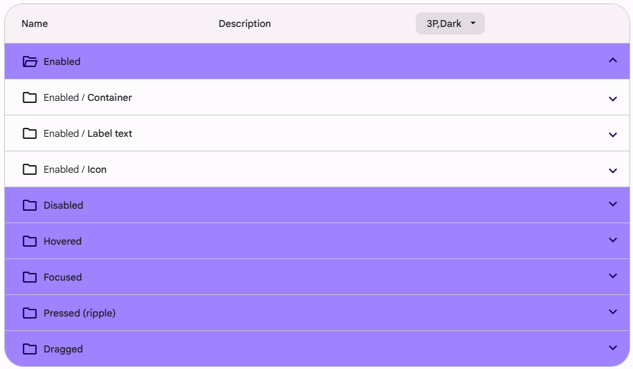
States
And the various states? Yep, the colors are also automatically applied based on composable states.
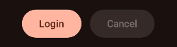
The above change in color for both the Button background and the label are directly derived from the Button’s enabled property, as seen from the code snippet below:
Summary
Implementing Material3 Color System can seem intimidating, but by using the Material Theme Builder and Material3 Compose components, you’ll find that the theming is far more simple and straightforward than without using them.
And as all developers like, you’ll end up with a cleaned codebase and refined color scheme throughout your app.
Links
If you are interested in learning more, here are some useful links


