Jetpack Glance
The Compose way to build beautiful Widgets on Android

For years, widgets have been a staple of the Android experience. However, creating and maintaining them has often been a frustrating process. Traditional approaches can be cumbersome, and unexpected behavior can arise without clear explanation.
This is where Jetpack Glance enters the scene, offering a revolutionary new approach. By leveraging the power of declarative UI with Jetpack Compose, Glance streamlines widget development, making it easier and more enjoyable to create beautiful and functional widgets for your Android applications.
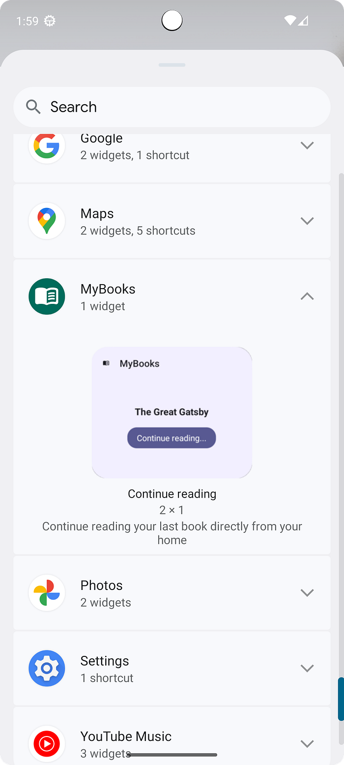
The recent release of Jetpack Glance 1.1.0 piqued my interest, particularly its potential to simplify widget development. For that reason, I decided to explore Glance’s capabilities firsthand. To put these capabilities to the test, I decided to build a widget for my books app. This widget would leverage Glance’s functionality to access user data and provide a convenient shortcut for continuing the last book read.
Let’s dive into the development process and explore how to build our own widgets for a complete hands-on experience.
Define the structure
As with any project, we need to start by setting up the necessary dependencies. In this case, we’ll leverage two key Jetpack Glance libraries:
[versions]

glance = "1.1.0"
...

[libraries]

glance-appwidget = { group = "androidx.glance", name = "glance-appwidget", version.ref = "glance" }
glance-material = { group = "androidx.glance", name = "glance-material3", version.ref = "glance" }
...
With the dependencies in place, we can now turn our attention to the code itself.
To promote code organization and reusability, I’ve opted to create a separate package specifically for the widget. This approach will allow us to group all widget-related code in a single, well-defined location.
Our Glance widget development begins with establishing two core classes: MyBooksAppWidget and MyBooksAppWidgetReceiver.
- MyBooksAppWidget: This class inherits from GlanceAppWidget (In my case I use Koin for dependency injection you can choise what you prefer). Within this class, we'll define the layout of our widget.
class MyBooksAppWidget : GlanceAppWidget(), KoinComponent {
...
}- MyBooksAppWidgetReceiver: This class inherits from GlanceAppWidgetReceiver and is responsible for initializing the widget instance (
MyBooksAppWidget).
class MyBooksAppWidgetReceiver : GlanceAppWidgetReceiver() {
    override val glanceAppWidget: GlanceAppWidget = MyBooksAppWidget()
}
We need to create a new resource file in the xml directory (in my case named my_book_widget_info). This file serves as the configuration for our widget and provides various properties that define its behavior and appearance on the home screen.
<?xml version="1.0" encoding="utf-8"?>
<appwidget-provider xmlns:android="http://schemas.android.com/apk/res/android"
    android:resizeMode="horizontal|vertical"
    android:updatePeriodMillis="3600000"
    android:minHeight="50dp"
    android:minWidth="100dp"
    android:minResizeHeight="50dp"
    android:minResizeWidth="50dp"
    android:widgetCategory="home_screen"
    android:configure="com.stefanoq21.mybooks.MainActivity"
    android:widgetFeatures="configuration_optional|reconfigurable"
    android:previewImage="@drawable/widget_preview"
    android:maxResizeHeight="512dp"
    android:maxResizeWidth="512dp"
    android:targetCellWidth="2"
    android:targetCellHeight="1"
    android:initialLayout="@layout/glance_default_loading_layout"
    android:description="@string/widget_picker_description"
    >
</appwidget-provider>
Let’s delve into the main properties and how they contribute to the user experience.
- The min/max/resize width and height defines the bounds of our widget and how it can be resized on the home page.
- The initialLayout defines the layout that will be displayed while your widget fetches data from your app’s logic or database. This temporary layout acts as a placeholder, preventing the user from seeing a blank space during the data retrieval process. With glance_default_loading_layout you can utilize the standard loading screen offered by Glance itself
- The previewImage and the description define how the widget will look like inside the picker.
The final step in establishing our Glance widget’s foundational structure involves registering the receiver class within the AndroidManifest.xml file. This registration process informs the Android system about the existence of our widget receiver and enables it to receive broadcasts that trigger widget updates.
 <receiver
            android:name=".widget.MyBooksAppWidgetReceiver"
            android:exported="true"
            android:label="@string/widget_receiver_label">

            <intent-filter>
                <action android:name="android.appwidget.action.APPWIDGET_UPDATE" />
            </intent-filter>

            <meta-data
                android:name="android.appwidget.provider"
                android:resource="@xml/my_book_widget_info" />
        </receiver>
With the core structure established, let’s focus into the creation of the widget’s layout. Glance empowers us to design an adaptive layout, catering to various scenarios. This adaptability ensures the widget adjusts its presentation based on the data it receives and the user’s chosen size on the home screen.
Adaptive Layout
The MyBooksAppWidget class plays the central role in determining the visual appearance of your widget.
Here, we have the two important override that we need to customize the layout:
sizeMode: It controls how the widget manages its size based on the available space on the home screen. Glance offers three options:
- SizeMode.Single: The widget maintains a fixed size and doesn’t respond to size changes.
- SizeMode.Exact: The widget receives all size updates from the system, allowing for fully dynamic layout adjustments.
- SizeMode.Responsive: This mode provides more control by letting you define specific sizes that the widget should adapt to.
In my example, I’ve chosen SizeMode.Responsive and specified sizes called ICON_SQUARE, SMALL_SQUARE, and MEDIUM_SQUARE. This allows the widget to adjust its layout based on the available space, potentially displaying different content or layouts for different sizes.
class MyBooksAppWidget : GlanceAppWidget(), KoinComponent {

    companion object {
        internal val ICON_SQUARE = DpSize(50.dp, 50.dp)
        internal val SMALL_SQUARE = DpSize(100.dp, 100.dp)
        internal val MEDIUM_SQUARE = DpSize(150.dp, 150.dp)
    }

    override val sizeMode = SizeMode.Responsive(
        setOf(
            ICON_SQUARE,
            SMALL_SQUARE,
            MEDIUM_SQUARE,
        )
    )
...
The provideGlance function forms the heart of our widget’s visual representation. Here, we can define the actual layout using Jetpack Compose composables.
...
 override suspend fun provideGlance(context: Context, id: GlanceId) {
        val repository: DatabaseRepository by inject()
        provideContent {
            val book by repository.getLastOpenedLibraryItemFlow().collectAsState(null)
            GlanceTheme {
                if (book != null) {
                    BookState(
                        book!!, onClick =
                        actionStartActivity(
                            Intent(context.applicationContext, MainActivity::class.java)
                                .setAction(Intent.ACTION_VIEW)
                                .setFlags(Intent.FLAG_ACTIVITY_CLEAR_TOP)
                                .setData("https://com.stefanoq21.mybooks/ReaderEpub/${book!!.bookId}".toUri())
                        )
                    )
                } else {
                    ZeroState(
                       onClick =
                        actionStartActivity(
                            Intent(context.applicationContext, MainActivity::class.java)
                                .setAction(Intent.ACTION_VIEW)
                                .setFlags(Intent.FLAG_ACTIVITY_CLEAR_TOP)
                        )
                    )
                }
            }
        }
    }
The provided code snippet showcases two key aspects of your Glance widget’s functionality:
- Conditional Layouts: I’ve implemented two distinct layouts: one for when data are available (BookState) and another for when data are unavailable (ZeroState). This ensures the widget provides appropriate feedback to the user in the different scenarios.
- Actions: The actions passed by the onClick parameters. One action launches the MainActivity, while the other leverages Jetpack Compose Navigation's deep linking feature to navigate to a specific screen within the app. This allows me to seamlessly transition from the widget to relevant parts of the app.
The ZeroState composable serves as a placeholder layout displayed in the widget when there's no relevant data to show. This scenario occur if the user has added the widget before starting to read a book.
import androidx.glance.Button
import androidx.glance.GlanceModifier
import androidx.glance.GlanceTheme
import androidx.glance.ImageProvider
import androidx.glance.LocalSize
import androidx.glance.action.Action
import androidx.glance.action.clickable
import androidx.glance.appwidget.components.Scaffold
import androidx.glance.appwidget.components.TitleBar
import androidx.glance.layout.Alignment
import androidx.glance.layout.Box
import androidx.glance.layout.fillMaxSize

@Composable
fun ZeroState(onClick: Action) {
    val size = LocalSize.current
    if (size.width <= ICON_SQUARE.width) {
        IconDimension(onClick)
    } else {
        Scaffold(
            titleBar = {
                TitleBar(
                    startIcon = ImageProvider(R.drawable.ic_launcher_foreground),
                    textColor = GlanceTheme.colors.onSurface,
                    title = LocalContext.current.getString(R.string.widget_title),
                )
            },
            backgroundColor = GlanceTheme.colors.widgetBackground,
            modifier = GlanceModifier.fillMaxSize().clickable(onClick),
        ) {
            Box(modifier = GlanceModifier.fillMaxSize(), contentAlignment = Alignment.Center) {
                Button(
                    text = LocalContext.current.getString(R.string.start_reading),
                    onClick = onClick
                )
            }
        }
    }
}
It’s important to note that Glance provides its own set of composables specifically designed for widgets. This snippet intentionally includes the imports to highlight this distinction.
The ZeroState composable demonstrates Glance's ability to create adaptive layouts that adjust their presentation based on the available space. This ensures the widget remains informative and usable regardless of the user's chosen size. Based on the width, the layout conditionally renders either the IconDimension component (for smaller sizes) or the more elaborate layout with a title bar and button (for larger sizes).
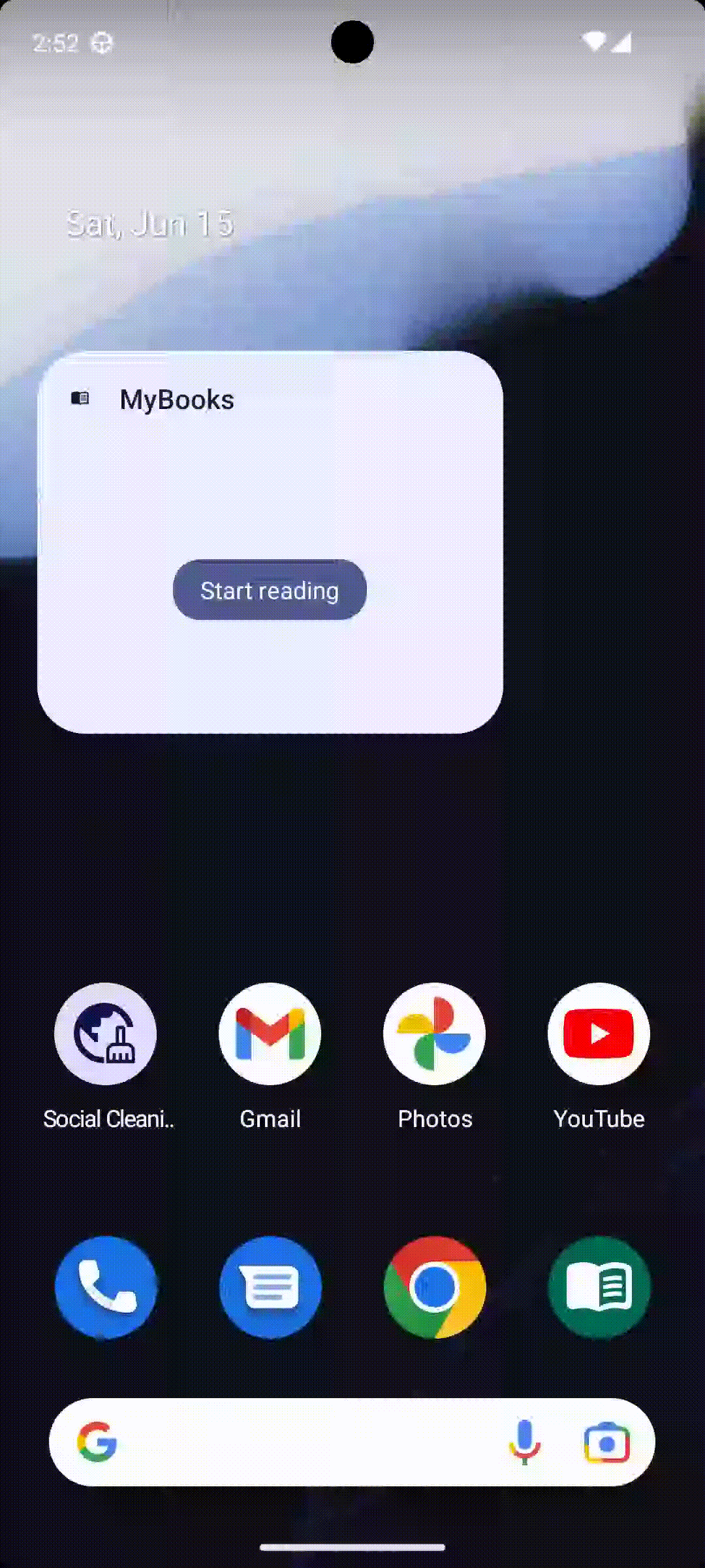
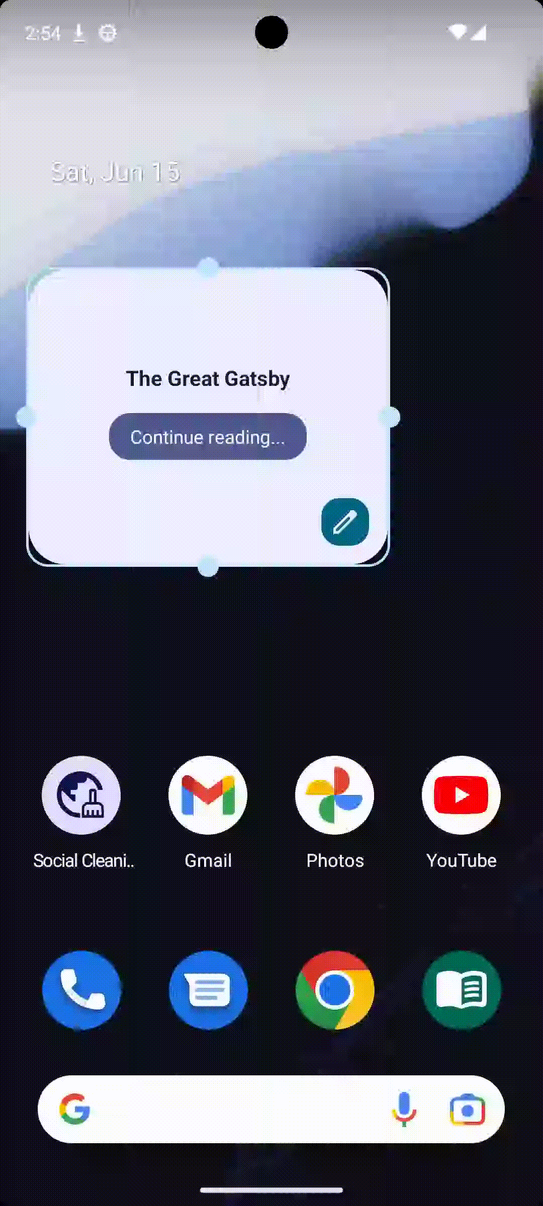
The BookState composable builds upon the foundation of ZeroState. It serves to display information about a book the user might be currently reading or has recently interacted with. Similar to ZeroState, the button is displayed only if there's sufficient vertical space. This ensures the layout remains balanced and avoids visual clutter.
@Composable
fun BookState(book: LibraryItem, onClick: Action) {
    val size = LocalSize.current
    if (size.width <= MyBooksAppWidget.ICON_SQUARE.width) {
        IconDimension(onClick)
    } else {
        Scaffold(
            backgroundColor = GlanceTheme.colors.widgetBackground,
            modifier = GlanceModifier.fillMaxSize().clickable(onClick)
        ) {
            Column(
                modifier = GlanceModifier.fillMaxSize()
                    .padding(bottom = 8.dp),
                verticalAlignment = Alignment.Vertical.CenterVertically,
                horizontalAlignment = Alignment.Horizontal.CenterHorizontally,
            ) {
                Text(
                    text = book.title,
                    style = TextStyle(
                        fontWeight = FontWeight.Bold,
                        fontSize = 16.sp,
                        color = (GlanceTheme.colors.onSurface),
                    ),
                )
                if (size.height >= MyBooksAppWidget.MEDIUM_SQUARE.height) {
                    Spacer(GlanceModifier.size(16.dp))
                    Button(
                        text = LocalContext.current.getString(R.string.widget_with_state_button),
                        onClick = onClick
                    )
                }

            }
        }
    }
}
Update the widget
While Glance manages widget updates based on the interval defined in the widget configuration (my_book_widget_info), there might be situations where you want to force an update immediately.
Glance provides a convenient method to achieve this manual update. We can simply call MyBooksAppWidget().updateAll(context) from within the app's logic. This method instructs Glance to update all instances of the widget on the user's home screen, reflecting the latest information.
Promote your widget
Creating a valuable Glance widget is just the first step. To ensure users discover and utilize your widget, it’s crucial to implement effective promotion strategies.
In my app, I’ve developed a widget that helps users resume reading their current book. However, there’s a high chance users might not actively browse the list of available widgets to find it.
For that reason we can define a function that promote our widgets in a specific point of our app.
fun promoteWidget(context: Context) {
    val appWidgetManager = AppWidgetManager.getInstance(context)
    val myProvider = ComponentName(context, MyBooksAppWidgetReceiver::class.java)
    if (appWidgetManager.isRequestPinAppWidgetSupported) {
        appWidgetManager.requestPinAppWidget(myProvider, null, null)
    }
}
If the device supports the requestPinAppWidget method and the user's system allows it, the code will trigger a system-provided bottom sheet. This bottom sheet will inform the user about your widget and offer them the option to add it directly to their home screen. This approach provides a seamless and user-friendly experience for widget discovery.
The result will be something like this:

Conclusions
This article has guided you through the process of creating a Glance widget. We’ve delved into the process of setting up the widget’s foundational structure, defining its layout for various scenarios, and understanding how to handle user interactions. Additionally, we’ve explored strategies for promoting your widget and encouraging user adoption.
Take this knowledge and start creating your own Glance widgets! Experiment with different functionalities and explore how they can benefit your app and your users. Remember, the key lies in providing value and a seamless user experience.
Feel free to share your comments, or if you prefer, you can reach out to me on LinkedIn.
Have a great day!

