
Jetpack Compose Interop Part 2: Using Compose in Traditional Android Views and Layouts with ComposeView
In Part 1 I demonstrated how we can use AndroidView to render traditional Views inside our Compose UI. For this part, we are now going to make newly created Compose UI components work inside traditional Views and Layouts with another special class, ComposeView.
Note: Just like in part 1, I am not going to deep dive into Jetpack Compose and I do assume you have some basic knowledge of how to use Compose. However, it should be fairly easy to follow along without knowing too much.
You are probably wondering why would anyone want to put Compose UI into older views. If you are using Compose, why not just use it everywhere 😅. However, just like Kotlin interop, having the ability to progressively adopt something new allows us to overcome the learning curve while remaining productive. We can keep our code consistent but start using Compose in projects sooner. So let’s look at how we can achieve this interop and provide some examples of why it may be useful.
ComposeView
Again, this is not a poorly formatted title, but another useful class that, this time, allows us to easily place Compose UI into traditional UI. ComposeView extends from View so it allows us to use it like any other View in Android with one major difference, we can add Compose UI components using a convenient setContent method.
Let's look at a quick example to demonstrate:
So here we are creating a new ComposeView and attaching it to a parent container, just like we might do with any View. We then use setContent to render Compose UI, and in this case, a simple Text composable. It’s as simple as that! We can even use the ComposeView in XML layouts too. So taking the same example, let's do that.
Our activity_main.xml now contains a ComposeView nested inside a LinearLayout. We use this to do the same as we did before, but instead of adding the ComposeView manually we grab the reference and call setContent to add our Text.
And there you go, we have our Compose UI being treated like a traditional View. This is a little messy though. Mixing the two like this is not great and what if we want to do something a bit more custom.
AbstractComposeView
As you start to adopt Jetpack Compose one thing you might not want to do is start flip-flopping between older UI and Compose UI in the same file (like we did in the example above). Doing it like that will start to blur lines between which bits are Compose and which are not as things get more complex. To solve this you might want to create a bit of abstraction to keep things cleaner and in general, hide what's going on under the hood. So let's take the same Text example above but use AbstractComposeView to create our own custom View that will wrap the Compose UI components.
And just like before, we can then use this either directly in code or in our layout file.
So now we have a custom MyComposeView component that under the hood is rendering Composable UI, which is pretty awesome!🤩 The benefit here is you will be able to write new UI in Compose and retrofit them to your older screens with a simple wrapper View allowing you to maintain consistency in your codebase, which is particularly useful when you can’t refactor all features and views at once.
Taking it a bit further
The problem with the example above is the Text has a hardcoded value. So let’s take the same example and provide the ability to set the text dynamically. I have not added an example to use attrs here but setting a value to the Statefrom an attribute value on initwill work in the same way.
In the new example, the MyComposeView now exposes a title field that we can use to update the text value whenever we want. I am not going to go into the details here, but just to note, the mutableStateOf function creates aStateobject that when its value is used inside Compose, it will automatically update the UI if the value changes. That’s exactly what we have done in the above example with text = titleText.value. Unlike LiveData you don’t need to explicitly observe and set values. Compose handles this for you.
We can now use our title setter wherever we want to update the title.
And there you go, we can now set the text for our custom AbstractComposeView without exposing anything from Jetpack Compose into our older Views and Layouts.
But that’s a little boring really. Let’s create something a bit more interesting.
Live TV Featured/Recent Channels
As part of our Live TV experience within Plex, we display a horizontal list of recently watched/Featured TV channels. The architecture around how we deliver and display dynamic lists like this within the app is a lot more complex than the example below but let's see if we can implement a basic version of this feature that creates a horizontal scrolling list of TV channels written in Compose but displayed as traditional View just like we did in the previous example.
First off let's define a ChannelCard composable and a Channel data class.
Our ChannelCard is a simple Card with rounded edges containing a single CoilImage. CoilImage is not part of the standard Compose toolkit and for anyone who is not aware, Coil is an image loading library for Android. We are using this simply to display the channel logo of each channel in the list. If you want to use CoilImage composable to load images in your projects you can find out more here.
The ChannelCardon its own is only going to display a single channel. So let's create a ChannelCardRow composable that will render them in a horizontal list.
From the above snippet, you can see our ChannelCardRow is a simple lazy horizontal list (row), that creates a ChannelCard for each channel.
Now that we have all our Compose components defined, let’s create our AbstractComposeView implementation that will allow us to display our horizontal list of channels as a traditional Android View.
As you can see, just like before we are using mutableStateOf for our list of Channel data. Our Content method override then displays aChannelCardRow connected to the State so that whenever we set the current channels we render them onto the UI.
Now for the final bit, let’s use our ChannelCardRow implementation of AbstractComposeView in our Activity and load in some channels from our ViewModel.
All wired up and 🥁…
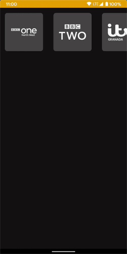
And there you go, we have a nice little reusable View that is using the just as reusable Compose UI components under the hood to display a horizontal list of TV Channels. And as you start to adopt more Compose in your app you can remove the traditional wrapper layers as and when they become obsolete.
Summary
The point of these blog posts was more to show what is possible for Compose interop. I can provide more details but hopefully, this and Part 1 provide enough detail to get you started and thinking about how you might adopt and interop Compose in your projects as things begin to stabilise. And just to recap:
- Use AndroidView to render traditional
Views in your Compose UI (Part 1). - Use ComposeView/AbstractComposeView to render Compose UI in traditional Android
Views and Layouts.

