
Jetpack Compose: Calculator UI
Cloned Android 10’s Calculator UI using Jetpack Compose, as it’s (surprisingly) one of the more complex UI structures.
Before I get into it — previously I also covered Twitter UI —so check that out as well:
Also recommend these:
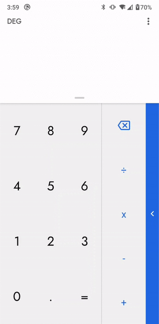
The Calculator UI
Note: I’m using Compose version 0.1.0-dev09 at the time of writing this.
Ok — so the thing that’s complex about the Calculator UI is that it has multiple draggable panels and overlays.
What it looks like:

The Code
You can get the source code here:
Starting with the top most level composable
The hierarchy goes like: MaterialTheme → WithConstraints → Content
MaterialTheme
It’s a high level component that sets the pre-defined colors and styling according to the Material design principles.
WithConstraints
For getting the available screen height and width — these constraints are later used for setting and defining anchors for draggable panels.
The Components
We got two draggable panels (the TopView and SideView). I’ll be focusing on these (as the rest of the app is pretty straight forward).

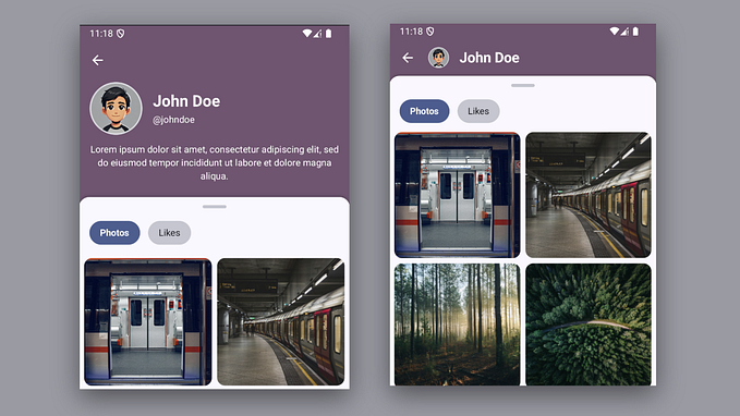
Side View
Let’s start with the side view. That’s the blue panel that slides from right to left. It’s either in collapsed state or expanded.
This is what it looks like when expanded:

This panel has drag and fling property. In order to add this slide behaviour — we have to use three things.
- AnimatedFloat
- FlingConfig
- Draggable Modifier
AnimatedFloat
For animating values between bounds. Inherits from BaseAnimatedValue.
FlingConfig
For adding fling — when drag ends, it figures out whether to fling to start or end given velocity. AnchorsFlingConfig is used for flinging between a predefined set of values (anchors).
Draggable Modifier
A modifier that adds drag to a single view. Used for when we want to drag a child component. It has these params:
dragDirection direction in which drag should be happening
onDragDeltaConsumptionRequested callback to be invoked when drag occurs. Users must update their state in this lambda and return amount of delta consumed
onDragStarted callback that will be invoked when drag has been started after touch slop has been passed, with starting position provided
onDragStopped callback that will be invoked when drag stops, with velocity provided
enabled whether or not drag is enabled
startDragImmediately when set to true, draggable will start dragging immediately and prevent other gesture detectors from reacting to "down" events (in order to block composed press-based gestures). This is intended to allow end users to "catch" an animating widget by pressing on it. It's useful to set it when value you're dragging is settling / animating.
I also used a helper model class for passing drag/fling information around.
Side View Drag

Specify min and max values (calculated pixel locations on screen) as the animated values and anchors for the fling. And then use this information in SideView composable like this:
In the composable — the drag position is retrieved, and horizontal offset is calculated. The flingConfig is used in onDragStopped callback.
And that’s it — the drag and fling works!
Top View
Similar to the side view — it’s also a draggable component, but from top to bottom.
Just like before — we calculate the min and max values as animated float values and anchors for the fling. And then use this information in TopView composable like this:
Used Card for elevation, and a custom scroller position so that the scroller stays scrolled to bottom when dragging.
Inside the Card composable, we simply have a column with a few components

As the drag position changes — I hide and shrink MainContent. That gives us the cool sliding down effect for HistoryList.
Overlays
I created a box component with background color, passing in the alpha value.
This overlay is placed on top of Numbers Panel — and the alpha is calculated based on drag. I used the Stack composable, so that it’s placed over the views.
This is how the numbers dim out as I slide out the Side View. Similar concept is used for the Top View overlay.
Limitations
There were some limitations as well (as Compose isn’t production-ready).
AdapterList: There wasn’t much control over scrolling state so I had to opt for VerticalScroller instead for showing history list.
TextField: No RTL mode & couldn’t disable soft input
Link to source:
Disclaimer: As the Jetpack Compose is in development phase — any of these APIs can change at any time. So as the source of truth, please always refer to the official documentation.
That’s it for now, thanks for reading — I’ll cover more of Compose as it becomes more stable and production-ready, so stay tuned.


