How to use Tabs in Jetpack Compose?

In this blog post we will explore how we can use Tabs in Jetpack Compose.
If you are interested in exploring other components in Jetpack Compose you can check out the series of articles that I have written.
Series Pit Stops
- How to make a Scrollable list in Jetpack Compose?
- Handling Clicks in Jetpack Compose
- Creating AppBars in Jetpack Compose
- How to use Tabs in Jetpack Compose? (You are here)
- Exploring Drawers in Jetpack Compose
- Exploring AdapterList in Jetpack Compose
- Animations in Jetpack Compose using Transition
Just like any other component, implementing tabs in Jetpack Compose is really easy and fun.
Let’s begin.
To implement tabs we will be using two components that are TabRow and Tab. Let’s have a look at the method signature of TabRow:
Here items represents the list of tabs that will be shown in the TabRow. selectedIndex as the name suggests is the index of the currently selected tab. scrollable is a parameter which tells if the list of tabs should be scrollable in the TabRow in case there are too many tabs, otherwise if it is false then all the tabs will appear to be compressed in the space provided. The following images will make things more clear.


indicatorContainer is the container used to animate the position of the indicator between tabs. You can provide your own implementation in case you don’t like the default implementation. The last parameter is the tab, this is where you define what kind of tab you want. Speaking of tab, there is a composable function by the same name which you can use here. Let’s have a look at it.
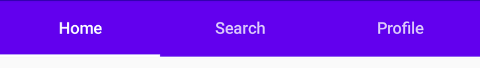
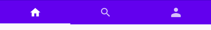
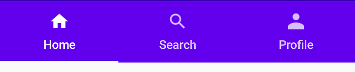
The parameters are kind of self explanatory it’s what happens inside that’s interesting. So if you want just text in your tabs, you can leave the icon parameter as null and from the when block you will get a TextTab. If you want to show just an icon in the tabs, you can leave the text parameter as null and you will get an IconTab from the when block. Then you even have the option of using both icon and text in the tabs and a CombinedTab is returned from the when block. The images below will help you to get a better idea of about these tabs.
The following code snippet shows how you can implement tabs.
The above example is pretty straight forward. We provide a list of titles for the tabs in TabRow and tell which tab should be selected by default. Then in the Tab component we are updating the currently selected tab. Instead of using a Tab component in the above code snippet, you can also use your own implementation.
An important point to notice here is that TabRow will create a row where Tab headings are displayed but to display stuff below the tab title, you need to write your own logic like it has been done in the above code snippet.
I personally really like how each component of a tab can be easily customised, bet it the tab indicator or the tab type, allowing us to quickly build our UI.
Jetpack Compose is still in developer preview, there will be breaking changes in the future so some of the things that I mentioned might change over time.
Thanks for reading! If you enjoyed this story, please click the 👏 button and share it to help others!
If you have any kind of feedback, feel free to connect with me on Twitter.

