How to master Swipeable and NestedScroll modifiers in Jetpack Compose
Material components are helpful, but sometimes the UI you want to build slightly varies from the platform’s default look, style or behavior.
In this case, the solution is to roll up your sleeves and build your own custom view. The good news is that if you’re using Compose in your project, creating a custom component is easy as it can reasonably get.
Let’s suppose you find yourself in the mood of re-implementing the popular bottom sheet view with some slight differences:
- When it expands, it expands to its full parent’s height — no matter its content’s height.
- It should host two composables: one representing a small header/toolbar and another the inner content.
- The inner content must always be scrollable, but the header should not.
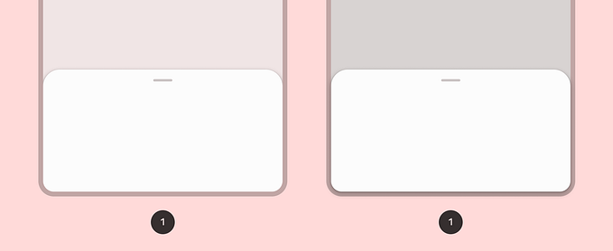
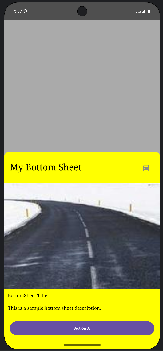
Here’s a preview of how it should look like.

How do we build this?
First, we want to create a composable that can be dragged between two states: Collapsed and Expanded.
With Compose, this is just a matter of using the proper modifiers and remembering the right states.
Let’s start creating a simple interface that comprises these two states.
Then let’s lay the layout’s foundation: a simple, composable function that gets in a header and a body.
The outer box doesn’t do much for now, but it’ll soon be the draggable core of the bottom sheet. Same as the box containing the body.
The swipeable modifier
To make this composable swipeable, we will apply two modifiers to the outer box: swipeable and offset.
The swipeable modifier provides your composable the superpower of being dragged up and down. It doesn’t perform any elaborate magic, and it just updates the offset value contained within the remembered swipeable state as the gesture goes.
When the gesture ends, it’ll fling toward the direction of the closer anchor point. These points are provided through a map that defines to which offset in pixels each state corresponds.
- The
Expandedstate is the natural composable state: no motion was applied, the sheet rests on a zero offset. - When the state is
Collapsedinstead, the offset should push the composable down to its entire length to make it disappear completely.
But as you might’ve noticed, to map the collapsed state correctly, we’d need to pass the full container’s height. Hence, you might be asking next: where can I fetch such a height in this abstract composable world?
BoxWithConstraints to the rescue
Luckily, BoxWithConstraints is the right composable to answer our last question.
Inside this composable’s scope, we can use BoxWithConstraintsScope to get the raw value of the container’s maximum height constraint. This value is computed during the measurement pass, and it triggers an independent sub-composition. This way, we can use a tangible, measured dimension to lay out the children of BoxWithConstraints.
Since the draggable box composable has no modifiers defining its height, the resulting maxHeight value is determined by the height of its children. Remember that Column containing the header and the body and the fillMaxHeight modifier applied to it?
That composable is going to decide how tall the bottom sheet will be.
The offset modifier
Finally, the offset modifier will provide motion to the composable.
We are only interested in vertical movements. Therefore, the offset we return here has a constant zero in the x, but its y value varies according to the gesture’s offset computed by the swipeable modifier.
Nested scrolling
If we run our app now, we would be presented with a nice draggable composable that hides and shows just like a bottom sheet worthy of its name.
There’s still a small catch, though. We wanted its body composable to always be vertically scrollable.
At this point, the simplest way to achieve this is to modify the Box containing the body composable, slam a verticalScroll modifier on it and call it a day.
If you run the application again, though, you will notice that things are no longer the same, and the scrollable body is now capturing all the gestures, leaving nothing for its parent.
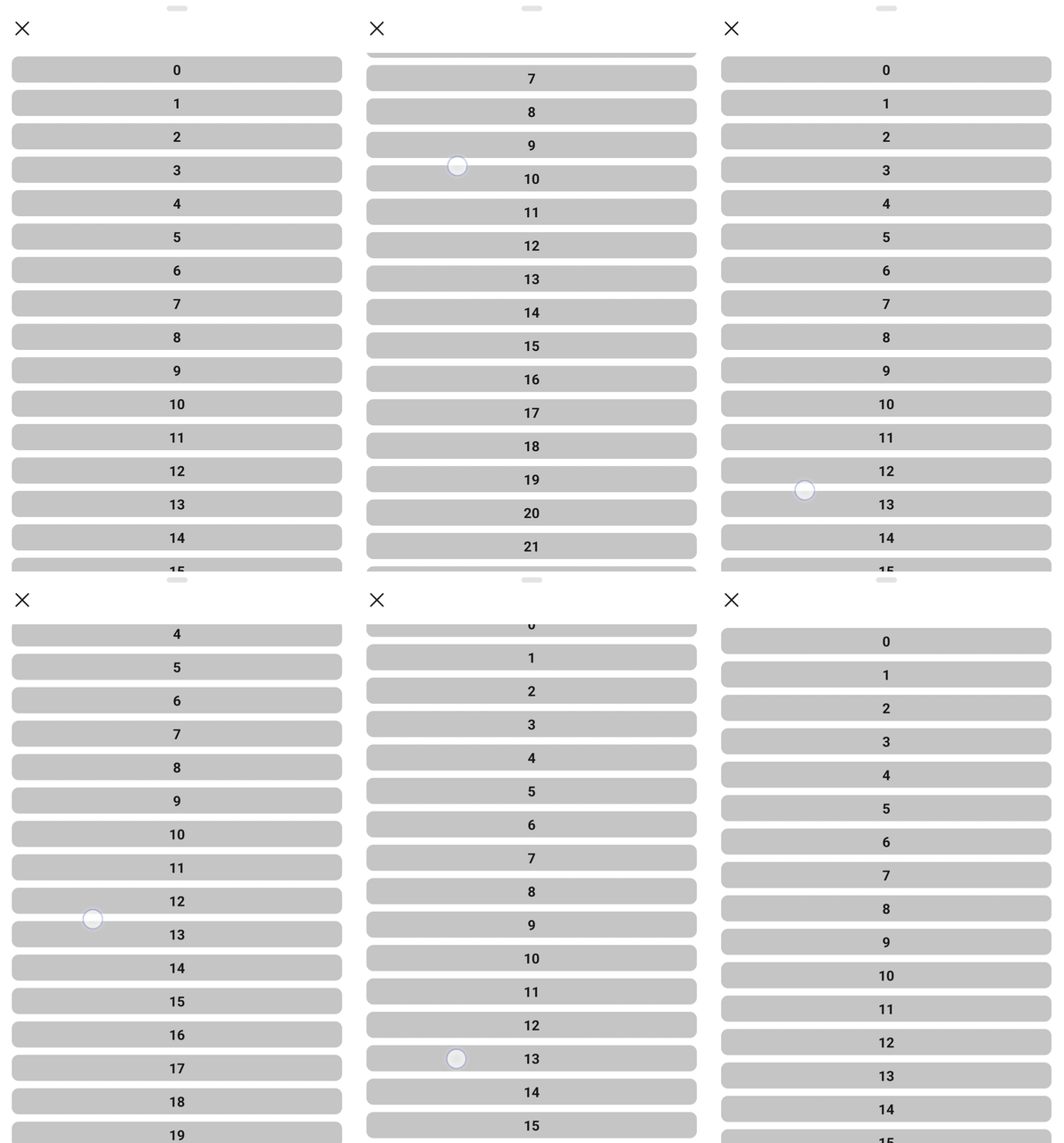
Even if this is a good moment to panic, we can still solve this situation by applying another modifier to the draggable composable: nestedScroll.
The nested scroll connection
This modifier is quite simple, and it only accepts an implementation of the interface NestedScrollConnection as a parameter.
As its name suggests, this interface provides a bridge between the scrollable children and their parent. It offers four callbacks, and we are interested in overriding them all.
Pre-scroll callback
This callback allows the parent to consume any amount of the dragging motion before the child’s scroll starts. The returned Offset’s instance, instead, represents the number of pixels that is left for the child to consume:
- If it’s zero, the child is free to consume the total available amount the parent entirely refused.
- If it’s not zero, the child could consume an amount equal to the difference between the
availableparameter and the returned value.
If we look again at the snippet above, we can distinguish two cases.
Delta is negative: we are moving the finger upwards. If the gesture goes in that direction, we’re scrolling either the draggable composable or the scrollable inner content. How to decide which one of these two should scroll or drag?
The best way to handle this case is to use a handy method of the swipeable state: performDrag.
This method will perform any drag if it’s possible and return the amount of dragged space. Here again, we have two cases:
- If the parent consumed some space,
performDragwould produce a non-zero result, preventing the child from scrolling — or just scrolling partially. - If the parent reaches its topmost anchor and doesn’t need to drag any longer, then
performDragwill return zero, passing down the remaining space for its child to use for its scrolling purposes.
Delta is positive: we are scrolling down. We can ignore this and pass all the consumable space down to the child (returning Offset.Zero). If it doesn’t need to scroll (for example, the inner list reached its top), this quantity will reappear in the onPostScroll, where the parent will get another chance to consume it.
Post-scroll callback
This callback is easy to implement. We do only one thing here: if the underlying list has finished scrolling, we are very interested in passing all the leftover space to performDrag that will drag if necessary.
Any quantity that the parent didn’t consume in preScroll and passed down before would appear here if the list didn’t use it.
Pre and post flings
These two callbacks work in the same way as pre and postScroll. The only difference is that the unit bouncing back and forth between the parent and its children is not space but velocity.
Note that in the onPreFling callback, we only want to transmit the motion to the parent when the scrollable child cannot scroll more.
It’s important to override these two methods too, as the swipeable modifier will always invoke a fling in the closer anchor’s direction when the finger lifts and the gesture finishes. If we leave these two methods blank, the bottom sheet won’t close or expand when the gesture ends.
Conclusion
And this is it. If you made your way until here, you would find yourself with a tiny and lovely bottom sheet-like composable ready to serve you well. And in the process, you learned something about swipeableand nestedScroll modifiers, that will enable you to implement interactive-rich UIs with really just a few lines of code.
Feel free to grab the entire implementation from this link, and copy and paste it within your favorite composable to try it out and experiment with it.
Thanks for reading!


