Hints in Compose

Sometimes our apps need to highlight some UI components, e.g. during the first login (onboarding), or when we added something new (“what’s new”).
In this article I will guide on building a custom solution to show hints / tooltips, pointing to a particular UI element in Compose (Compose Multiplatform and Jetpack Compose).
Layout hierarchy
To highlight a UI element firstly we should get through the main concept of “hints”.
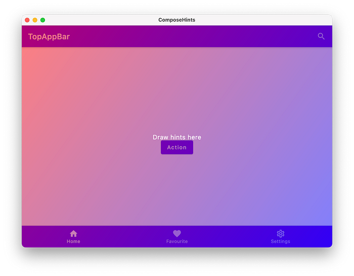
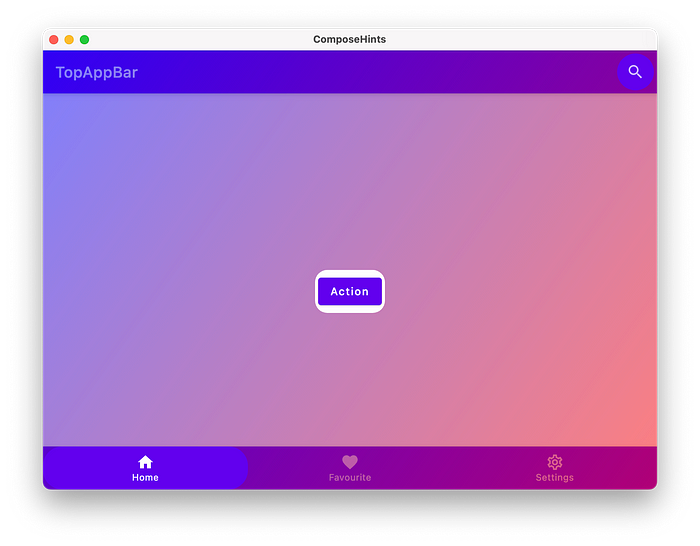
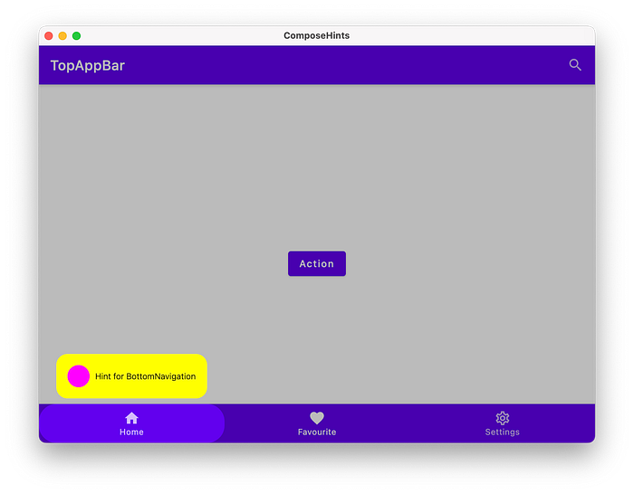
Let’s imagine we have an app with TopBar, BottomNavigation, and a primary action button. We want to highlight a TopBar’s action, the primary button, and an item from BottomNavigation.

For our “hints” we need to draw a dimmed background (also to to intercept touch events), calculate position of a highlighted UI elements, clip out (mask) our elements shape not to be dimmed, and finally draw a hint (e.g. text with background).
1. Dimmed background
To draw a dimmed background as overlay or popup on top of all content we might:
- Wrap all content of our app (root component) with a custom composable (e.g.
BoxwithModifier.background)
2. Use Dialog
By using Dialog we can show an overlay on top of all content (e.g. on Android the Dialog is shown in its own Window).
With Dialog the problem comes for scrimColor in Compose Multiplatform. We can’t configure from Compose common target the scrimColor, but each target (except for Android) provides an actual value for the scrimColor. As a possible solution, we can create an excepted class to provide DialogProperties and provide actual implementation for each target.
3. Use Popup
Popup looks more better here because it does not draw a scrimColor by default, and the overlay is shown on top of all content.
I would go with the 3nd approach not to force to use HintOverlay manually.
I also want to add support of Brush for the overlay background, not only Color.
I can set the Brush to override the overlay’s background by using CompositionLocalProvider.
2. Calculate anchor coordinates
To get coordinates of an UI element in Compose we can use OnGloballyPositionedModifier, which is called with the final LayoutCoordinates of the Layout when the global position of the content may have changed.
Usage example:
For our hints we need to create a state to hold coordinates and size of anchors, and introduce a Modifier to update the state:
So, we just subscribed to size and coordinates changes of a desired UI element to update the anchor’s state.
Now we need to apply this hintAnchor modifier to our content:
Note:
Modifierordering always matter in Compose, we set4.dpafterhintAnchorto have extra space around this button (the anchor’s size will be bigger by4.dpthat the actual button’s size).
The HintOverlay composable requires some changes to use the HintAnchorState to draw hints for this anchor.
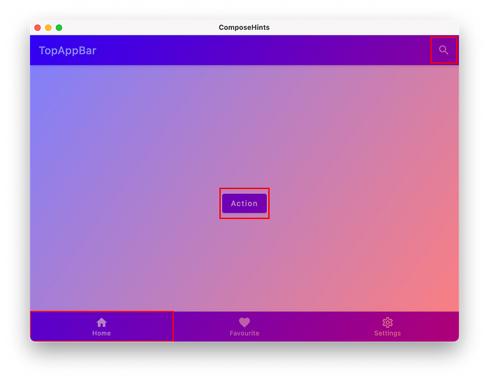
For now we just draw a red rectangle around out anchors.
But if we run on mobile, we get wrong numbers on Android.
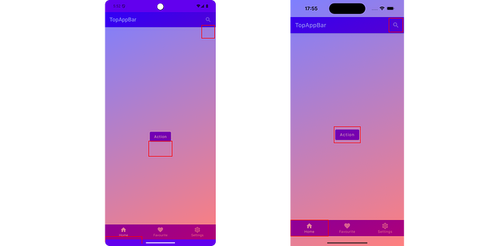
The issue is related to WindowInsets. Let’s substract these insets to fix it.
3. Clip out anchor’s shape
To clip our a shape we will use Path and PathOperation.
Modify the hintAnchor Modifier to accept Shape, which will be used to set a desired shape around anchors.
Based on the provided Shape we can create anOutline which will be used to clip the anchor’s shape out of the background.
Let’s pass CircleShape and RoundedCornerShape to see how the hints look now.
At this point we know how to draw a background overlay, calculate positions of our anchors, and how to clip out the background.
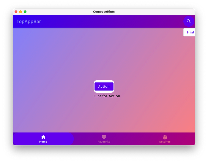
4. Draw hints
Before the actual drawing we should define what information hints need to present.
Not to force providing only a text, let’s go with “slot” approach. By defining a “slot” we allow to use any desired composable.
I will introduce a new class Hint to hold our Composable content.
And will add this Hint to be part of HintAnchorState.
Inside HintOverlay we might go with the simplest solution — BoxWithConstrains.
Modify the app content.
The result will be following.
Let’s introduce an app specific code to draw backgrounds for out hints.
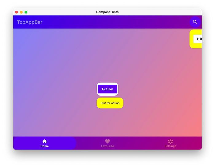
We got 2 issues:
- Horizontal alignment, the hint should be center align to its anchor.
- Hint for BottomNavigation is out of the screen.
Let’s switch to a custom layout instead and fix those issues there.
To measure and layout multiple composables, use the Layout composable. This composable allows us to measure and lay out children manually. All higher-level layouts like Column and Row are built with the Layout composable.
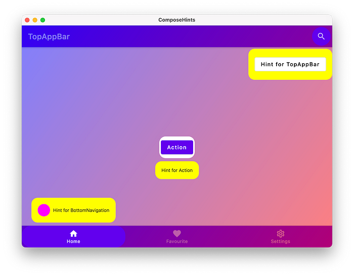
Because we allowed to pass any composable to be as a hint, the caller has all control on how the hints will look like, e.g. we can use just Text, or a complex Row with many children.
5. How to control hints?
We statically added our hints to show them on the screen. But it’s not the case for production apps. Let’s introduce HintController to control when we want to show the hints.
Modify the app content to show hints when we click on anchors.
Note: we no longed need to
HintOverlay, it becomesinternalnow.
Now we can show hints one by one, but there are 2 missings parts: how to dismiss hints, and how to override the overlay color.
Make changes to HintController to allow passing the overlay color.
To allow dismissing our hints let’s introduce following changes.
We used Popup as a container for our overlay, and the Popup can be dismissed if users click back button on Android.
Now the HintController allows us to show one hint by time, but there is no actual queue in case we want to show many hints sequentially.
Extend the HintController and add suspend modifier to know when a hint was shown (e.g. do something right after it’s shown).
Now to show a hint inside app we need to have a CoroutineScope.
Note: if we dismiss a hint by calling
hintController.dismiss(), code afterhintController.showwill not be called.
coroutineScope.launch {
    hintController.show(topAppBarActionHintAnchor)
    // Snackbar will not be shown if the
    // previous hint was dismissed by calling hintController.dismiss
    scaffoldState.snackbarHostState.showSnackbar("One hint was shown")
}
The final result is following: we can show a single hint, and we can show a list of hints.
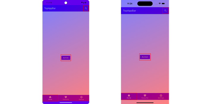
Since the project is using Compose Multiplatform, we can run the app for different targets.
Summary
Compose and Kotlin Multiplatform is a powerful combination which allows us to use Kotlin for UI and for business logic. CMP libraries are fully compatible with Jetpack Compose Android projects only.
Check out my library on GitHub:
Thank you for reading, looking forward to getting your stars on GitHub :)

