
Fun with the circle shape in Compose
I noticed that Facebook is using a horizontal list view with circled-shaped items to showcase the mutual friends of a user. Inspired by this, I aim to craft a similarly sleek interface using Jetpack Compose. 🥷🏻
Let’s begin.
We would LazyRow as the container, for the items we need two shapes one with a circular shape and a clipped circular shape. While the CircularShape class is readily available, a custom-clipped circular view must be crafted 😃.
Therefore, my strategy involves crafting a clipped circular shape and applying the clip modifier to achieve a trimmed view like the way we are using the CircularShape.
Modifier
    .size(200.dp)
    .clip(CircleShape)

or

Modifier
    .size(200.dp)
    .graphicsLayer {
         clip = true
         shape = CircleShape
    }
To create that, we have to extend the Shape class and return a simple shape, used for bounding graphical regions as Outline.
class ClippedCircleShapeTest : Shape {

    override fun createOutline(
        size: Size,
        layoutDirection: LayoutDirection,
        density: Density
    ): Outline {

      //...Here we have to specify the shape

    }
}
Here, I am using Ourline.Generic because we have to clip paths to create the clipped circular view.
        return Outline.Generic(
            Path().apply {
                addRoundRect(
                    roundRect = RoundRect(
                        rect = size.toRect(),
                        radiusX = size.height / 2f,
                        radiusY = size.height / 2f
                    )
                )
            }
        )
Now, we will get a circle shape like this,

Having successfully completed the initial phase, our focus now shifts to understanding how to clip a portion of a circle. If you are familiar with image editing tools you could have seen how they are doing it. Yes, they will create another view and clip it 😀. We are going to follow the same process. Let’s start to create another circle and combine it.
        val circleOne = Path().apply {
            addRoundRect(
                roundRect = RoundRect(
                    rect = size.toRect(),
                    radiusX = size.height / 2f,
                    radiusY = size.height / 2f
                )
            )
        }
        val circleTwo = Path().apply {
            val rect = Rect(
                offset = Offset(
                    x = -size.width + (size.width * .15F),
                    y = Offset.Zero.y
                ),
                size = Size(
                    width = Offset.Zero.x + size.width,
                    height = Offset.Zero.y + size.height
                )
            )
            addRoundRect(
                roundRect = RoundRect(
                    rect = rect,
                    radiusX = size.height / 2f,
                    radiusY = size.height / 2f
                )
            )
        }

        return Outline.Generic(
            Path.combine(path1 = circleOne, path2 = circleTwo, operation = PathOperation.Uniion)
        )
Here, I have created two circles and specified the x, and y axis to render them perfectly.
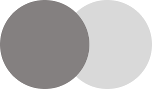
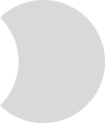
Right now, I am using PathOperation.Union to render this view if we change that to PathOperation.Difference.
🎉Tada…. 😍.
Sample Code
class ClippedCircleShapeTest : Shape {

    override fun createOutline(
        size: Size,
        layoutDirection: LayoutDirection,
        density: Density
    ): Outline {

        val circleOne = Path().apply {
            addRoundRect(
                roundRect = RoundRect(
                    rect = size.toRect(),
                    radiusX = size.height / 2f,
                    radiusY = size.height / 2f
                )
            )
        }
        val circleTwo = Path().apply {
            val rect = Rect(
                offset = Offset(
                    x = -size.width + (size.width * .15F),
                    y = Offset.Zero.y
                ),
                size = Size(
                    width = Offset.Zero.x + size.width,
                    height = Offset.Zero.y + size.height
                )
            )
            addRoundRect(
                roundRect = RoundRect(
                    rect = rect,
                    radiusX = size.height / 2f,
                    radiusY = size.height / 2f
                )
            )
        }

        return Outline.Generic(
            Path.combine(path1 = circleOne, path2 = circleTwo, operation = PathOperation.Difference)
        )
    }
}

@Preview
@Composable
private fun ClippedCircleShapeTestPreview(
) {
    Box(
        Modifier
            .defaultMinSize(
                minWidth = 60.dp,
                minHeight = 60.dp
            )
            .background(Color.Gray, shape = ClippedCircleShapeTest())
            .clip(ClippedCircleShapeTest()),
        contentAlignment = Alignment.Center
    ) {

    }
}
You can find the complete code here

