
First steps in Jetpack Compose, Part 1 — the power of @Preview
My journey through the future of Android UIs
One of the first things that every new Android developer learns is how to create a simple user interface. We’ve all been there, reading about all the XML files needed to build a UI — the layout, strings, dimensions, styles… Then we were taught how to use those in our Activities and Fragments. Android UIs have been built like that since the first versions of the OS - until Google announced Jetpack Compose in 2019.
Compose is a paradigm shift in the way we build UIs, that promotes a programming model which is quite a bit different from the current one.
With the introduction of Compose 1.0.0-alpha01 I decided it’s time to dive-in and learn what’s it all about. In a series of articles, I’ll be documenting my journey exploring the different aspects and tools that Compose offers. In all code samples, I’m using the latest Android Studio Canary release 4.2 Canary 11 (at the time of writing) and Jetpack Compose 1.0.0-alpha03.
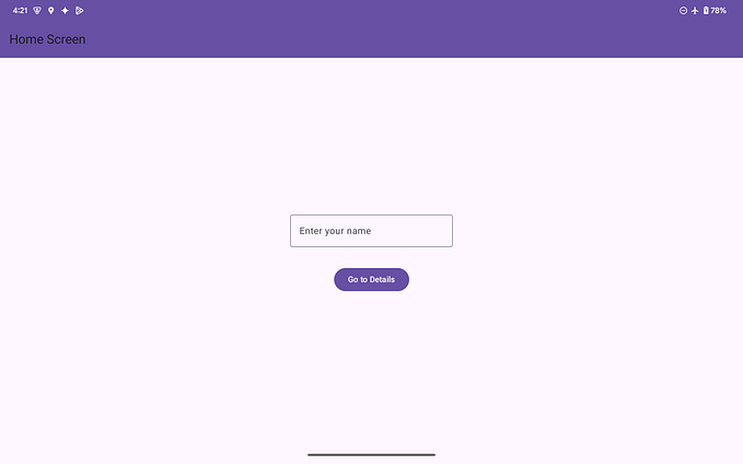
In the past few years, the Android Studio team has put a lot of effort into making the layout editor and preview accurate, performant and easy to use. It’s very convenient to be able to preview your UI without having to run the app. So that’s one of the first things I decided to look into Compose — how to preview the UI that I’m building! In most examples in this post I’m using the following Composable function that displays a Text (think of it as the equivalent of TextView):
Basics
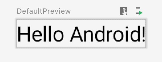
If you want to see how your Composable will look like, create a function with no arguments and annotate it with @Preview, like so:
After every change to a composable function, you have to rebuild the project to see its preview:
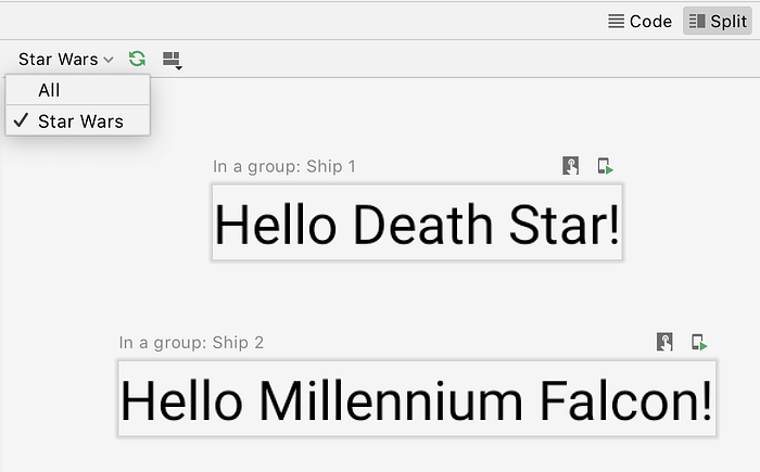
Name & Group
Notice the “DefaultPreview” label in the screenshot above? You can customize it by providing a name argument to the Preview annotation. And if you have multiple Composable functions annotated with Preview, you can put them into different groups and tell Android Studio to display any or all of those groups:
Background
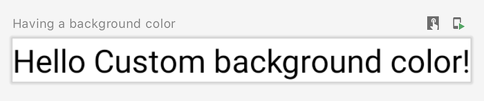
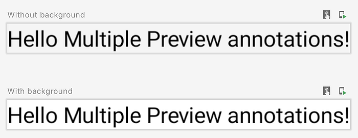
The Greeting composable doesn’t define any background on its own, but you can add one to the preview by setting showBackground = true in the Preview annotation. There’s also backgroundColor argument, but right now it doesn’t work:
Width & Height
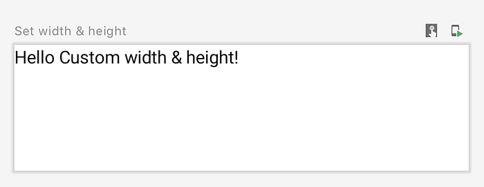
So far Android Studio showed the Greeting composable in a wrap_content-style size (see the dark-gray border around each preview — that’s the border of the composable). What’s cool though, is that you can change the preview size without making any changes to your composable! Just pass your desired widthDp and heightDp and rebuild (right now both parameters expect an Int as value, but there are plans to change it to Dp in the future).
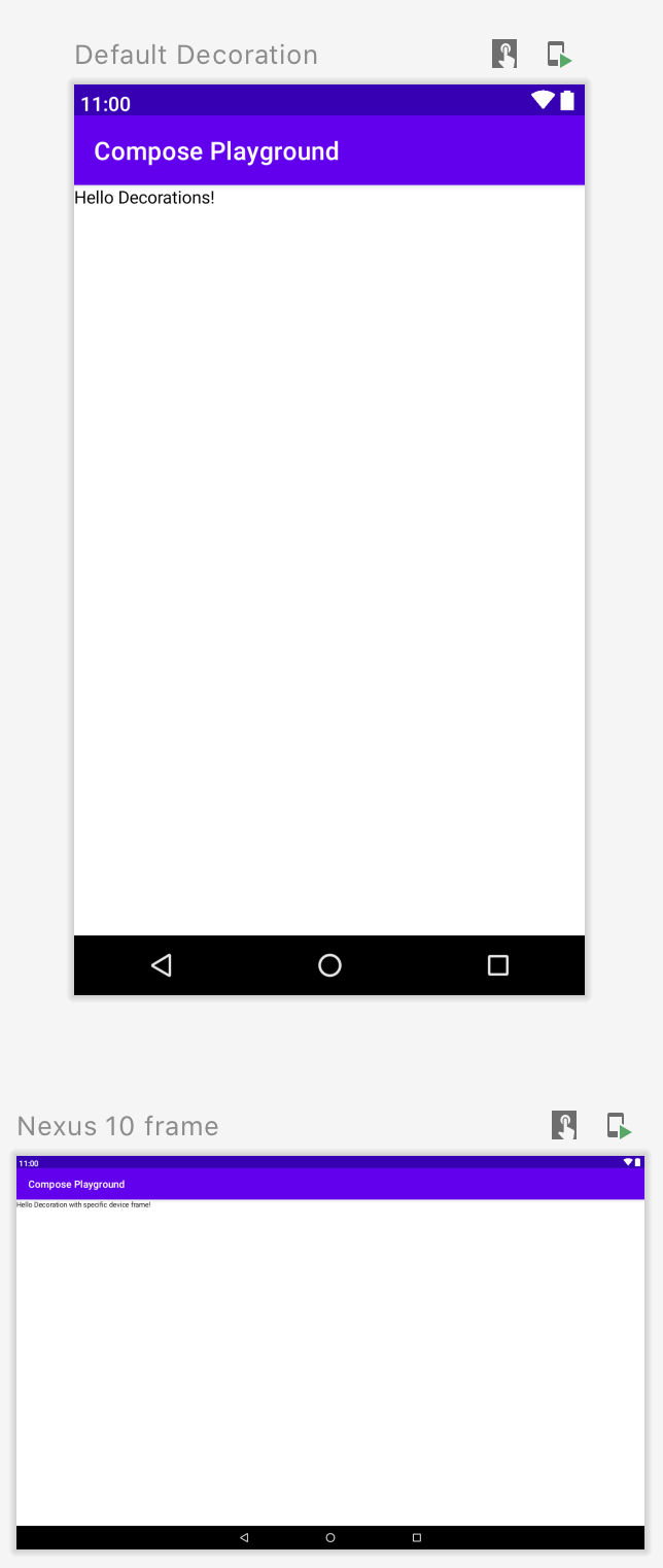
Decoration
Going even further, you have the ability to preview a composable function in a dummy screen (with a status bar, Toolbar and navigation menu). Just set showDecoration = true and you are ready. You can also change the device frame used — e.g. device = Devices.NEXUS_10 , but bare in mind that the list of devices is limited to Pixel and Nexus phones & tablets (starting from Nexus 5).
Add multiple @Preview annotations to a Composable
Something that’s worth mentioning is that you don’t have to create multiple functions annotated with @Preview if the only differences are the arguments passed to the annotation. You can add multiple @Preview annotations to the same composable functions and Android Studio will generate a separate preview for each one!
There are a few more arguments to Preview annotation that I won’t go into much details:
apiLevel— API level to be used when rendering the Composablelocale— desired locale, useful if your @Composable references locale-specific resources.fontScale— user preference for the scaling factor for fonts, relative to the base density scalinguiMode— bit mask of the ui mode as per Configuration.uiMode
Advanced use cases
I’ve explored the basics of @Preview annotation and the different customization options that it offers. In many cases they are more than enough. But what if your Composable has few input parameters and you’d like to see how it looks like with different values passed to those parameters?
@Preview-annotated composable function with an input parameter
In the examples so far the value for name parameter in the Greeting composable was always hardcoded. Let’s change this now and instead, pass the name as an argument to the @Preview-annotated method.
But now Android Studio will show an error:
Composable functions with non-default parameters are not supported in Preview unless they are annotated with @PreviewParameter.
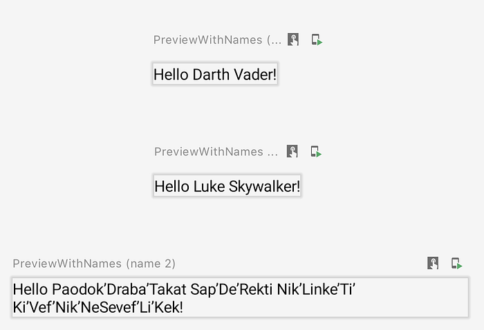
A-ha! The error message gives us a hint to the solution — using the @PreviewParameter annotation. But applying it to the parameter is not enough, though. First, you have to create a class that implements PreviewParameterProvider interface and provides the values to be passed as input to your @Preview-annotated composable. So let’s create one:
I’m overriding the values property of the interface, returning a sequence of names to be passed as arguments to the PreviewWithNames function. Now I can apply @PreviewParameter annotation to my composable’s parameter, specifying the class that’s going to provide the input values. This is the complete implementation:
The above code will result in the following 3 previews:
What about multiple input parameters?
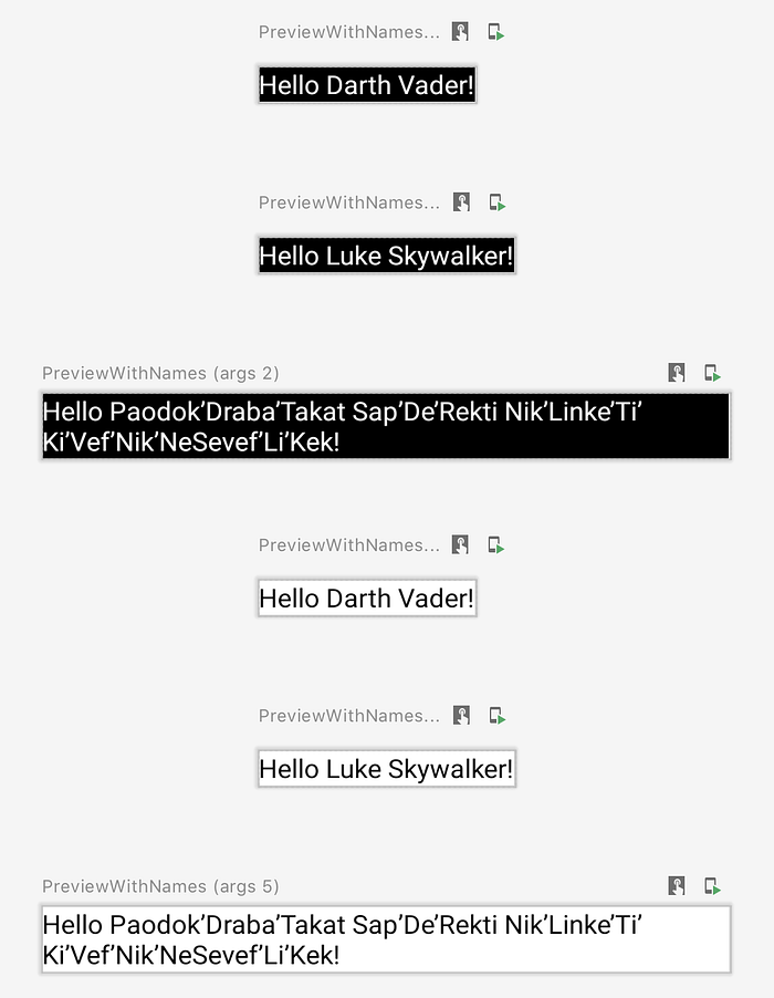
The above approach works great, but with only 1 input parameter, as@PreviewParameter can be applied to only 1 argument. What if you want to see your composable, iterating over multiple parameters? Let’s say I want to see my Greeting composable with the 3 names, both — in light and dark theme.
Option 1: Use a wrapper class for the parameters
One solution would be to create a class that holds the 2 parameters and pass it as an input to the composable. This seems to be the most obvious approach and works great! The downside is that you have to create a new class and a PreviewParameterProvider for it. Here’s a sample implementation of this (I’m using 2 new composables here -ComposePlaygroundTheme and Surface . The first one provides a Material Design implementation and helps in switching between light and dark theme. The second one represents a Material Design surface and takes care of clipping, elevation, background, borders, etc.):
Option 2: Combine multiple PreviewParameterProviders into one
If you already have PreviewParameterProvider for each of the input parameters, you can create a class that “combines” several parameter providers into one. Once having this generic “combiner”, you can use it anywhere, without having to create so many additional classes. I came across this idea in “What’s new in Compose Design Tools” video by Diego Perez. It’s a great video showing some of the things I’ve covered in this post. I strongly encourage you to watch it!
So let’s start by creating a generic “combiner” parameter provider that will merge 2 providers into 1.
It iterates over the values of the 2 parameter providers that will be merged and creates a Pair object out for each value combination. Having this generic class, you can easily reuse it throughout an application. Now, let’s create a DarkThemePreviewParamProvider and tie everything together — the “combiner”, the 2 parameter providers for name and isDarkTheme and the composable:
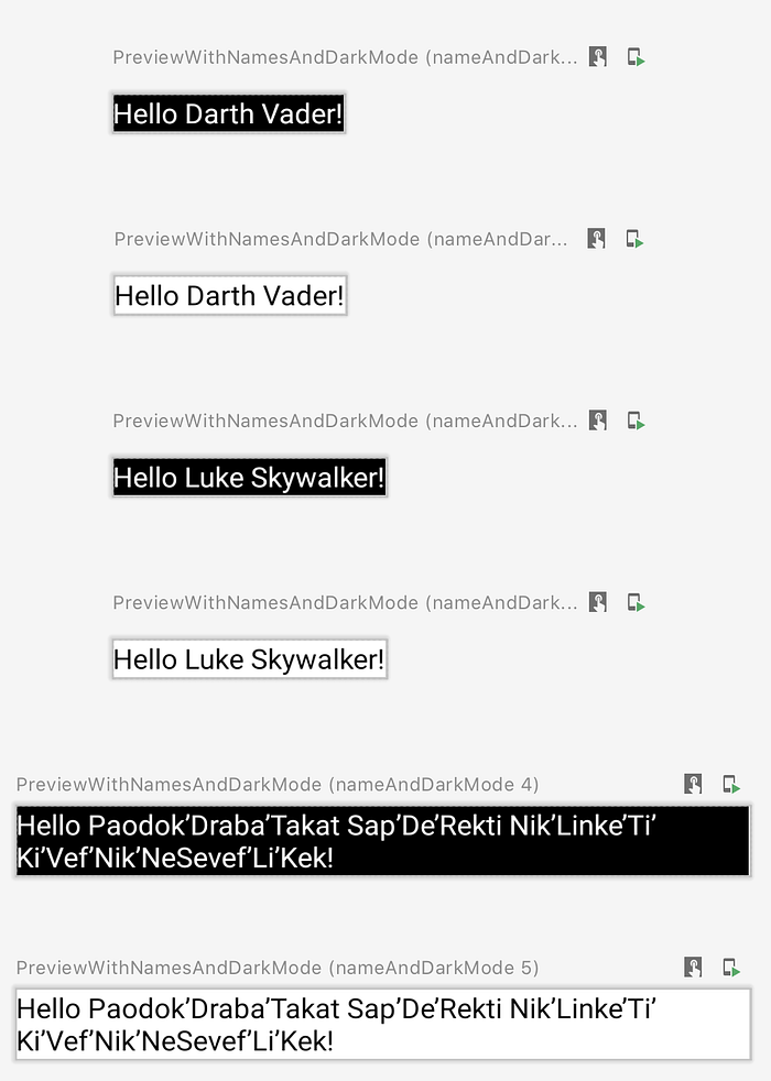
This is the result — with just a few lines of code you can generate many variations of a Composable function:
Interactive Previews
Probably you’ve noticed the 2 small icons in the upper right corner above each preview. They are used when you want to interact with your previews.
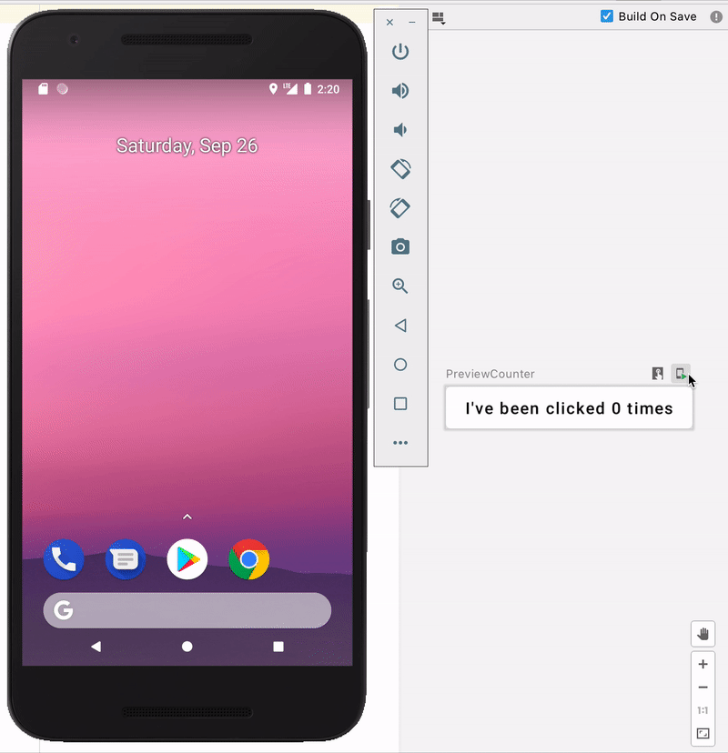
For the sake of demonstrating these, I’ll use another example — a composable Button that shows the number of times it has been clicked and changes its background color if it was clicked more than 5 times. I won’t be going into details explaining the actual implementation as this is subject of another post.
Running a Preview on an emulator or real device

The right icon, with the phone and the little green “play” icon will install and run (on an emulator or real device) the preview in a dummy Activity. In that way it’s super easy to play around and test the behaviour of your Composable, without having to navigate to a particular screen of your application. It’s something like Instant Run / Apply Changes. Upon clicking the “Deploy Preview” button, Android Studio will build and install your project/composable.
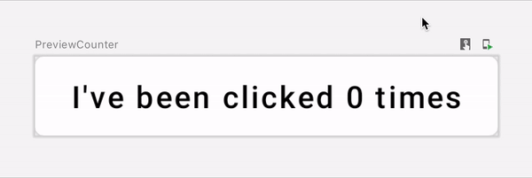
Running a Preview within Android Studio

The left icon, with the square and the hand, will build and run the preview directly in Android Studio. It’s completely interactive, with proper composable state updates etc.
Final thoughts
Although Jetpack Compose is still in early Alpha, I’m pleasantly surprised that the team took the time and added all these great capabilities for previewing a composable. The preview is not perfect yet — there were cases where after a new release the preview was completely non-functioning, sometimes pressed state is not properly visualized in interactive preview, or it takes way too long for Android Studio to show all the previews (when you have more than a few). But the team is constantly working on fixing existing bugs and improving the performance of preview/Android Studio. So far I’m really impressed with all the capabilities we have at hand and how much flexible it is.
This is Part 1 of my “First steps in Jetpack Compose” series. In Part 2 I plan on exploring some of the commonly used Android Views and their alternatives in Jetpack Compose
Useful links
- Official Jetpack Compose samples Github repository
- Jetpack Compose Pathway — Google’s guide to first steps in Compose
- Official Kotlinlang Slack — there’s a #compose channel where people from the community and Google employees (working on Compose) answer all kinds of questions
- Leland Richardson’s YouTube channel — Leland is one of the people working on the Compose compiler. He’s doing coding live streams, writing Compose screens and answers all kinds of questions. I highly recommend it! It’s also available on Twitch.


