Motional Intelligence for Global Persistent UI on Android with a Simple State Store

Android Q’s debut draws nearer, and with it, the cries and echoes of multiple Android Developer Advocates stressing by way of numerous talks and blog posts that we really ought to embrace edge to edge UIs for our Android apps. Going edge to edge is only step one however; the fruition of that initial step only comes to bear fully if delightful animations and transitions accompany navigation from destination to destination within the app.
At Google IO ’19, Nick Butcher spoke about the concept of Motional Intelligence, and how it can be used to build smarter animations. This post is an interpretation of that, but specifically to UI elements that are persistent, only differing slightly from navigation destination to the next. This allows for these pieces of UI to appear like they are morphing in direct response to the user’s actions which in combination with edge to edge UI provides for a UX that is not only cohesive, but delightful to use, giving Material Design a fantastic platform to truly shine. Examples of these persistent UI items include Toolbars and Floating Action Buttons.
To start, let’s define what the global persistent UI State object is. It should summarize what the user can see on the UI at any given point in time and what the screen can do.
From that class definition, every nav destination has:
- A toolbar that can either be visible or invisible. It displays a title, and has menu items defined by a menu resource
Int. - The same as above for an alternate toolbar. This alternate toolbar is used for context menus, for example when items on the screen are selected. It’s a custom implementation of Android’s ContextMenu
- A Floating Action Button that can be visible or invisible, with resources for its text and icon. It also carries a nullable reference for the click listener for when it’s tapped.
Next, we’ll need to attach listeners to actually drive animations when any of the fields in the state changes. These animations can be fairly expensive, so care needs to be taken to make sure that a listener is only fired when its field actually changes. only fires if a single field has changed and either fires if either of the referenced fields have changed.
In the above, the respective consumers are only invoked when the pertinent slice of UiState changes.
It’s quite convenient for the current nav destination to be its own source of truth for the current UiState. We can define a BaseFragment that maps to each of the UI fields like this:
Finally, since the activity’s content view is the host of the persistent UI elements, it holds the reference to the current UiState object, feeds the input that mutates each UiState transition, and defines the listeners that drive the animations when a new screen appears.
To cause animations to run when the destination changes, a FragmentLifeCycleCallback can be attached to the activity’s FragmentManager and the State updated in the onFragmentViewCreated callback.
If the UiState needs to be updated outside of navigation, the property getters in the BaseFragment can be hooked into reactive values in a ViewModel, say an instance of LiveData that should reflect what the current value of each slice of UiState should be at any given time. Additional hooks can then be written to notify the Activity that it should update itself again with the current fragment. This can be easily done with an Activity scoped ViewModel.
The toggle methods that hide and show the toolbars and FAB, are variations of the following snippet, depending on the direction the View needs to move in.
From the above, all animations are driven by ViewPropertyAnimators, which animate from the View’s current properties satisfying the 3 tenets of good animation defined in Nick’s talk above to an acceptable degree:
- Reentrant: If the state changes while an animation is going on, the current running animation changes direction smoothly.
- Continuous: There are no stops or stutters, because navigation transitions the whole screen; everything moves in sync with navigation changes.
- Smooth: … to a certain degree. There are things that could be better, for example the hiding and showing the Toolbar and floating action buttons could uses a Physics based transition system to make things more natural, rather than just
ValuePropertyAnimators. However since the range of motion for both items are relatively short, things look okay as is.
Setting things in motion, we can achieve the following effects:


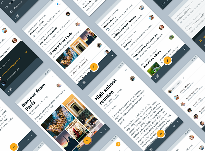
In the examples above, because there is a single instance of a Toolbar and FAB in the entire app, navigation changes appear clean and smooth. There is no flickering of common UI elements from screen to screen, because all screens share the exact same instance. Also because the properties of these common elements are mutated by a single object, the MainActivity, there is no duplication of animations and no stuttering. There is a strong feeling of cohesion, as pieces of material just comes in and go out when needed.
The above is one of the significant benefits of single Activity Android apps. Shared Element Transitions, UI animations can all be defined and controlled by a single entity: the Activity. Full source for all apps shown above can be found below:
To close, smooth navigation transitions in Android can be achieved with a simple class definition, provided that there is a single driver of global persistent UI, and it uses animators that adhere to the tenets of Motional Intelligence.

