Dot. Dash. Design
Mastering Lines in Jetpack Compose with PathEffect

Often when creating a UI in Jetpack Compose we need to draw lines. Sometimes as dividers to break up some space or aesthetically as part of more complex shapes or designs. We don’t always want them just to be a straight unbroken line either, using dots or dashes may give a less harsh effect than a unbroken line would and using fun shapes or styled line endings can give design refinement.
If you want your lines to show a morse code of dots and dashes then read on to decode the secrets of styling lines!
The Basics.
Just to make sure we’re on the same page, here is how to draw a basic line in Jetpack Compose:
Here, the line is horizontal, is inside a canvas and has a start and end Offset. The strokeWidth is set to a pixel value (in my case, converted from dp) and we can set a colour. You can apply more interesting colour effects using a version that takes a Brush instead of a solid colour.

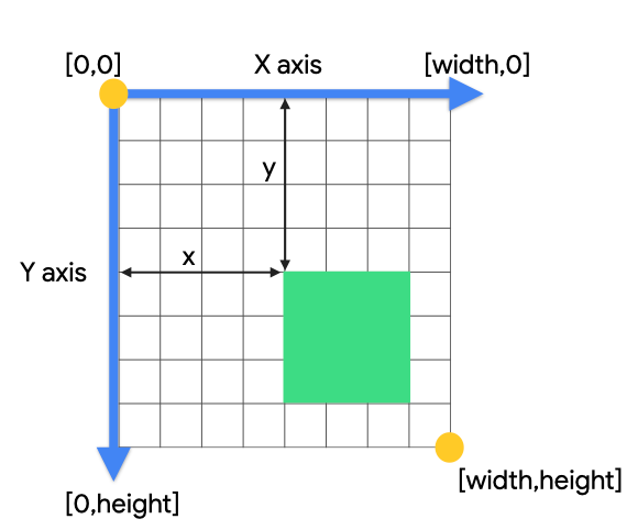
The endpoint coordinates start from (0,0) in the top left and bottom right is the canvas (width,height) point.
For a basic primer on how to drawing in Canvas works in Jetpack Compose and DrawScope, you can check out the official documentation.
Now that we have a line, how can we make it a little more polished?
Stroke caps
The first thing we can do is apply a more refined stroke cap to the line.
Our options here are StrokeCap.Butt, the default, no extension, just square ends, StrokeCap.Rounded which extends the line with a semicircle and StrokeCap.Square which also extends with a square shape (which looks the same as Butt but for the extension.

StrokeCap.Butt: black line, StrokeCap.Rounded: red line & StrokeCap.Square: blue lineIt is important to note that these extensions will go outside of the Canvas bounds, in the image above you can see that the red & blue lines are longer than the black line even though their Canvas composables are the same size.
These stroke caps can be applied using the cap argument on the line:
Let’s go for something a bit more dashing…
Now the basics are under control, now we can make use of PathEffect to make the lines more interesting.

Here, we can a dashPathEffect which allows you to specify the amount of time to dash on (show the line) and dash off (don’t show the line). You can set these intervals however you like. They also use pixel values so it is good to use with(LocalDensity.current) to convert dp into px to account for the specific device screen density.
You may notice the phase value, this indicates where the line should start drawing from, zero will start with drawing the first dash on, other values will allow you to start at different points.
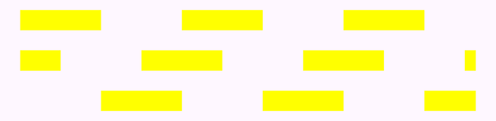
Morse code
Here is where we can get a bit more complex with dashes by adding more intervals to the dashPathEffect:
Giving a nice interesting line:

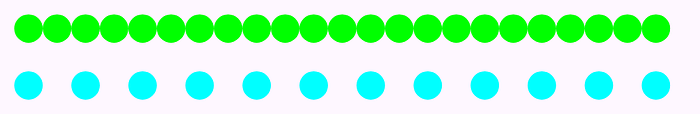
Stamping time
What if you don’t want your line to be made up of other lines? Instead we can stamp a specific shape along the line using stampedPathEffect. Here, we construct the shape desired, and set up the spacing between shapes (the advance, using a phase as before and a StampedPathEffectStyle:
With a circle shape to stamp we have a line of circular dots!
StampedPathEffectStyle.Translate will just move along the line and keep displaying the shape the same way up it was defined. The other types of StampedPathEffectStyle we’ll get to later, they don’t really apply when we’re looking at a straight line.
For something a bit more fancy, just make the shape fancy:

Zig Zags? Waves?
So how might we go about making this kind of line:

So you could just create a path, and have a loop that calculates and draws all the zig zags as points or, just create this path shape once, then stamp this path as we have done above.
In the first attempt, we create the shape and stamp the shape along the line (using an advance of the same width as the entire shape
This gives an unexpected (although not unpleasing) result:

Usually, if we were drawing this as a path, we could just use drawPath with a style of DrawStyle.Stroke and we would have zig zags as lines. But because we are using this as a shape, it is automatically filled. To fix this, we need to close the path:
Putting this into the line we get:

So you may notice here that the actual line is drawn from point (0,0) so all the zig zag shape hangs below and extends from the end of the actual line. This can be more easily seen if we also add in the straight line path:

If you are after precision, you can add a translation to your path using translate with an Offset so the path is drawn exactly over the desired line:
Giving the desired result:

The full code for the zig zag line:
Of course, not just straight lines!
Now we have mastered drawing straight lines! What if you want to put this into a shape? Well then just use drawRect or drawCircle or drawPath to get the shape you want:
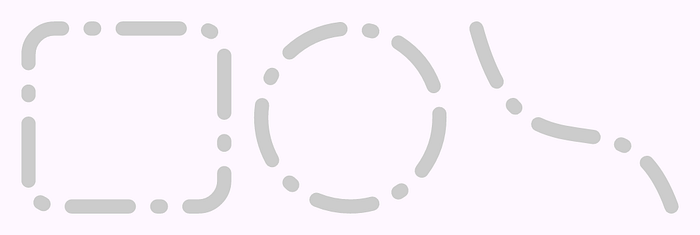
What happens at the corners?
I mentioned earlier about StampedPathEffectStyle, this is useful for when you are not just drawing straight lines. This tells the stamped path what to do as the line changes direction.
For example, we can see the different styles using the heart path:
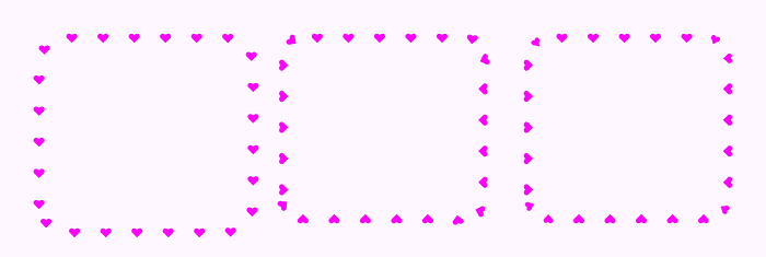
StampedPathEffectStyle.Translate, StampedPathEffectStyle.Rotate, and StampedPathEffectStyle.MorphTranslate is a direct translation, and because I didn’t fix the offset for the heart shape it means my shape is not following the exact rectangle outline, it overhangs. The Rotate style rotates the shape around which fixes that overhang but we get some hearts that are closer and some further away from each other. For Morph, it is a bit easier to see with the zig zag path:
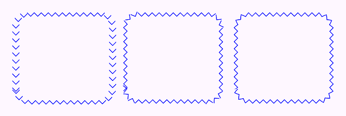
StampedPathEffectStyle.Translate, StampedPathEffectStyle.Rotate, and StampedPathEffectStyle.MorphHere, the difference is more pronounced, while the rotate does okay for the heart path, for the zig zag where the stamped shapes are connected the gaps are obvious in the corners (and in some places overlapping). Morph fixes this by transforming the shape as it goes around corners and (mostly — see bottom left corner) giving a smoother line effect. You can kind of see this with the heart path as well as the hearts in the corners are a little smaller to allow them to transition around the corner.
Lines. Mastered.
Now you can see many ways you can style your lines in Jetpack Compose and how you can use them in interesting shapes and paths.
Go make some fun morse code with dots and dashes in your lines and shapes and send secret messages to your users!
You can find all the sample code used here in my Github experiments:
The eagle eyed may have noticed that I didn’t discuss PathEffect.chainPathEffect. To be completely honest I could not construct a good example use of it and could not find any other examples where others have used it (I even tried Gemini!) If you do see a good example, please share it with me.
Hopefully one day I’ll come back to this with a part two just for chainPathEffect!