Creating Pixel-Perfect UI with Jetpack Compose
If you’ve ever built an Android app, you’ve likely faced complaints from your design team about UI elements not matching the size in their design files. It can be frustrating to explain that you’ve followed the design specs to the letter, yet the results vary across devices. This back-and-forth discussion seems to resurface with every project, often without a clear solution. But that’s about to change. In this article, I’ll show you how to create pixel-perfect UI for any device spec in Jetpack Compose using a library called “aDp.”
Problem

If you’ve ever examined your design file closely, you might have noticed that the width in pixels never matches the resolution of your device. For instance, while your device might have a resolution of 2460x1080, the design file might only show a resolution of 800x360.
How does it even work then?


This is a fundamental aspect of how Android’s dimensions in dp work, whether you’re using XML or Jetpack Compose. Android’s official documentation covers this topic thoroughly, so I won’t delve into it here.
But there is a catch — Display Zoom Setting

In Android, there’s a setting called “Display size” — though the name may vary across different device manufacturers. This setting allows users to adjust the size of the display content. When this setting is changed, the same app with identical dimensions can appear differently in size. For instance, here’s how WhatsApp looks on the same device with different zoom settings.

What Actually Changes?

If you check the “Smallest width” option in your device’s Developer Options, you’ll notice that this value changes when you adjust the display size.
What is Smallest Width?
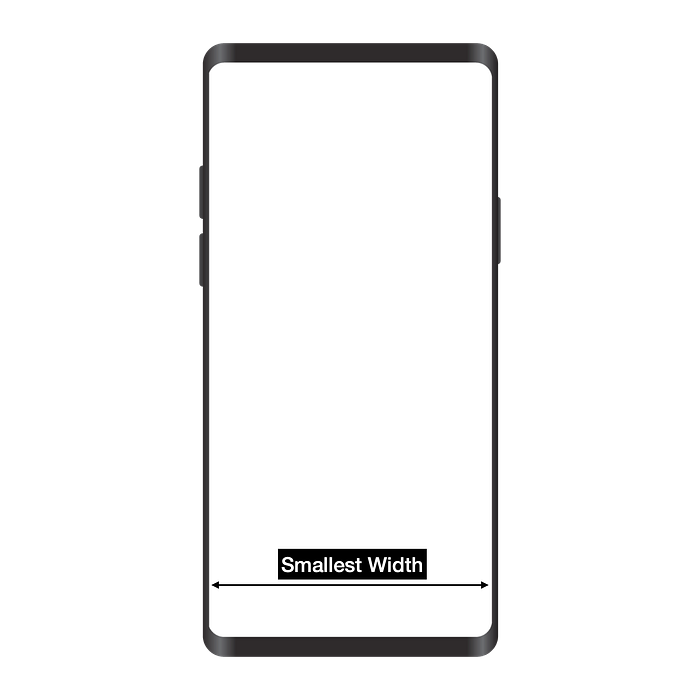
In simple terms, the smallest width represents the width of the screen in dp. To simplify further, if the smallest width is 360, a rectangle with a width of 360dp will fill the entire screen. If the smallest width is 720, then that same 360dp rectangle will only fill half the screen’s width.
Solution
While changes in display zoom are intended to alter the appearance of your app — aligned with Google’s Accessibility guidelines — they may not always be beneficial, especially if your app includes complex, custom views. In such cases, you may want your views to adapt more precisely to the device’s settings. For this, you can use a library called “aDp.”
Github repo: https://github.com/mohitsoni48/aDp
How it works?
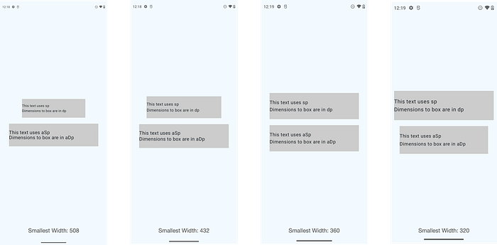
This library takes the design width as input and then scales all your dimensions according to the device’s settings, ensuring they match the design file precisely. For example, here’s a comparison of two TextViews: with a design width of 360, you can see how the TextView using standard dp changes, while the one using aDp adjusts itself to look nearly identical to the design.
Did I just mention Text View?
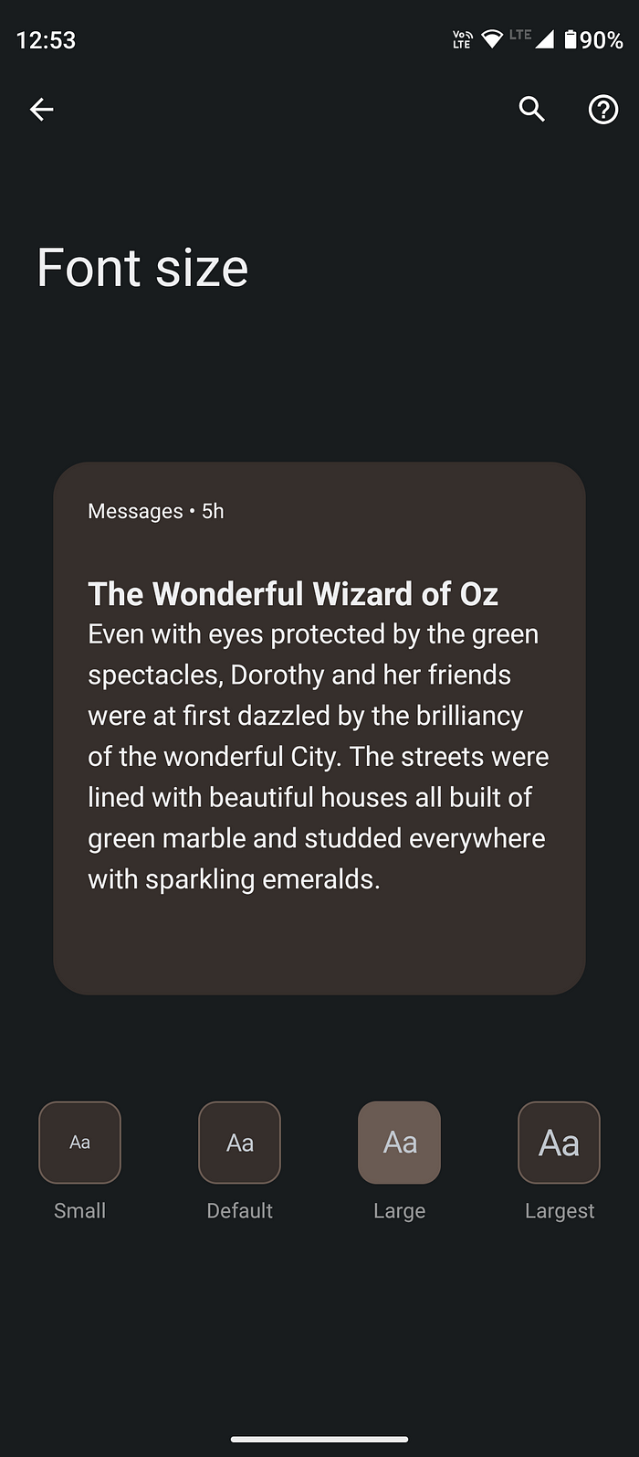
The same issue applies to fonts. If users adjust their device’s font size to Large or Largest, your design is likely to break, as it may not scale properly with the changes.
Similar to how sp is used for fonts, this library includes a separate unit for fonts: aSp, which operates on the same principle.
Conlusion
While it’s generally advisable for your app to adapt to changes in display size and font size, this isn’t always feasible, especially with complex and custom views. In such cases, aDp and aSp are invaluable, as they ensure your views remain consistent across all devices and settings.

