Creating Custom Text Views in Android: A Fun Exploration with SampleView

Have you ever wondered how to create custom text layouts in Android? Maybe you want to display text in unique alignments or even curve it along a path? Well, you’re in for a treat! Today, we’ll explore a nifty custom view class called SampleView that does just that. Think of it like adding your own twist to a plain old recipe, making it uniquely yours.
Let’s dive in, shall we?
output:

The Magic Behind SampleView
The SampleView class is like a wizard that turns boring text into something extraordinary. It extends the View class, meaning it takes full control of how it draws itself on the screen. We'll break it down step-by-step, so you can see how the magic happens.
Step 1: Setting Up the Paint and Path
Imagine you’re an artist setting up your tools. You need paint and a canvas to get started. In SampleView, we initialize Paint objects and a Path to draw text along a curve.
The Constructor: Gathering Supplies
private val textPaint: Paint
private val pathPaint: Paint
private var centerX = 0f
private val textPosition: FloatArray
private val textPath: Path

init {
    isFocusable = true

    // Setting up text paint
    textPaint = Paint().apply {
        isAntiAlias = true
        textSize = 30f
        typeface = Typeface.SERIF
    }

    // Setting up path paint
    pathPaint = Paint().apply {
        isAntiAlias = true
        color = 0x800000FF.toInt()
        style = Paint.Style.STROKE
    }

    // Building text positions
    textPosition = buildTextPositions(POSITIONED_TEXT, 0f, textPaint)

    // Creating the path
    textPath = Path().apply {
        makePath(this)
    }
}
Here, textPaint is like our main brush for drawing text, and pathPaint is for drawing the path. The buildTextPositions method calculates where each character should be placed along a straight line, like marking spots for planting seeds.
Step 2: Drawing the Text
Now comes the fun part — painting on the canvas. The onDraw method is where we tell our view exactly how to display the text.
Drawing Text: The Artist at Work
override fun onDraw(canvas: Canvas) {
    canvas.drawColor(Color.WHITE) // Setting the canvas background

    val paint = textPaint
    val x = centerX
    val y = 0f
    val positions = textPosition

    // Draw normal text with different alignments
    paint.color = 0x80FF0000.toInt()
    canvas.drawLine(x, y, x, y + LINE_HEIGHT * 3, paint)
    paint.color = Color.BLACK

    // Draw left-aligned text
    canvas.translate(0f, LINE_HEIGHT.toFloat())
    paint.textAlign = Paint.Align.LEFT
    canvas.drawText(LEFT_TEXT, x, y, paint)

    // Draw center-aligned text
    canvas.translate(0f, LINE_HEIGHT.toFloat())
    paint.textAlign = Paint.Align.CENTER
    canvas.drawText(CENTER_TEXT, x, y, paint)

    // Draw right-aligned text
    canvas.translate(0f, LINE_HEIGHT.toFloat())
    paint.textAlign = Paint.Align.RIGHT
    canvas.drawText(RIGHT_TEXT, x, y, paint)

    // Draw positioned text
    canvas.translate(100f, (LINE_HEIGHT * 2).toFloat())
    paint.color = 0xBB00FF00.toInt()
    for (i in positions.indices step 2) {
        canvas.drawLine(
            positions[i], positions[i + 1] - LINE_HEIGHT,
            positions[i], positions[i + 1] + LINE_HEIGHT * 2, paint
        )
    }
    paint.color = Color.BLACK
    paint.textAlign = Paint.Align.LEFT
    canvas.drawPosText(POSITIONED_TEXT, positions, paint)

    // Draw text along path
    canvas.translate(-100f, (LINE_HEIGHT * 2).toFloat())
    canvas.drawPath(textPath, pathPaint)
    paint.textAlign = Paint.Align.LEFT
    canvas.drawTextOnPath(PATH_TEXT, textPath, 0f, 0f, paint)
}
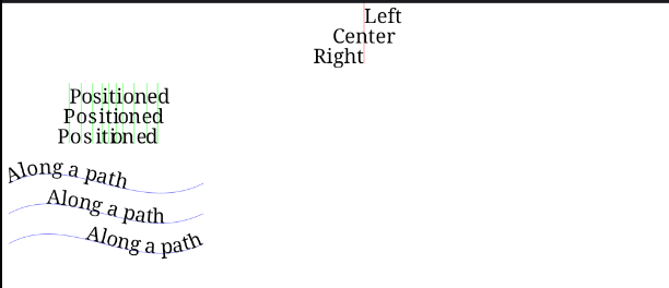
In this method, we draw text in different alignments — left, center, and right. Then, we draw text at specific positions calculated earlier. Finally, we draw text along a custom path. It’s like an artist adding different elements to a painting, layer by layer.
Step 3: Handling Size Changes
When the view size changes, like when the device is rotated, we need to recalculate some dimensions. The onSizeChanged method takes care of that.
Resizing the Canvas
override fun onSizeChanged(w: Int, h: Int, oldw: Int, oldh: Int) {
    super.onSizeChanged(w, h, oldw, oldh)
    centerX = w * 0.5f // Centering the text horizontally
}
Step 4: Supporting Methods
We have a few helper methods to build text positions and create the path. These are like the unsung heroes that make everything work behind the scenes.
Building Text Positions
private fun buildTextPositions(text: String, y: Float, paint: Paint): FloatArray {
    val widths = FloatArray(text.length)
    val count = paint.getTextWidths(text, widths)
    val positions = FloatArray(count * 2)
    var accumulatedX = 0f
    for (i in 0 until count) {
        positions[i * 2] = accumulatedX
        positions[i * 2 + 1] = y
        accumulatedX += widths[i]
    }
    return positions
}
This method calculates the x and y positions for each character in the text, ensuring they are evenly spaced.
Creating the Path
private fun makePath(path: Path) {
    path.moveTo(10f, 0f)
    path.cubicTo(100f, -50f, 200f, 50f, 300f, 0f)
}
This method creates a cubic Bezier curve path, giving the text a wavy appearance.
Constants for Readability
Finally, let’s define some constants for better readability.
companion object {
    private const val LINE_HEIGHT = 30
    private const val LEFT_TEXT = "Left"
    private const val CENTER_TEXT = "Center"
    private const val RIGHT_TEXT = "Right"
    private const val POSITIONED_TEXT = "Positioned"
    private const val PATH_TEXT = "Along a path"
}
Putting It All Together
And there you have it! The SampleView class is a fun and engaging way to display text in various styles and along custom paths. By breaking down each step, we've demystified the process, making it easy for you to add your own creative touches.
With SampleView, you can turn your Android app into a canvas, where text flows like an artist's brushstroke, making your UI uniquely yours. Happy coding!
The whole sample code
output :


