
Creating a Time Picker Based on the ELSA Speak App Using Jetpack Compose
Motivation
After writing about Glovo-animation, I was still curious about one type of movement in the app known as fling animation. I realized that learning this could help me get better at designing user interfaces. Then, I saw the same animation in another app called ELSA Speak, and it seemed like a hint that I should dive deeper into it. I decided to learn all about it and share my findings with others who enjoy making apps look nice.
Check the comments for extra tips and explanations!
En avante!

Main Component
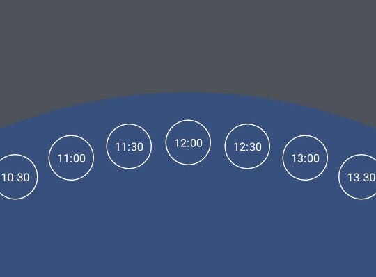
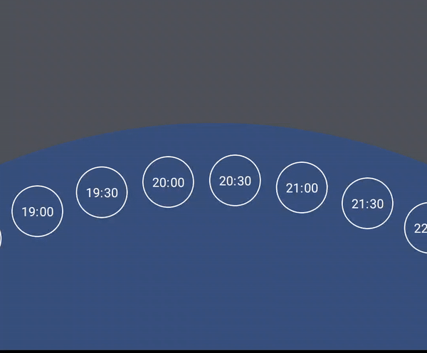
Let’s start with the basics: drawing large and small circles. In my previous article, I did it using Canvas, and now I want to try something new — Custom Layout. With a custom layout, we will have less amount of drawings, which, in my view, will be easier to support, although it always depends on your preferences.
First, let’s create a Composable.
In this setup, items represent our inner circles. itemSize and size define the dimensions of the items and the main circle, respectively. onItemPicked is a callback function triggered upon choosing an item. The content lambda allows customization of item composable. itemPadding provides spacing between items and the main circle, while modifier offers additional customization options for our layout.
TimeItem is a simple data class that contains a time string and information about the period of a day (we will need it later for the Sun and Moon animation).
When we have all the important components, it’s time to draw everything.
To summarize our process, inside the custom layout, we measure each child with the given constraints, resulting in a list of placeables that are ready to be placed in the layout. We then perform calculations to determine the available space, the radius of our circle, and the necessary distances for optimal item positioning. Next, we processed all placeables to calculate their angles in radians. Using the trigonometry function we calculate the position inside the global circle and place our items according to the coordinates.
Let’s review the entire composable.
There isn’t much more to explain. In this section, we simply configure the colors and sizes of our main and item circles. Although I’m not generally a fan of using offsets, they offer the quickest solution in this scenario. To simplify this explanation, I’ve left out the getTimes() function and colors. You can find these details in the attached GitHub repository.
Draggability
Now, we approach the most challenging yet engaging part of our animation: implementing fling actions and draggability. Our goal is to enable users to interact with the main circle by dragging it smoothly or flinging it with force, resulting in a spinning motion.
To begin, we should create a state to track the current angle of our circle and the selected item
While comments will provide immediate guidance, it’s better to return to them later, when the whole picture is clearer.
The next step will be to create a drag modifier.
The implementation depends on two key parameters: state, as mentioned before, and magnitudeFactor. The latter is crucial for adjusting the decay animation’s speed to prevent the circle from spinning too quickly, an optimization realized through testing.
We start by identifying the center of our component. Next, we initialize a DecayAnimationSpec to manage the dynamic changes in our circle’s angle, ensuring smooth transitions.
A coroutineScope is then set up to handle user input events. Here we can start to catch different user events. The initial event we capture is the DownEvent, which allows us to determine the initial angle of the drag. For this calculation, I employ the atan2 function, a choice explained in more detail in my previous article.
On detecting a drag gesture, we calculate the angle changes based on the user’s touch position relative to the center of the component and continuously update the angle, keeping the interaction responsive.
A VelocityTracker captures the speed of these gestures. When the user releases their touch, the tracker’s data, adjusted by the magnitudeFactor calculates the animation’s velocity. This calculated speed helps us determine the target angle, marking the animation’s endpoint. We also calculate the side of a fling by subtracting the changeAngle from the startedAngle. Then circle smoothly transitions to the new angle
We keep track of the last selected angle by saving it to the oldAngle variable to ensure continuity between drag gestures.
The last step in this part is to add this state to the drag modifier.
And here is the beautiful result of our efforts.
Item Picker
In this section, we’ll refine the item selection process. Our goal is to ensure that the selectedItem is always centered at the top of the global circle and trigger onItemPicked callback. This requires a slight adjustment in our drawing logic — specifically, subtracting 180 degrees from the starting position of our items.
Next, we focus on identifying the closest item to the top of the circle. By calculating the distance of each item to the circle’s apex, we can dynamically update the selectedItem.
After the decay animation, we simply need to drag the main circle the remaining distance to the nearest item.
Also, we need to add different colors when an item is selected or deselected. For this, we add a few items that will control it — specifically, the currently selected item and color animation inside content lambda that triggers when currentItem changes.
Pass this item to the box modifier.
.background(colorAnimation)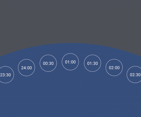
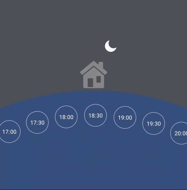
Animating the Sun and Moon
To add a finishing touch, we introduce a Sun and Moon animation to reflect day or night time based on the selectedItem. This involves a component with three icons (a house, the Sun, and the Moon, which can be found here) that rotates using a rotate modifier.
We add new objects to our main Box: AnimationSpec for the animation's behavior, a rotation value, and a coroutine scope to execute the animation. (Also with an offset).
This animation is triggered by the onItemPicked callback.
Finally, seeing the complete animation in action, I’m deeply touched…
Conclusion
This article showed you how to add fling animation to your apps, using the ELSA Speak time picker as an example. We covered how to combine this with other features such as Custom Layouts, VelocityTracker, and DecayAnimation, detailing each step to enhance your app’s interactivity and visual appeal.
Links
If you want to see the whole implementation, you can find it in the link below.
Many useful insights I’ve got from this article.
Icon by Fasil on freeicons.io


