Create Gemini loading animation using Jetpack compose
Mind Motion 🧑🏼🎨
Setting meaningful animations is crucial to creating smooth mobile experiences. I’m particularly fond of the term “mind motion,” which means that animation must be logical and predictable by the human mind. Creating a natural and interactive change by morphing the app icon into the app frame is a better alternative to having the user click on the icon to open the app out of nowhere.
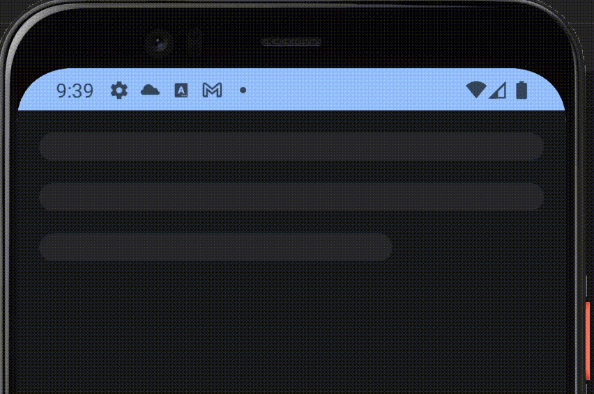
When I came across the loading animation for Gemini on mobile, I was quite impressed and decided to try to recreate it. I would appreciate any suggestions in the comments to make it better. 🕺
Breakdown ䷪
Let’s break down the animation and try to replicate it.
- As you may have noticed, the core style of the animation is a gradient.
- The gradient animates across the X-axis. First, it enters from behind the screen, then goes through the screen’s full width, exits out of the screen bounds, and then repeats.
- To make it easier to imagine how the animation goes, Here is a diagram that I crafted to wrap my head around the concept. 😉

💡 Note: It’s essential to start and end the animation outside the screen boundaries to achieve a natural feel.
Implementation 🧑🏻💻
Let’s write code 🙌
We can use Jetpack Compose’s LinearGradient Brush as a skeleton for our animation.
@Stable
fun linearGradient(
colors: List<Color>,
start: Offset = Offset.Zero,
end: Offset = Offset.Infinite,
 tileMode: TileMode = TileMode.Clamp
): Brush = LinearGradient(
      colors = colors,
      stops = null,
      start = start,
      end = end,
      tileMode = tileMode
)- This Composable function draws a gradient in our scene and enables X-axis animation via
startOffsetandendOffset. - I chose to create our animation effect as a
Modifier, To ensure that we can apply it to any Composable. - To begin with, we need to draw the gradient and then animate it.
fun Modifier.animatedGradient(
 primaryColor: Color,
 containerColor: Color
): Modifier = composed {

val colors = listOf(
  primaryColor,
  containerColor,
  primaryColor
 )

  background(
      brush = Brush.linearGradient(
          colors = colors
  ),
  shape = RoundedCornerShape(24.dp)
 )
}primaryColoris the main color in the gradient animation.containerColoris the secondary color, It will serve as a backdrop for our animation.- Because
animatedGradientis an extensionModifierwe can access all the operators inside, we will use thebackgroundoperator and bind theBrush.linearGradientas it’s painted. - Lastly, we will assign
RoundedCornerShapeto ourbackground; feel free to adjust the value of the radius, Similar to the Gemini animation I made it24.dp
⚠️ Note: primaryColor and containerColorshould differ from your screen’s background — Anything that can make a good contrast.
Animating the gradient 🪄
Let’s break the code
- We will track the screen width using the declared
sizestate value, I will be updated with the Screen/View width thanks toonGloballyPositionedoperator. - Our
transitionwill be Infinite to keep the loading animating running; something like theProgressBar. colorsis a list to represent the gradients, the color ordering is important here!
listOf(
primaryColor,
containerColor,
primaryColor,
)
📝 After extensive experimentation, this color sequence closely resembles the Gemini gradient. Feel free to innovate with different orders and shades, and share the results in the comments section. ✨
- Thanks to the extension function
animateFloatwe can pass the desired start and end, and it will take care of repeating the animation infinitely and return a stateoffsetXAnimation(State<Float>)to apply to ourLinearGradient. - Because the animation is happening on the x-Axis, So
initialValuewill be-widthwhich means, go outside the screen to the left until the distance iswidth. - The
targetValueopposite in direction but the same in distance meaning, go outside the screen to the right unit the distance iswidth. animationSpecwill take repeating the animation for us, with a bunch of experimentation, I found1500milliseconds, andLinearEasinganimation looks very similar to Gemini’s animation.- Lastly, we will modify the static
linearGradientto make use of theoffsetXAnimationvalue, As we mentioned before, it takes two offsets.
- Start: The coordinates where the gradient will start spreading.
- End: The coordinates where the gradient will stop spreading. - the
Offsetis a representation of a point in space (X as the horizontal point and Y as the vertical point) - Now We can animate the spreading of the gradient by assigning
offsetXAnimationas part of the X value. - Going back to our diagram in Figure 1, We only care about the X-points
- The x-axis Equation: At any point in the animation the gradient start will be
offsetXAnimationvalue itself, and will end atoffsetXAnimation + width. - The y-axis Equation: Y will remain normal meaning, it will start at point 0 and end at the screen height
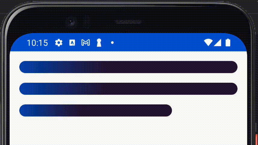
Now Our modifier is ready to be used, Let’s create a simple layout and animate it with our animatedGradient Modifier 🎉
- I extract the
primaryandcontainercolors from the animation. - Then created 3
BoxComposables taking the same look as the three bars in the Gemini animation
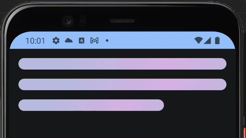
Here is how it looks 🕺✨
Going the extra mile 🏃🏻
Having recreated Gemini’s animation, let’s explore other ways to customize it.
Material You Adoption 🎨
Since our Modifier accepts colors as arguments, imagine using colors from the Material You scheme, which respects both Dark and Light modes.
To adopt our code for Dark Mode, we will change the color parameters to reflect a suitable style with darker accents 🧑🏻💻
Dark Mode
We changed the primary and container colors to the colors from MaterialTheme.colorScheme. Experiment with different theme colors depending on your preferences. I found secondary and tertiary colors fitting for Dark mode.
Here is how it looks. ✨
PS: Google already used the material colors scheme for similar loading animation in their Gemini integration in Google Docs 😎
Light Mode
I chose onTertiaryContainer and primary for light mode.
Here is how it looks. ✨
Experimenting 🧪
- Easing: Further optimize the animation by adjusting the easing. Jetpack Compose offers several built-in methods, such as
FastOutSlowInEasing,LinearOutSlowInEasing, andFastOutLinearInEasing. I choseLinearEasingto illustrate the animation, but feel free to try other techniques and share your findings. 👀 - Duration: Another important aspect of animation is its duration. Adjust this to suit your needs; Usually, a good duration ranges from 1000 to 2000 milliseconds.
- Color sequence: Experiment with the order to control how the gradient looks and its dominant color, such as switching between
-containerColor -> primaryColor -> containerColor(primaryColoris dominant).
-primaryColor -> containerColor -> primaryColor(containerColoris dominant).
Thank you!
I appreciate your time and interest. 🙏
I’ve shared the complete source code for each example in a GitHub gist.
https://gist.github.com/ahmed3elshaer

