Member-only story
Collapsing Toolbar in Compose— PART 2

Introduction
Creating smooth, responsive user experiences in modern UI development often involves complex scrolling interactions. One common requirement is nested scrolling, where a scrollable component is embedded within another. Jetpack Compose, with its declarative approach, provides an elegant way to handle such interactions.
In PART 1 of this article, we covered scroll states and the basics of nested scrolling. Now, in PART 2, we will build a dynamic UI with a collapsing toolbar and learn how to handle nested scrolling effectively.
Mastering Scroll in Jetpack Compose — PART 1

Overview
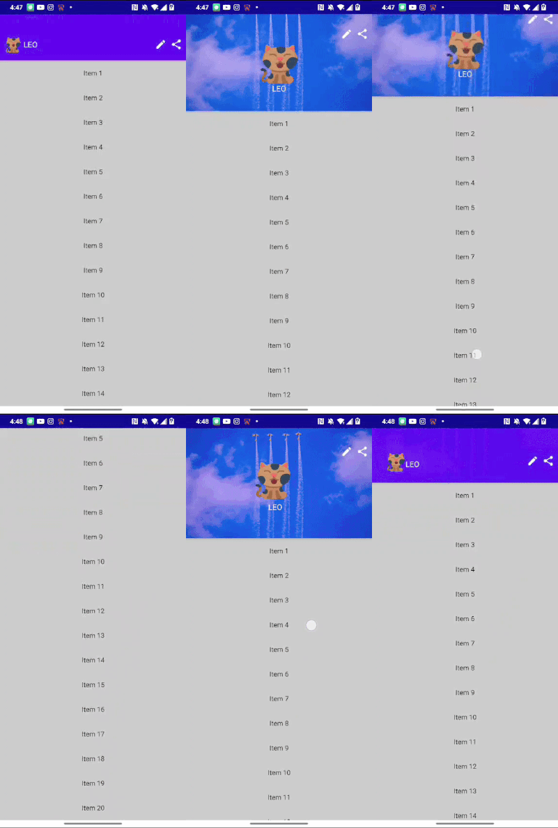
We aim to create an interface with a lazy list where scrolling causes the top card to transform into a toolbar, with a smooth, curved path transition effect.
What You’ll Learn
- Creating custom layouts
- Resizing layouts based on states (collapsed or expanded)
- Combining lazy list scrolling with screen content
- Working with nested scrolling and
NestedScrollConnection
Step 1: Building the Header
The header has two states: expanded and collapsed. We use dynamic elements with changing heights and widths to achieve a smooth transition between these states.

To calculate the height for these containers we will use Custom layout in compose. If you already not know custom layout checkout this.
# Defining the Heights
private val expandedBoxHeight = 200.dp
private val collapsedBoxHeight = 96.dp
private val ExpandedLeoHeight = 80.dp
private val CollapsedLeoHeight = 32.dp
private val leoTextHeight = 16.sp
private val ButtonSize = 24.dp
We interpolate between these values as the header transitions between states.

