Building a Modern Design System Using Jetpack Compose
Short overview of the Flamingo Design System from an Android Dev’s perspective.
If you ever worked on a big project, you may have encountered these challenges: non-reusable components (especially relevant with the wide adoption of composable functions), a lot of tones of brand colors, a wide range of font sizes, static Figma files. And, far more difficult one — maintainability.
Before we start, I want to mention that I’m writing this story from the point of view of an Android developer, not a UI designer.
The Major Players
The design system is not just a set of graphic elements that reflect the brand style. The design system includes a visual language, reusable interface elements in code, and templates for designers. Now, let’s see, how all of this was implemented in Android.
API
Flamingo object is a common entry point to the design system. It provides the most useful API methods, and it’s helpful to discover features and learn Flamingo from scratch.
It contains properties like colors, typography, palette, icons and many others. Some of them have composable getters.
Colors
Our design system includes a huge brand palette with unique names, for example, electricBlue-600. These colors have no alpha.

For this palette I’ve created a class with static colors and an internal constructor. The single instance can only be accessed by calling Flamingo.palette.
Theme Colors
Our project should support switching on any theme, e.g. Dark / Light theme. That’s why we’ve developed another set of dynamic colors, which have a value for each of the themes (currently only two— Dark and Light). Whenever the theme changes, so do the color values.
Colors are semantically named (like error, primary, info, warning), because these colors must be used by developers and designers. It is widely known, that people remember associative names better than unstructured data sets.
Also, semantic names are more maintainable. If the brand team wants to change the brand palette, it wouldn’t affect developers, because I can change the color value in this file, but the semantic name would be unchanged.
Gradients
Also, our design system includes gradients, which do not depend on the current theme.

They are implemented as Android Vector Drawables. I decided not to use Compose gradients API because:
- they were created long before Compose has even existed, and XML-based gradients don’t support custom angles that are not a multiple of 45°;
- gradients are exported from Figma in SVG format. That means, when designers will decide to change them (already happened twice to us), it will be much easier to swap a resource file than to rewrite Kotlin code.
Typography, Icons, and Illustrations
Flamingo has them, but I’ll tell you more about them in the next articles.
UI components
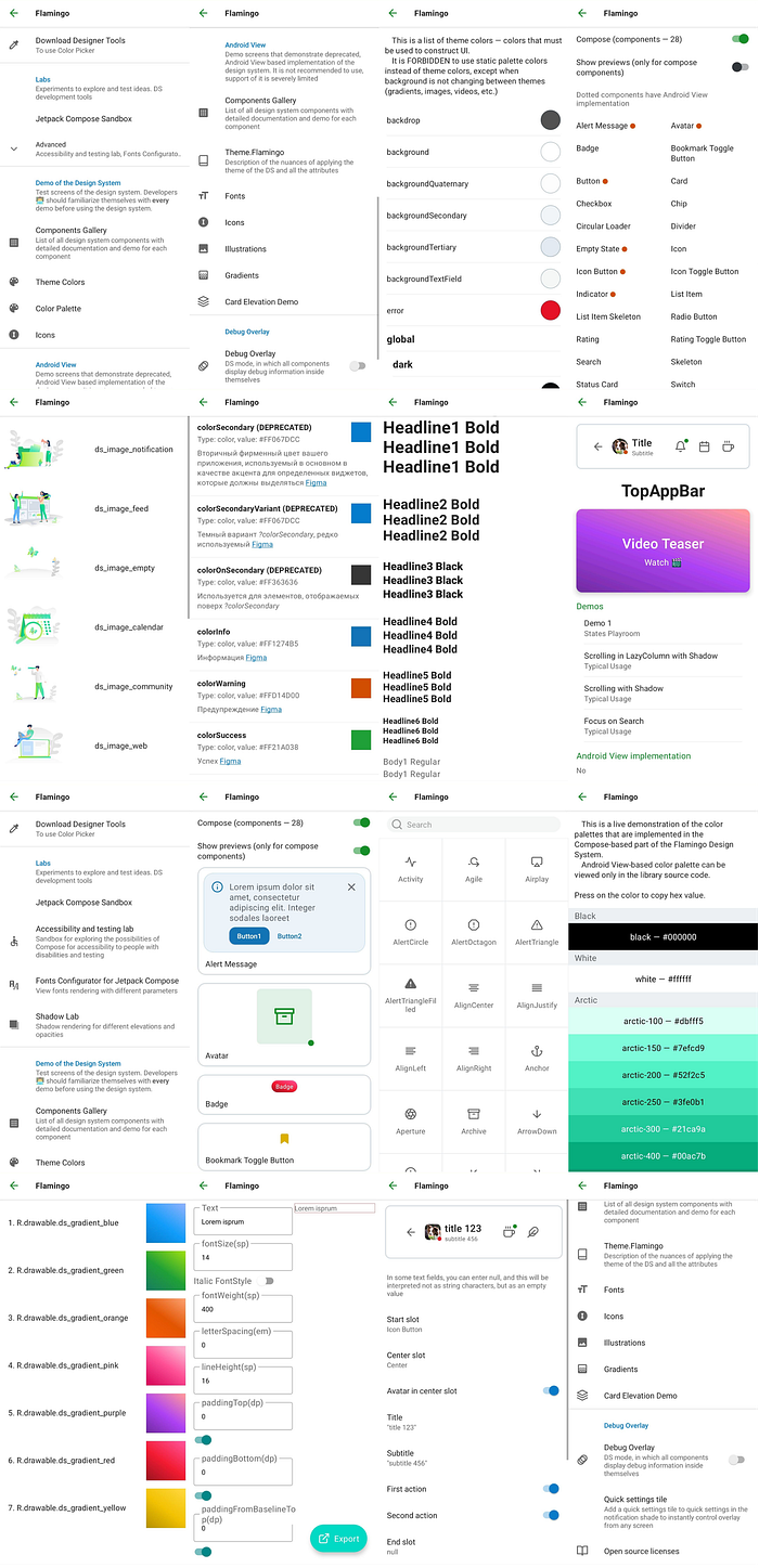
An essential part of any design system is UI components. Currently, there are 28 reusable components in the Android version of the Flamingo which I’ve implemented.

There are two types of them: with Android View implementation and without one, but all of them have a Jetpack Compose implementation. The ones with Android View are marked with an orange dot.
Creation of the Flamingo started before the beta of Jetpack Compose was released, so I had to start implementing UI components using the Android View system. But I quickly felt the immense pain of the old view system and was very excited to start learning Compose, once it hit a beta milestone.
Currently, we work on removing view-based implementations of all UI components and substituting them with Compose-based implementations so the developers who already use view-based UI classes would not have to change their code, but I won’t have to support legacy codebase.
Source code of components is here.
The Single Source of Knowledge
So, we have everything that is needed to start building a great UI. But how the teammates will discover components, know, what colors are out there and in general, learn about best practices of the Flamingo Design System?
Our team developed an idea for The Single Source of Knowledge application — Flamingo Playground, which contains live, generated from the actual code, interactive documentation of the many Flamingo parts mentioned before.

Modules Structure
Basically, to use Flamingo in the app, you just include flamingo module in your production app and all the feature modules where Flamingo is needed.
But, to be able to:
- Launch Flamingo Playground from your app (not to download it separately and constantly make sure that the app’s Flamingo version is the same as Playground’s version);
- Use additional debugging features baked into the playground (Debug Overlay and others)
You need to include flamingo-playground module into your app’s staging module:

Documentation of the UI Components

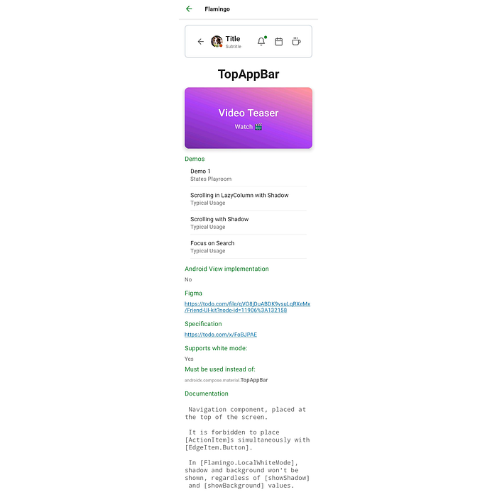
Each component has a dedicated details page which contains the following:
- Interactive preview of the component in a common configuration. Users can change system theme and font scaling to see, how the component behaves;
- Optional video teaser — short animated video clip that is created using Theater framework;
- A list of demos (minimum one) that showcase the component’s features. There are multiple types of demos, but almost every component has a States Playroom demo (detailed below);
- An indication of the existence of an Android View implementation. If it exists, there is a link to the details page of the implementation;
- Url to the Figma page of the component;
- Whether component supports white mode — an ability of the component to enter special configuration that modifies its appearance, so it can be placed on top of the white backgrounds.
- If the component has alternatives in the material design system, they are listed in the “Must be used instead of” section. This info is also used in the corresponding lint check (detailed below)
- Documentation of the component, taken from the KDocs of the composable function.
This info is derived from @FlamingoComponent and @UsedInsteadOf annotations by the custom ksp-based annotation processor — crab.
@FlamingoComponent annotation has properties like
preview— fully qualified name of a composable functionfigma—urlspecification—urltheaterPackage—fully qualified name of a TheaterPackage classdemo—string array of the fully qualified names of fragment classes
and others.
States Playroom
States Playroom is a type of component demo that allows users to toggle all parameters of the component right in the playground app and instantly see the component preview in that particular state. It’s built using the Androidx Preference library, although if I was building States Playroom today, I would’ve used Jetpack Compose.
Here is how it looks:

Theater
With the goal of quickly introducing users to the all features of the UI components, I created a framework for creating short animated video clips that demonstrate the majority of the states of UI components. Videos are created using Kotlin and are rendered directly in the Android app.
Basic principle is simple: you just animate rotation, translation, alpha and a few other parameters of the composables (called Actors) using an easy to use API and launch your program on a mobile device, screen-capturing it.
More info about the framework is available here.
Here are examples of the videos, created using Theater:
The rest of the videos can be seen here:
https://youtube.com/playlistlist=PLGEKQ_tCWabRme1pUVZJLektqXXfDIW2G
Debug Overlay
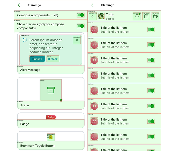
This is a feature that draws debug info on top of all UI components. It can be turned on in the Flamingo Playground.

This feature was inspired by Airbnb’s DLS. More — here (jump to 21:30).
Specifications
During the initial development of the first UI components, we realized, that Figma designs alone are not sufficient for correctly implementing UI components, because:
- they change frequently, not providing an ability to freeze a design;
- there is not enough info about the layout behavior of components and the different properties that they have.
To solve those problems we decided to create Specifications for each UI component — a confluence page that describes a list of all properties, layout behavior, paddings, animations, white mode, and other necessary info.
The advantage of this approach is that confluence has built-in versioning and team-wide approval systems, which provide tremendous help when working in a team.
Because we recently decided to make our design system open-sourced, all specs will be exported from Confluence in .docx format and uploaded into a separate GitHub repo.
Now we plan to move our work pipeline into GitHub.
Android Lint Checks
To help both experienced and novice devs use Flamingo I created several Android Lint checks. They help devs in avoiding common mistakes when using Flamingo, such as specifying TextAppearance instead of TextStyle in XML layouts, declaring multiple ALPHA_DISABLED constants across the project and others.
In particular, WrongComponentAlternative check prevents using incorrect alternatives of Flamingo components from the Material design system. Here is how it works:
- Flamingo components that have alternatives in Material design system are marked with
@UsedInsteadOfannotation, which contains a single string property—fully qualified name of the Material design component’s composable function. - Crab annotation processor collects all such annotation usages and creates a single file in CSV format that maps Flamingo components to their alternatives
- CSV file is placed in the flamingo-lint module, which is then compiled and automatically included in the flamingo module’s
lint.jar. - When developers use Android Studio, lint check searches for function calls to all alternatives, and if found, suggests to replace them with the original Flamingo component, like this:

Code of this lint check is located here.
Open Source
Recently, we decided to open source Flamingo, so that community could benefit from the work that we’ve done over the years.
Currently, we open-sourced the Android implementation of the Flamingo, Theater framework.
In the future, we are planning to open source at least web, and possibly also iOS implementations.
It was a brief overview of the Flamingo Design System. In the following articles, I will expand on many of the aforementioned topics in greater detail, which, I hope, will help you build better design systems 🙂.
My website: https://popov-anton.web.app/

