
Blueprint — Visualizing Paddings in Jetpack Compose
👋 Hi! Today, I’d like to tell you about how I optimized a workflow for developing custom UI components in Jetpack Compose.
The Good Old Constraint Layout
Before Compose, many developers used Constraint Layout to build most of their app’s UI. One advantage it has over Compose — instant visualization of paddings between different elements of the UI.
When Compose came around, it introduced us to the idea of writing UI directly in code without any graphic tools. It was a big change, but it turned out amazingly good—developers became much more productive and Android Studio’s preview feature eliminated most of the disadvantages of this approach.
The Problem
However, there is a use case where visualization of dimensions is still needed in live preview, while you are building the UI: complex design system components.
Typically, the code for these things looks like this:
val startPadding = when (size) {
    Small -> if (icon) 4 else 6
    Medium -> if (icon) 6 else 10
    Large -> if (icon) 10 else 14
}.dp

// endPadding, verticalPadding, iconPadding, etc.
It is very easy to get lost in the numbers, sizes, and paddings. After modifying the code above, you look at the composable preview in AS and wonder, have you actually matched the design spec, or there is a small error in one of the dozens of configurations 😩?
To solve this problem, I decided to write a small library that would have a capability similar to the Constraint Layout visual editor’s blueprint mode.
The Blueprint
The Blueprint library provides a way to visualize dimensional information in your UI using a simple DSL-based definition:
- Just wrap your target UI in a
Blueprintcomposable - Mark children with
Modifier.blueprintId(id: String)modifier - Write the blueprint definition
Blueprint(
blueprintBuilder = {
widths {
group {
"item0".right lineTo "item1".left
"item0" lineTo "item0"
"item2" lineTo "item3"
}
}
heights {
group { "item0Icon" lineTo "item0Text" }
group { "item0" lineTo "item0" }
group(End) { "item3Icon".bottom lineTo "item3Text".top }
}
}
) {
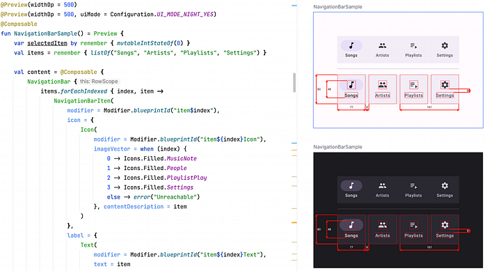
val items = remember { listOf("Songs", "Artists", "Playlists", "Settings") }
NavigationBar {
items.forEachIndexed { index, item ->
NavigationBarItem(
modifier = Modifier.blueprintId("item$index"),
icon = { Icon(Modifier.blueprintId("item${index}Icon"), TODO()) },
label = { Text(Modifier.blueprintId("item${index}Text"), TODO()) },
selected = index == 0,
onClick = { TODO() }
)
}
}
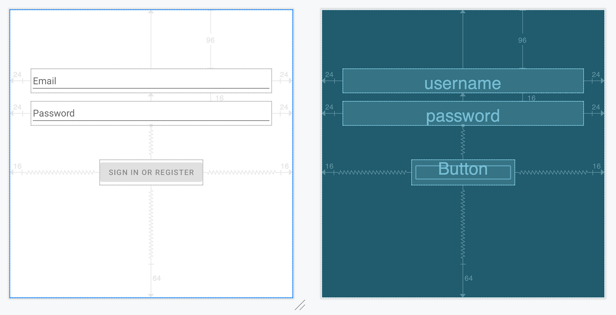
}This is the result:
Another example:
Lines in one group will be drawn at the same depth level.
The placing order of groups is the following:
first called -> placed closer to the composable.
In other words: going out from the center, like in an onion.
To produce a pretty blueprint, try to place in one group only
non-overlapping dimension lines. Place the overlapping ones in different groups.
Features
You can customize:
- Line and border strokes (width and color)
- Font size and color
- Arrow style (length, angle, round or square cap)
- Decimal precision of the dimensional values
Of course, Blueprint works in Android Studio’s Preview✨!
Also, you can disable all the overhead of this library in your release builds by either:
- Disabling blueprint rendering using
blueprintEnabledproperty. - Using the
no-opversion of the library:
dependencies {
    debugImplementation("com.github.popovanton0.blueprint:blueprint:LATEST_VERSION")
    releaseImplementation("com.github.popovanton0.blueprint:blueprint-no-op:LATEST_VERSION")
}How it works
blueprintId modifiers collect LayoutCoordinates of each target using OnGloballyPositionedModifier interface. LayoutCoordinates contains info about the absolute and relative position of the target, plus its size.
Then, the modifier puts all LayoutCoordinates in a ModifierLocal map — ModifierLocalBlueprintMarkers (alternative to CompositionLocal for modifier chains).
// from: https://github.com/popovanton0/Blueprint/blob/main/blueprint/src/main/java/com/popovanton0/blueprint/BlueprintId.kt

public fun Modifier.blueprintId(
    id: String,
    sizeUnits: SizeUnits? = null
): Modifier =
    // ...
    BlueprintMarkerModifier(id, sizeUnits)

private class BlueprintMarkerModifier(
    private val id: String,
) : ModifierLocalConsumer, OnGloballyPositionedModifier {

    private var markers: MutableMap<String, BlueprintMarker>? = null

    override fun onModifierLocalsUpdated(scope: ModifierLocalReadScope) = with(scope) {
        markers = ModifierLocalBlueprintMarkers.current
    }

    override fun onGloballyPositioned(coordinates: LayoutCoordinates) {
        val markers = markers ?: return
        if (coordinates.isAttached) {
            markers.remove(id)
            markers[id] = BlueprintMarker(coordinates)
        } else {
            markers.remove(id)
        }
    }

    // ...
}
LayoutCoordinates are updated on each position and size change, thus keeping the ModifierLocalBlueprintMarkers map up-to-date.
Then, in Blueprint composable, ModifierLocalBlueprintMarkers is provided with a value, and the blueprint is drawn on top of the target composable.
// from: https://github.com/popovanton0/Blueprint/blob/main/blueprint/src/main/java/com/popovanton0/blueprint/Blueprint.kt#L155

val markers = remember { mutableStateMapOf<String, BlueprintMarker>() }
var rootCoordinates by remember { mutableStateOf<LayoutCoordinates?>(null) }

Box(
    modifier = modifier
        // applying paddint to account for long dimension lines
        // outside of the wrapped composable
        .run { if (applyPadding) padding(blueprint, groupSpace) else this }
        // in the actual code, this modifier is
        // reimplemented, as to not depend on experimental APIs
        .modifierLocalProvider(ModifierLocalBlueprintMarkers) { markers }
        .onGloballyPositioned { rootCoordinates = it }
        .drawWithContent {
            drawContent()
            val params = // ...
            drawBlueprint(params) // big function 😅
        }
) {
    content()
}
So all of the logic for calculating sizes, relative positions, distances, and dimensions is handled in the draw phase.
Conclusion
This library helped me a lot during the development of complicated design system components, and I hope it will help you too.
Feel free to ⭐ Blueprint library on GitHub:
That’s all for today, I hope it helps! Feel free to leave a comment if something is not clear or if you have questions. Thank you for reading!


