Automating UI Model Generation With KSP

In this article, we’ll explore how to generate UI presentation models directly from Composable function definitions using KSP. This approach helps us structure and model data within the presentation layer (ViewModel) in a way that naturally aligns with UI components, leading to reduced maintenance overhead.
By ensuring that our data models reflect the structure of the UI components, we ensure that business logic doesn’t leak into the view layer. Instead, all data formatting and manipulation will reside within the ViewModel, preventing common issues such as embedding UI-specific logic — like boolean visibility conditions, label changes, or style adjustments — directly in the view.
This approach aligns with clean architecture principles, improving maintainability, enhancing code readability, and making testing easier and more efficient. By centralizing logic in the presentation layer, we reduce the reliance on UI tests.
ViewItems
Let’s walk through a simplified example from the Wise Android App to demonstrate how we structure a screen and its ViewModel using this approach. From this point on, we’ll refer to our UI models as ViewItems.

Screen Example
In the code above, we simplify the screen code by using the Render() function to automatically handle UI component data binding and rendering. Instead of manually binding UI properties, we instantiate the auto-generated UI models (ViewItems) in the ViewModel. The Render() function then takes care of binding the data and creating the corresponding Composable components.
ViewModel Example
In the example ViewModel, we instantiate the ViewItems with dummy data. In a real-world scenario, we would map and format the properties of the domain models into these UI models.
The ViewItems are simply instantiated as regular data classes. Generating them automatically eliminates the need to manually create separate models for the UI layer which is another benefit of this approach. As typically, UI-specific models are used to map domain objects to, which promotes encapsulation and, more importantly, enables proper data formatting within the ViewModel.
For example, a Contact domain object might include a creation date, which could be presented in the UI with a (New) tag based on a date threshold. By creating models aligned with the Composable's interface, you ensure the data is formatted as needed for display, avoiding the temptation to include this logic in the view layer.
However, it’s crucial to carefully design the Composable’s interface to avoid exposing implementation details unrelated to the semantic purpose of the component. For example, let’s consider a Composable called Alert. You might need to decide between a property like alertType (e.g., [Neutral, Positive, Negative]) or alertColor (e.g., [Grey, Green, Red]). It’s better to always choose the semantic representation (alertType), as it describes what to render rather than how to render it. This prevents the ViewModel from holding those implementation details — part of the view layer responsibilities — and promotes better separation of concerns.
Composable Example
For simplicity, we’re only showing one composable used to generate ViewItems. What’s important to highlight here is the @AutoViewItem annotation, which is responsible for automatically generating the UI models.
In addition, we have other Composables that are not shown in this example which aren’t used to generate ViewItems . These include some of our custom building blocks, such as CustomizableAppBarScaffold—a custom AppBar solution used at Wise to ensure consistent screen layouts—and Text, which is a custom wrapper for text resources resolution that is used throughout the app.
Implementation (using KSP)
First, let’s start with a brief introduction to Kotlin Symbol Processing (KSP). KSP enhances annotation processing by analyzing Kotlin code directly, unlike KAPT, which compiles Kotlin code into Java stubs before processing. Since stub generation is expensive and significantly impacts build speed, KSP offers faster build times and more efficient processing. This makes KSP a modern and powerful replacement for KAPT in Kotlin-based projects. You can learn more about KSP here.
Traditionally, annotation processors were primarily used by third-party libraries due to their complexity and impact on compilation times. However, KSP offers a simpler learning curve, making it a practical tool for everyday Android development. So instead of building a generic library for auto-generating ViewModels — which can be complex and difficult to maintain — we’ve implemented a custom solution tailored to our project’s needs. Generic libraries that attempt to cover all possible use cases often become unwieldy and challenging to maintain.
Our custom plugin enables us to annotate UI component Composables with the @AutoViewItem annotation, streamlining the generation of ViewItems without over-engineering a highly configurable, hard-to-maintain library.
When a Composable is annotated with @AutoViewItem, the plugin automatically generates the required data class and data binding code.
Example
To begin, we annotate a composable function, as shown in the example below:
Our KSP processor processes this annotation and generates the following code:
Note: Not all types will align with those of the original composable. For example, we’re replacing String with our custom type Text, this is done to avoid the need for resolving string resources when instantiating ViewItems in the ViewModel.
Custom Types in Our Implementation
Our implementation relies heavily on our project’s existing codebase. To provide clarity, here’s an overview of the key custom types we use:
TextType: This customTextclass wraps text resource references, enabling the use of both plain strings and string resource references. This approach eliminates the need to resolve string resources within the ViewModel.ImageSourceType: Similar toText, theImageSourceclass handles images by referencing resource IDs, URIs, or bitmaps, ensuring that image resources don't need to be resolved in the ViewModel.ViewItemInterface: TheViewIteminterface guarantees that each presentation model includes aRenderfunction and aSpacingRole, ensuring consistency across all components.SpacingRoleType: This property manages spacing behavior between items, dynamically adjusting it based on the items above and bellow.
Below is a simplified version of these custom types:
Additional Notes
The Render function includes an optional Modifier, making it easy to adjust the layout and placement of ViewItems within a screen.
LazyList Use Case
In addition to the auto-generated ViewItems based on the ViewItem interface, we introduce another interface called KeyedListViewItem. This interface extends ViewItem by adding a key (identifier), which is a requirement for rendering items dynamically in lists like LazyColumn. This approach allows us to automatically render these view items in lazy lists and even mix different ViewItem objects to dynamically compose a screen.
So for each @AutoViewItem annotation, two models are generated: one implementing the ViewItem interface and another implementing the KeyedListViewItem interface. In addition to the previously generated code, the following is also generated:
We can then reference a list of KeyedListViewItem in a LazyColumn, where the items will be rendered automatically. Additionally, different spacing will be applied for different ViewItem types using our SpacingRole logic:
val viewModel: UserViewModel by viewModels()
LazyColumn {
    renderItemsColumn(viewModel.state.items)
}
We use a custom function here, renderItemsColumn, which is an extension function that contains logic to extract the key from KeyedListViewItem and apply the appropriate spacing based on the SpacingRole. A heuristic is then used to calculate spacing between two SpacingRoles.
Below is a simplified version of our custom implementation for this functionality:
Building the KSP Plugin
While much has already been written about creating KSP plugins, this section provides an overview of our specific implementation. Our setup is organized into two main modules:
- view-item-generator-annotation: Defines the
AutoViewItemannotation. - view-item-generator-processor: Manages the processing and code generation tasks.
Annotation Module
The annotation module includes the definition of the AutoViewItem annotation class:
Processor Module
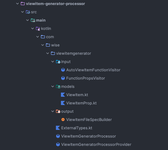
The Processor Module handles the core logic for processing and generating code. It is organized into four main sub-packages:
- Base: Contains the main processor classes as well a utility class with external type definitions we are using.
- Models: Defines the data models used for generating code, which are generated by the node visitors (
KSDefaultVisitor). - Input: Includes node visitors (
KSDefaultVisitor) responsible for parsing Composables annotated with@AutoViewItemand them generatingViewItemandViewItemPropmodels for code generation. - Output: Utilizes KotlinPoet to generate the ViewItems actual code.
AutoViewItemFunctionVisitor
This class is responsible for parsing Composable functions annotated with @AutoViewItem and delegating property processing to FunctionPropsVisitor. It also performs basic validation checks.
FunctionPropsVisitor
The FunctionPropsVisitor class processes each property of a Composable function, handling validation and data extraction.
Note: KSP currently does not provide detailed information on default argument values beyondKSValueParameter.hasDefault. Consequently, we have to manually extract and store default values as raw strings for use during code generation. This limitation is documented in Issue #268 on the KSP GitHub page.
Models
The models store parsed data in a format suitable for code generation.
ViewItemFileSpecBuilder
This builder uses KotlinPoet to generate the ViewItem code, incorporating custom logic to meet specific requirements.
ViewItemGeneratorProcessor
The ViewItemGeneratorProcessor and ViewItemGeneratorProcessorProvider orchestrate the processing and code generation logic.
Design System Integration and Conclusion
Auto-generating UI presentation models can offer significant benefits to any project, and these advantages are amplified when integrated with a comprehensive design system featuring multiple UI components, such as the one used at Wise. Our primary goal was to design UI presentation models that reflect the structure of our UI components and their render functions. This approach eliminates the need for manual binding of view items and enables the creation of dynamic lists of view items without adding extra logic to the views.
While maintaining these presentation models manually was manageable at first, the approach became increasingly time-consuming as the project grew. Any changes to UI components required corresponding updates to the models, increasing the risk of bugs and API inconsistencies. Additionally, this approach was not always followed consistently in every screen when using custom or composite components, leading to cases where logic ended up in the view layer. By adopting Kotlin Symbol Processing (KSP), we automated and brought consistency to our screens, resulting in a more efficient and maintainable codebase.
That said, there are trade-offs. Relying on auto-generated code increases build times and can make the codebase harder to navigate, as it’s not as straightforward to trace functionality by “jumping” to a specific function. This can contribute to a feeling of reduced robustness. However, the benefits — such as improved consistency, reduced manual coding, and better test coverage by centralizing logic in the ViewModel — make this approach worthwhile so far.
It’s important to note that this is an ongoing project, and we‘re’ actively working on improvements. For instance, functionally, one key focus improving the handling of default arguments. In the current implementation, default arguments are parsed as simple strings, lacking the processing to handle multiline arguments, extra imports among other complexities. We also have tests to cover a wide range of Composable configurations — thought that could be an article in itself.
License: All code samples in this article are licensed under the Apache License, Version 2.0.
P.S. Interested in working with us? We’re hiring! Check out our open Engineering roles here.

