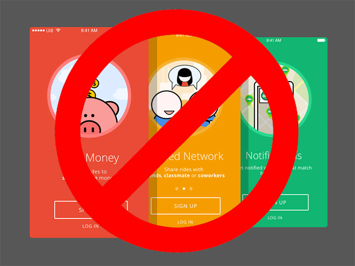
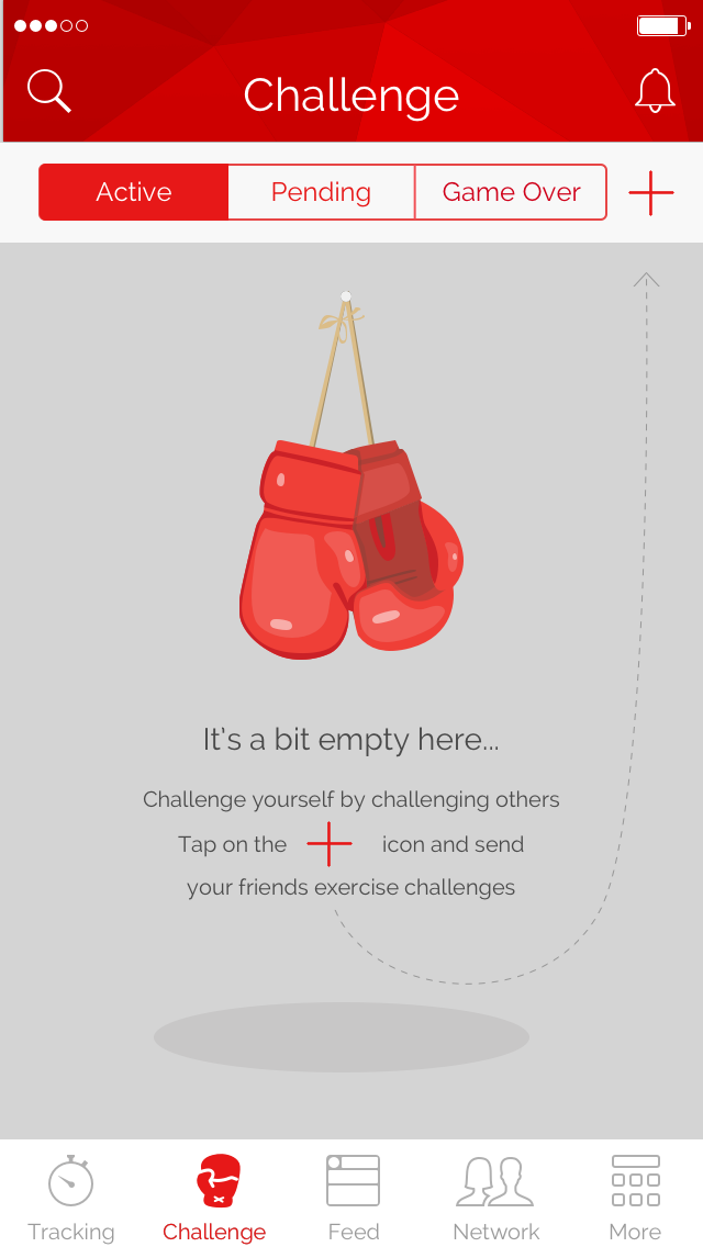
App Onboarding Screens, you don’t need them

Why does your app have onboarding screens?
Is it so counterintuitive that it requires explanation? Or are they there just… well… ‘cos’? With a little deeper and creative thought, I will show you how to avoid onboarding screens that are nothing more than interruptions. How they are often well meaning, but generally misplaced. And finally, how you can reap the benefits of a lower bounce rate by either removing, or moving them, to achieve their intended purpose elsewhere.
So… why does your app have onboarding screens? Lets look at the usual responses:
It’s just good UX
A UI/UX Expert who solves a gap in user experience with an onboarding screen, is like a developer who solves a memory leak by adding memory to the server.
UI/UX experts should be advocating the destruction of all onboarding screens, as onboarding screens are an admission that something is failing because the user requires assistance in order to engage with the app in a meaningful way.
But all apps have them! Google Inbox, Facebook, Tinder, …
“If everyone was jumping off a cliff would you follow them?” — my Mum
Think for yourself, don’t just blindly follow the pack. Sure, the fact that the Big Boys are doing it means it is worth considering, but doesn’t warrant taking permanent leave of your senses. The Big Boys change their minds all the time, and they often steal their ideas from the little guys. The moral: be a wolf, not a sheep.
But hey, don’t blindly follow me either, listen to your analytics…
If you already have onboarding screens, use analytics to watch how they are used. How often do people simply press skip? And if they do click next, do they do it in an “Installing Microsoft Office in the 90s” way and just click Next-Next-Next-Next? Catching this behaviour requires a little creativity in your analytics, but time spent in user retention is seldom wasted.
Even if I am right and your users don’t care about your onboarding screens, you are still one of the lucky ones…
If your [user] has two options open to him, be sure that he will choose the third — Bismarck
How many users neither skip nor click next, and simply bounce? It’s well proven that people will install a bunch of competing apps in the same category and then choose one based on their first impressions. This means that the first few seconds of interaction that your new user has with your app are extremely critical. Splash screens, forced sign up screens and onboarding screens are all a total waste of the users time and will likely result in a bounce.
Onboarding screens look professional
It’s true that there are many cool onboarding experiences. I’ve had lots of fun creating pretty transitions and animations with PageTransformer and Lottie. No doubt, as a developer, onboarding screens are a cool little sandpit to play in. But the app is not a playground, it exists for the users, not you.

Don’t get too emotionally attached to your code. Let it go. Have some fun elsewhere, monitor your user interactions with a simple state machine and Google Analytics to detect a series of user interactions (such as them clicking next-next-next without reading). Realise that user retention is more important than fancy animations, you can move your artwork into a ‘help’ section where it can be accessed by the senior citizens who are seeing what all the fuss is about.
It sets up the users expectations
This is a quote stolen straight out of the guidelines but probably the most out of context quote since Robert Frost’s, The Road Not Taken… Users live in 2018, making the assumption that they have used apps before is a fairly safe one. Design your app correctly, and they will work it out. Here’s why:
- If your idea is solving a problem that exists, they already know the general steps involved, because they do it already in some other way (or with some other app). In other words, they are expecting something easier than their current solution. Easier means no instruction manual.
- Expectations can be met before the app is even installed. The purpose of your app’s Play Store page is to be clear and instructive. Push the introductory information into the step before the app is opened…
- … and push the rest into the app itself by either reducing the initial interface’s complexity or showcasing it with Feature Discovery.
Reduce complexity. Go to war with buttons. Perhaps you could simplify the signup process with single click sign in? How about putting some just-in-time, contextual, non-interrupting ‘Hey we noticed you do XYZ quite a lot, have you considered ABC instead?’ tips into the workflow?
Sticking to standards ensures that users intuitively know what to do when they use your app because they are used to certain patterns. Navigating back, options menus, input fields, clicking the suggested button, clicking the destructive button, swiping hints, page view indicators, pull out navigation drawers on the left, pull down to refresh… these are all standard patterns that you can leverage to deprecate your superfluous onboarding interruptions.
What about advanced users? How do I show them cool new things?
Timing is everything. Inform people about the cool things in your app just when they are about to need it. This is called Feature Discovery and it converts your first time users to long time users, which is a far more important paradigm when it comes to user classification.
An example of the importance of timing: Android App Permissions. Remember how that was done before Marshmallow? Now it’s done just-in-time. It’s harder and more complicated to code, but a far better user experience.

Me: Onboarding is documentation in disguise
A long time ago in a galaxy far far away… my first job out of university was at a large software corporation. Towards the end of each release cycle, I interacted with an entire team dedicated to Documentation. User manuals, installation and upgrade guides, operating instructions and so on. Screen shots, step by step guides, troubleshooting sections… the works. These massive documents were meticulously edited, formatted, printed and shipped with a box of CDs to the Project Teams who were responsible for installing and setting up the software onsite.
Nobody read the documentation, not the customer, not the installation teams, not the support team, nobody. Support calls constantly filtered down through the layers of bureaucracy separating customer from developer manifesting in a stream of daily interruptions. The standard response was RTFM, which became an industry wide joke, but it highlighted a serious failure in the software development process.
Somewhere along the line the Documentation Team was replaced by User Experience Experts and User Interface Designers. The software world eventually learned that it was cheaper to make intuitive software from the word go, than to pay for a huge support team (who simply forwarded calls to the development team, who then missed their deadlines); and a documentation team (who destroyed the Amazon rainforests in order to create pretty documents that nobody read).
It seems that the software world is not quite ready to give up the ghost. Onboarding is documentation in disguise. Don’t repeat the mistakes of the past, put documentation back on the shelf where it belongs.
“Come to it [writing] anyway but lightly”. — Stephen King
I’ve taken a strong stance here because I believe most apps either misinterpret, or flat out violate the material design onboarding guidelines. To vehemently agree or disagree, drop me a line on Twitter @nshred or in the comments below. Thanks for reading!


