Member-only story
Android Material Component: Creating a Gmail like Navigation Drawer (Part II) — Adding that final Ripple touch
If you’re into tiny details and interactions in the app like me, something probably always annoy you when the interaction is just not too perfect.
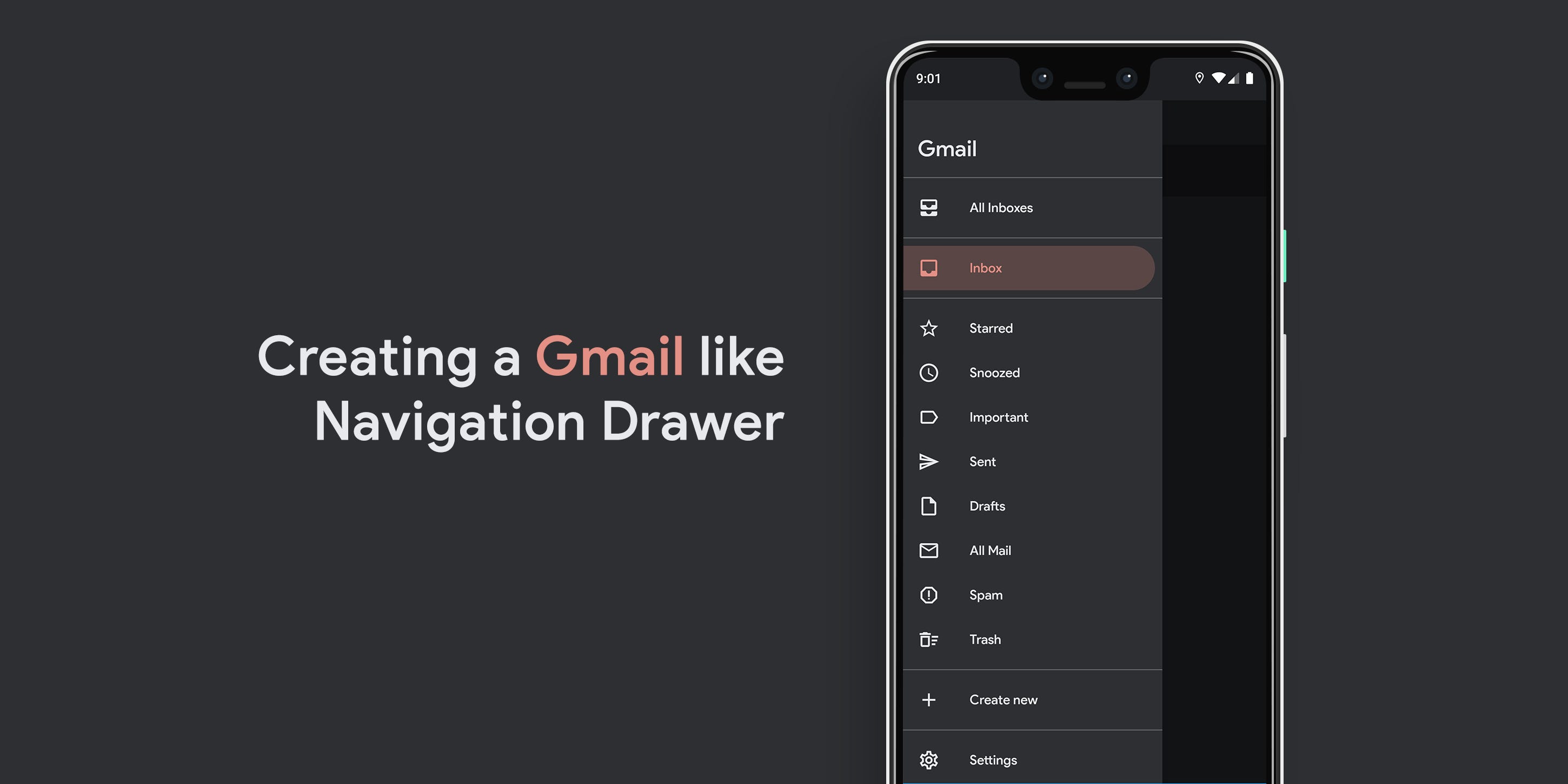
While I covered almost all the things there was about creating a Gmail like Navigation Drawer in the first part, this story is just about adding that tiny ripple effect to when you press the navigation drawer items.
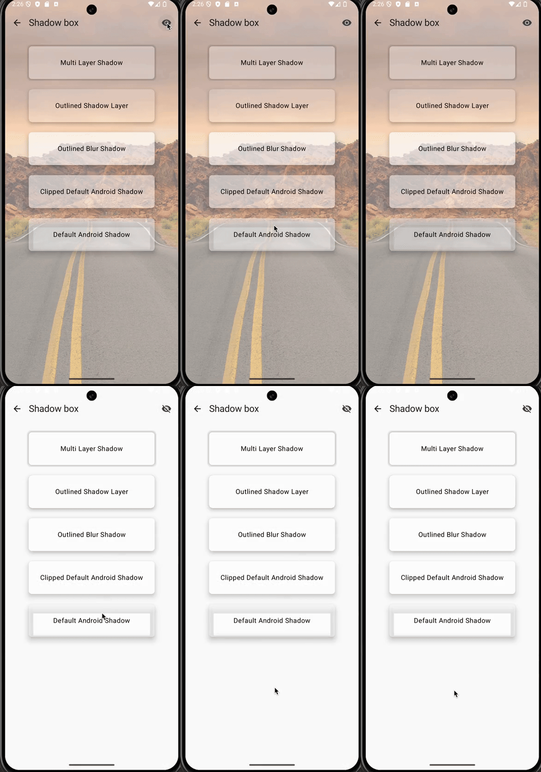
To look into the different before and after adding the ripple effect, here are two GIFs:
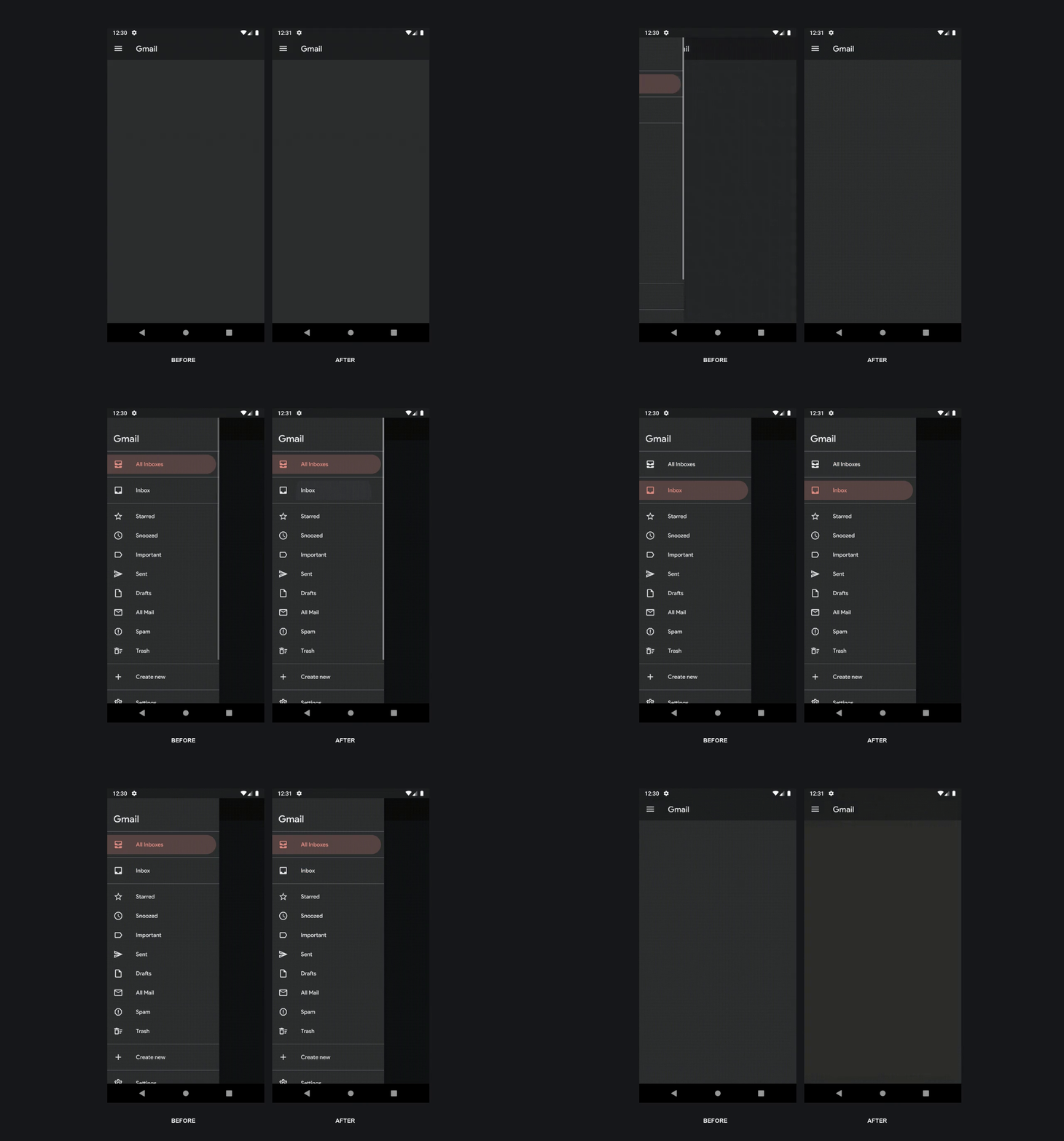
Although this is a tiny UI improvement which I did not initially plan to write about, I recently spent more time than I expected perfecting a ripple effect at work that it got me thinking to just write a blog about it and save everyone’s time once and for all!
Previous Post
Ripple Magic 🎩
Now that you know what we’re trying to achieve, here’s how you achieve it:
- Open background_round_padded_pressed.xml (This is the background for the menu item when it is pressed).
- Replace the parent element from layer-list to ripple.
- When you get an error, add the required android:color attribute to the element and set it to the same color as the pressed item color already set for the shape item.
- Add the already defined android ID @android:id/mask to the shape item inside the ripple element. (This defines the bounds to the ripple effect, which in our case is already defined as a custom shape):


